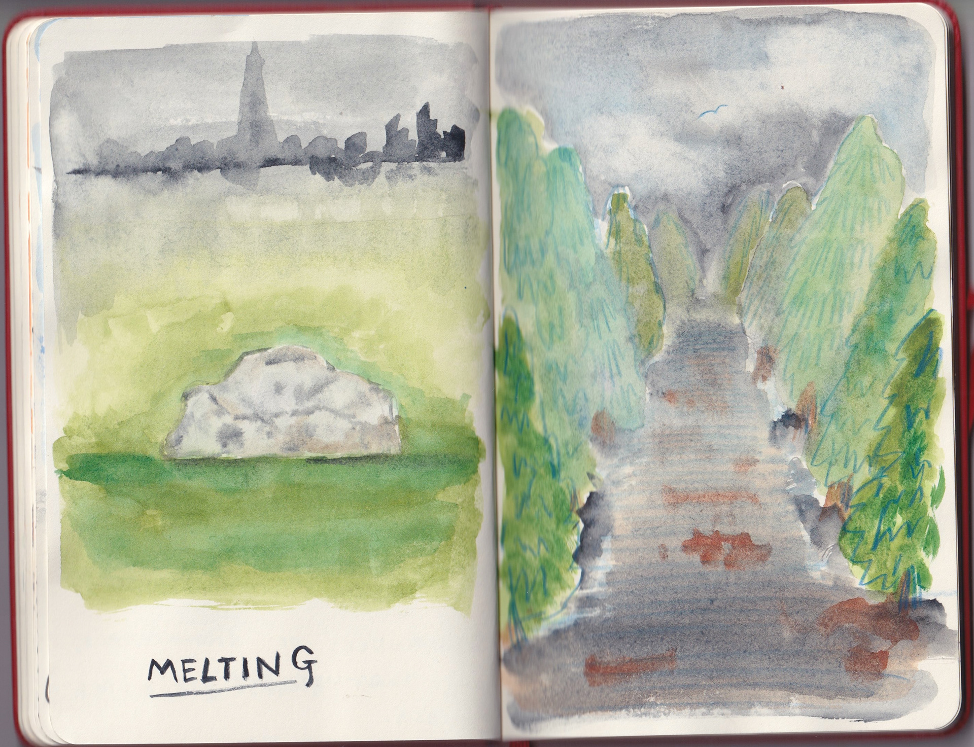
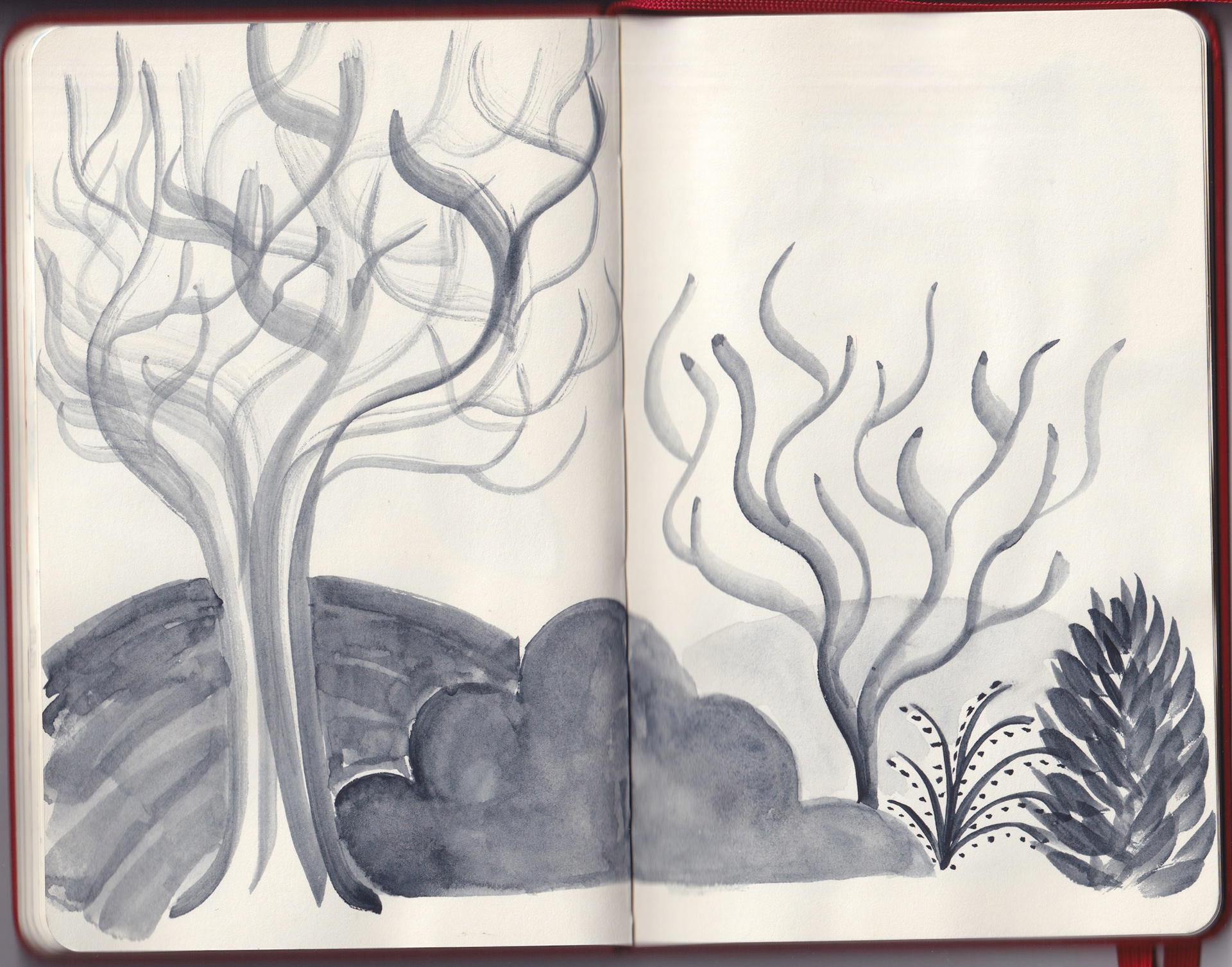
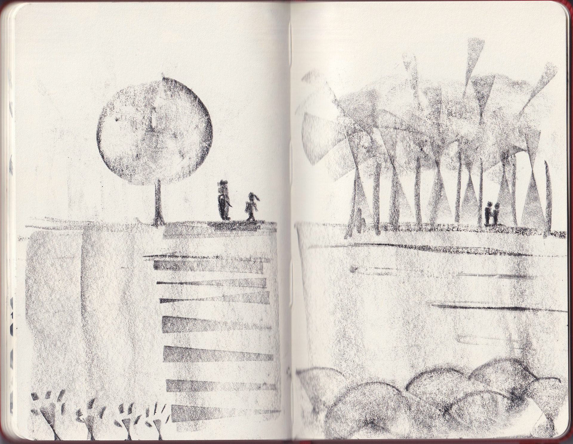
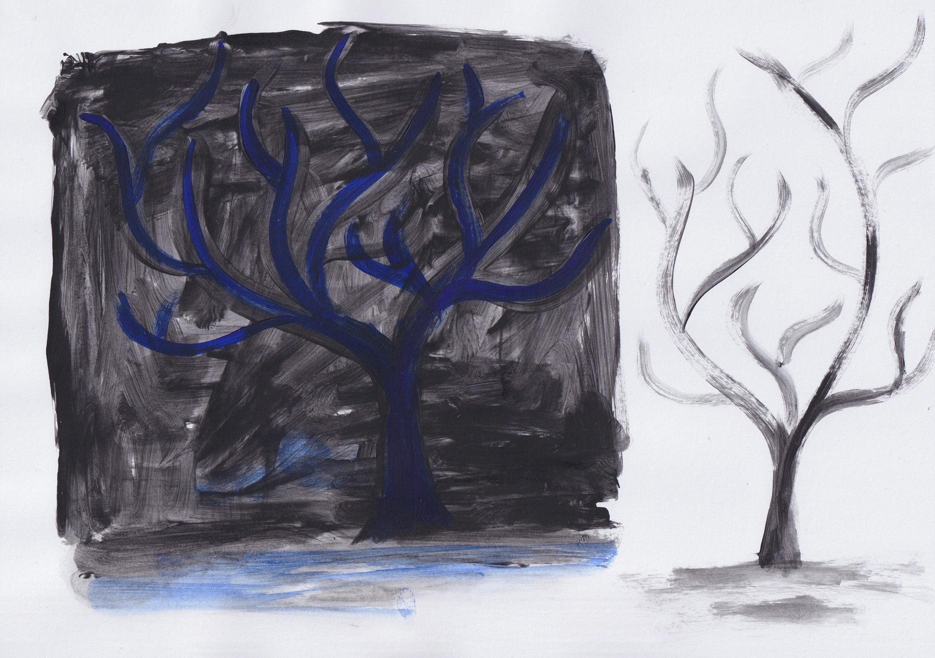
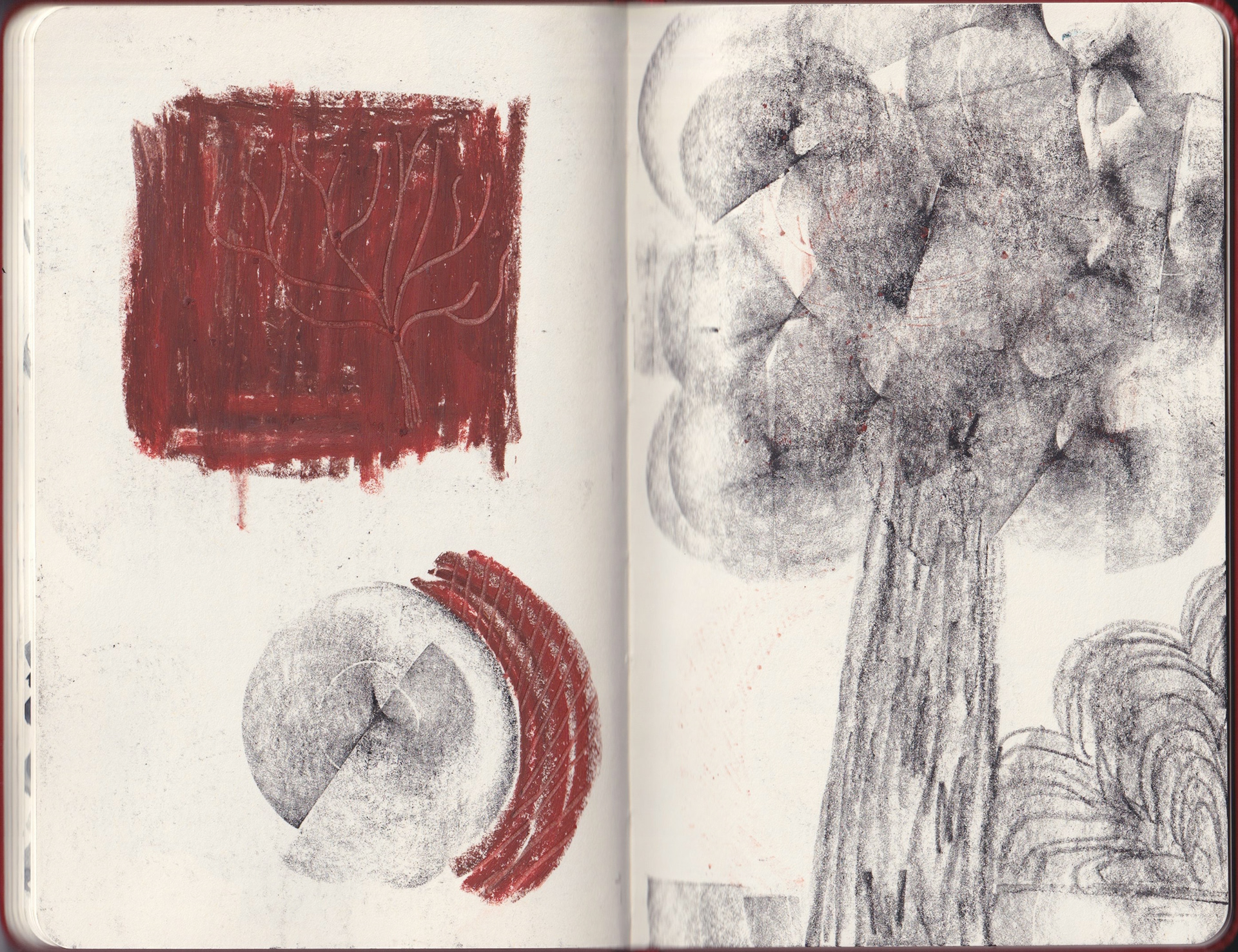
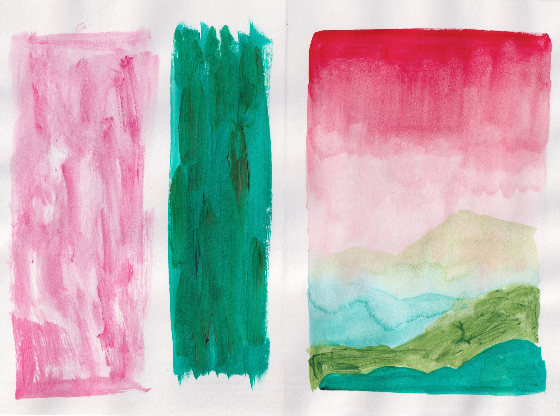
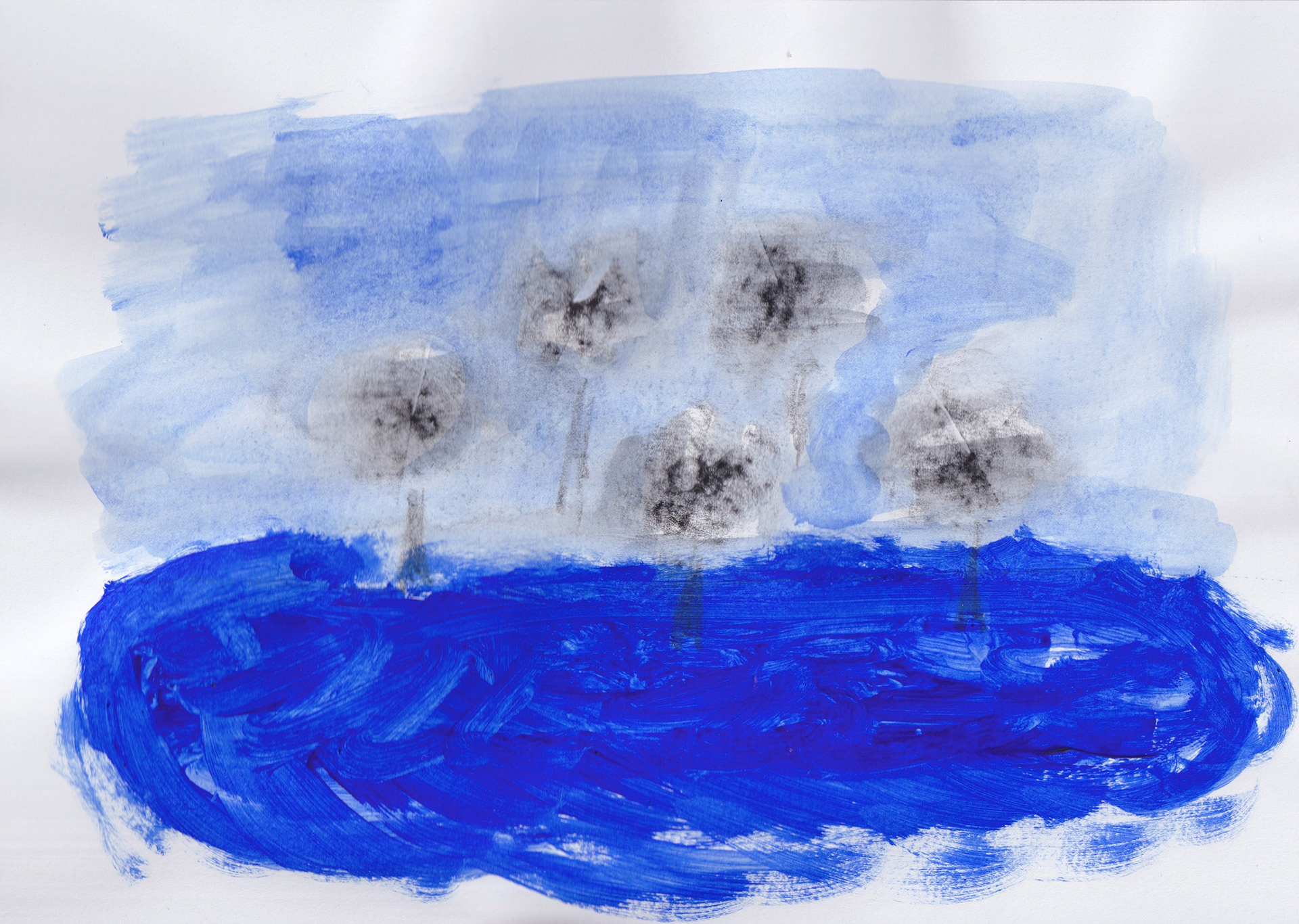
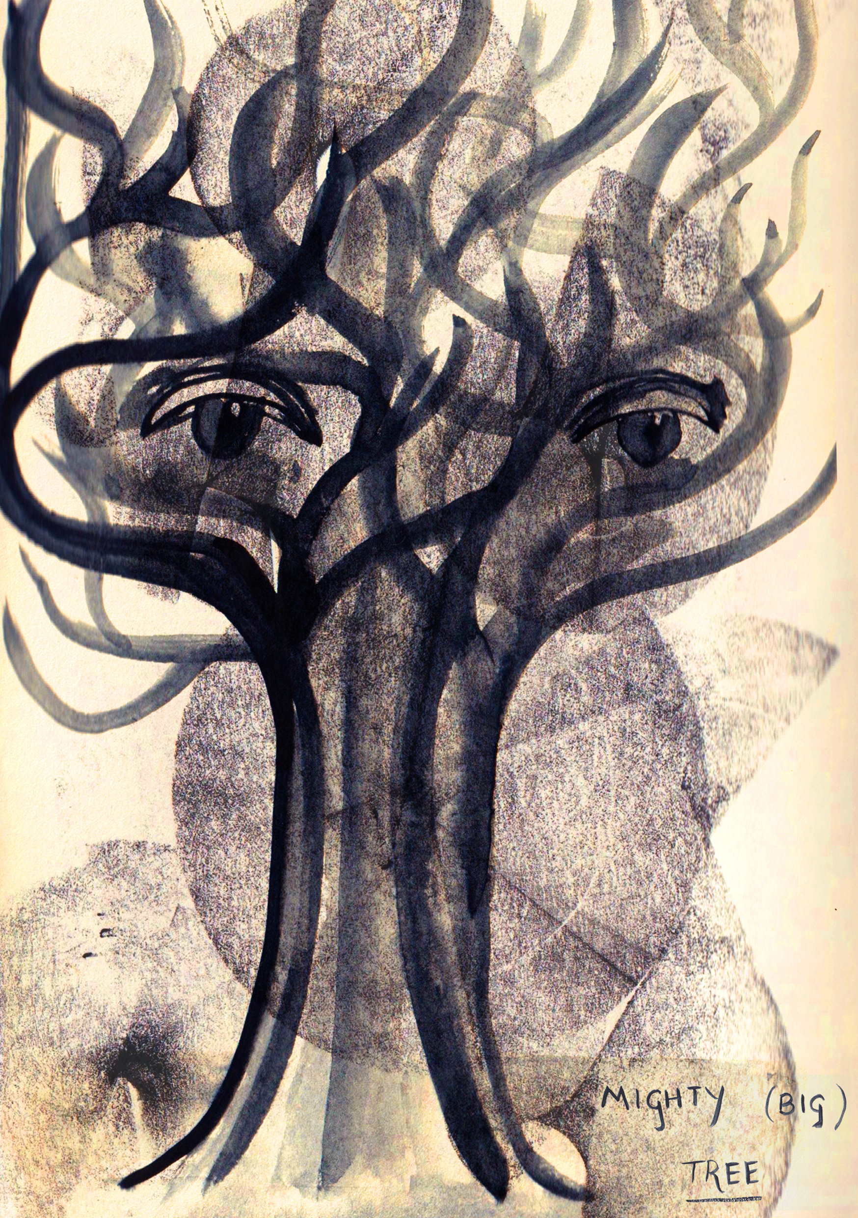
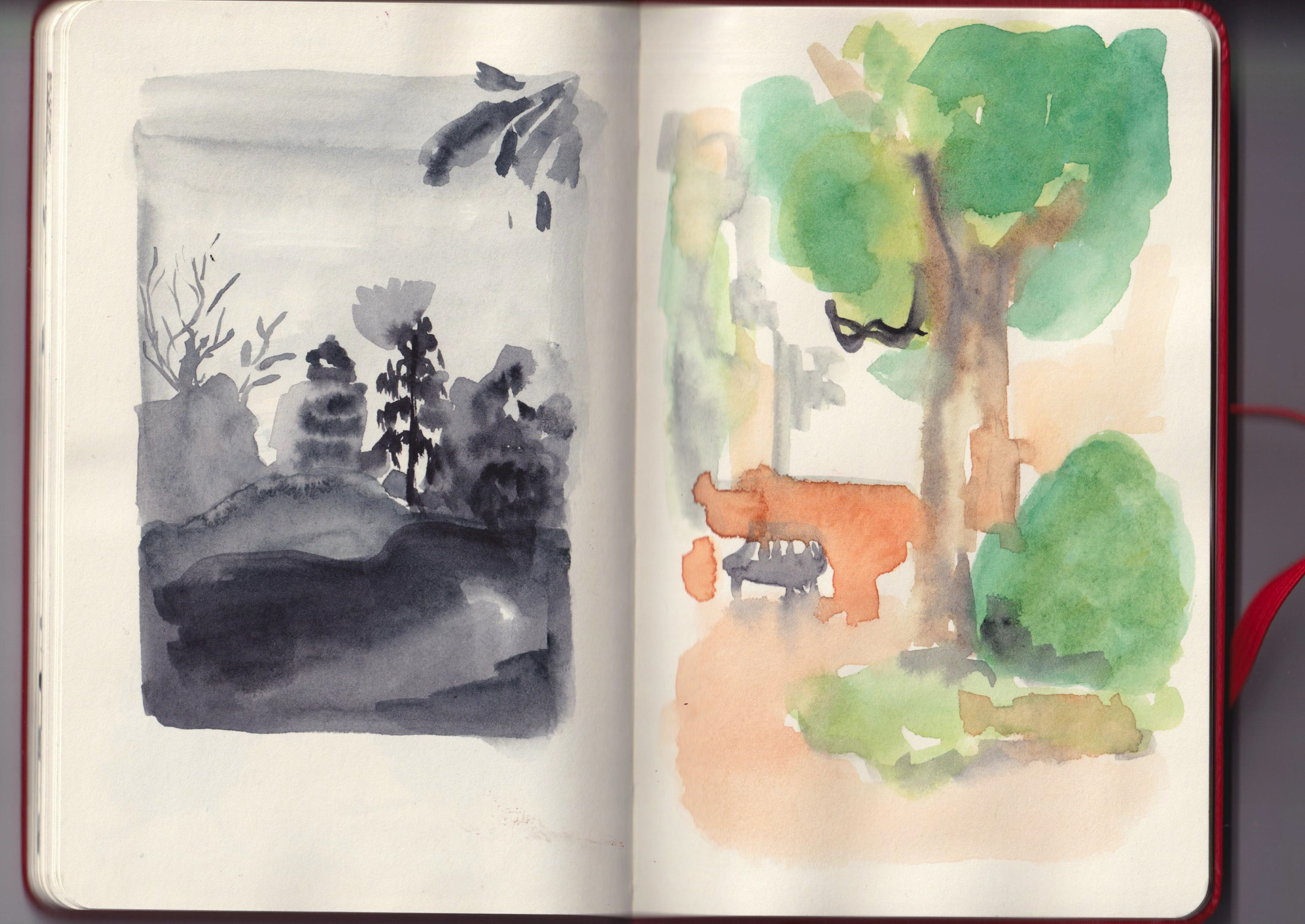
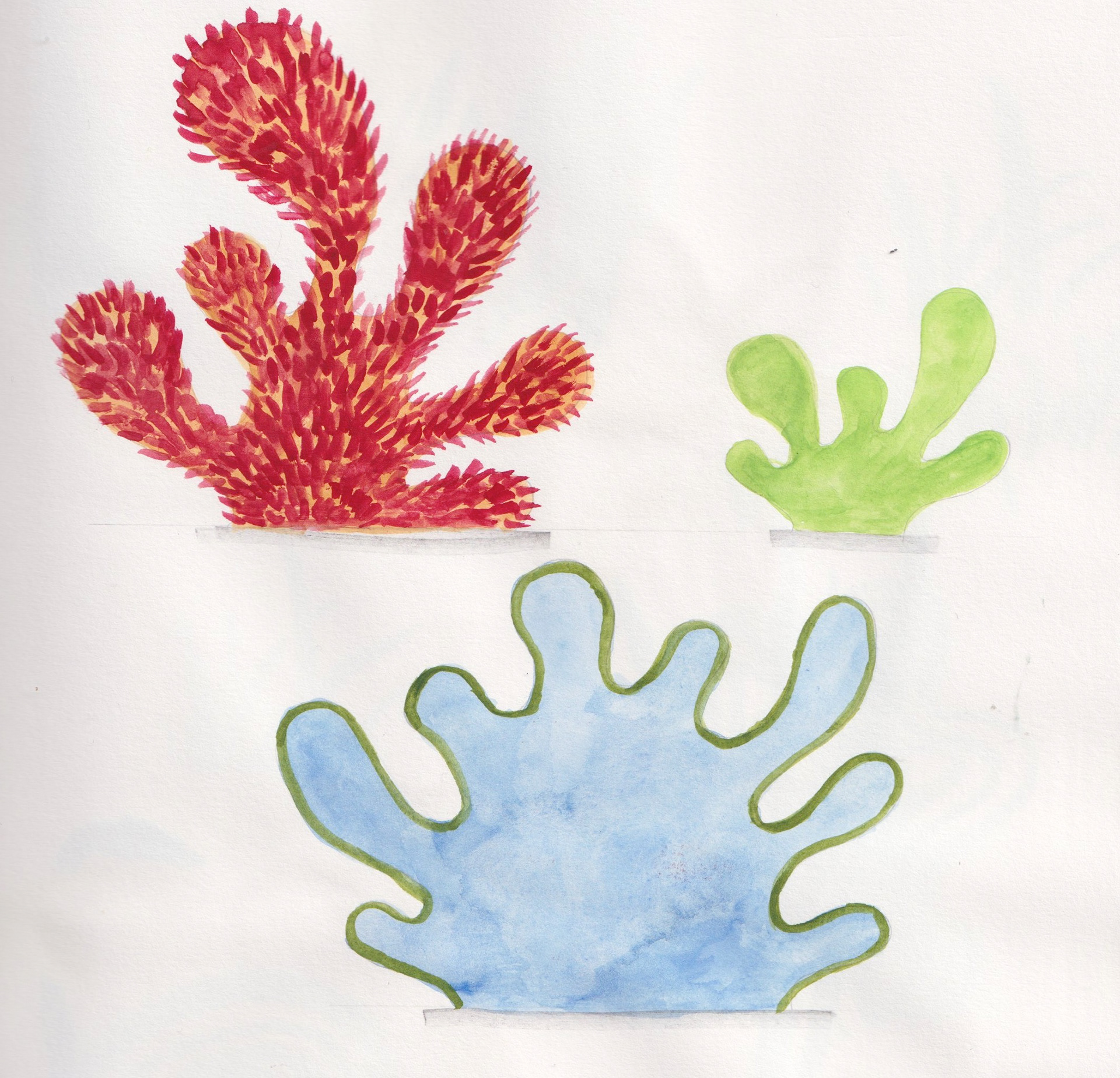
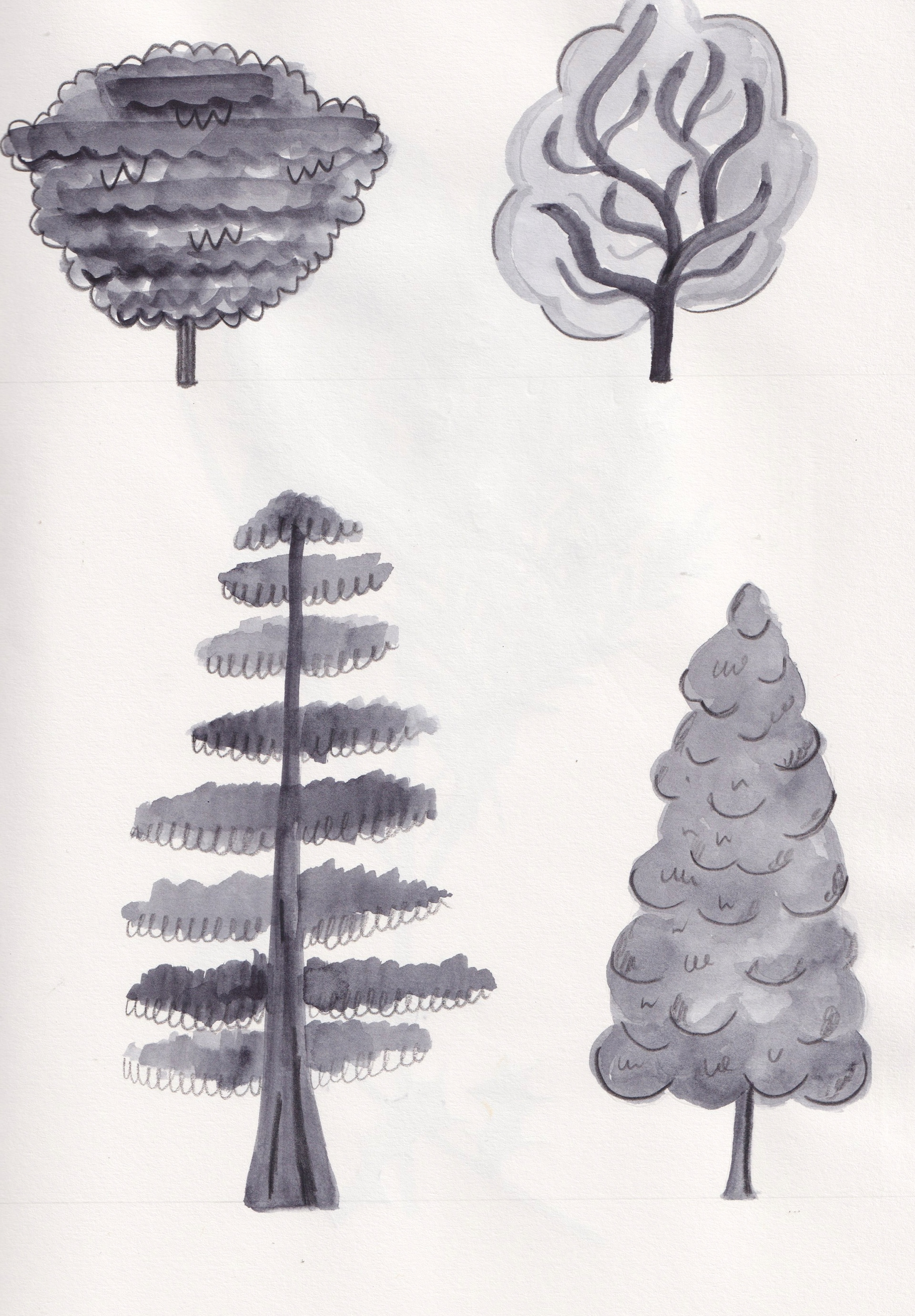
Focusing on form, atmosphere and texture
EXPERIMENTING WITH COLLAGE
These mosaics (below) exist in Platt Fields park already, depicting community, peace and compassion. I'm looking to explore possibly echoing either the visuals of a tiles and collage appearance or the physicality of them in my work


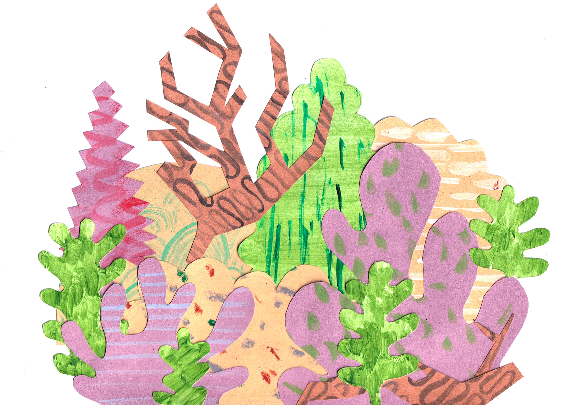
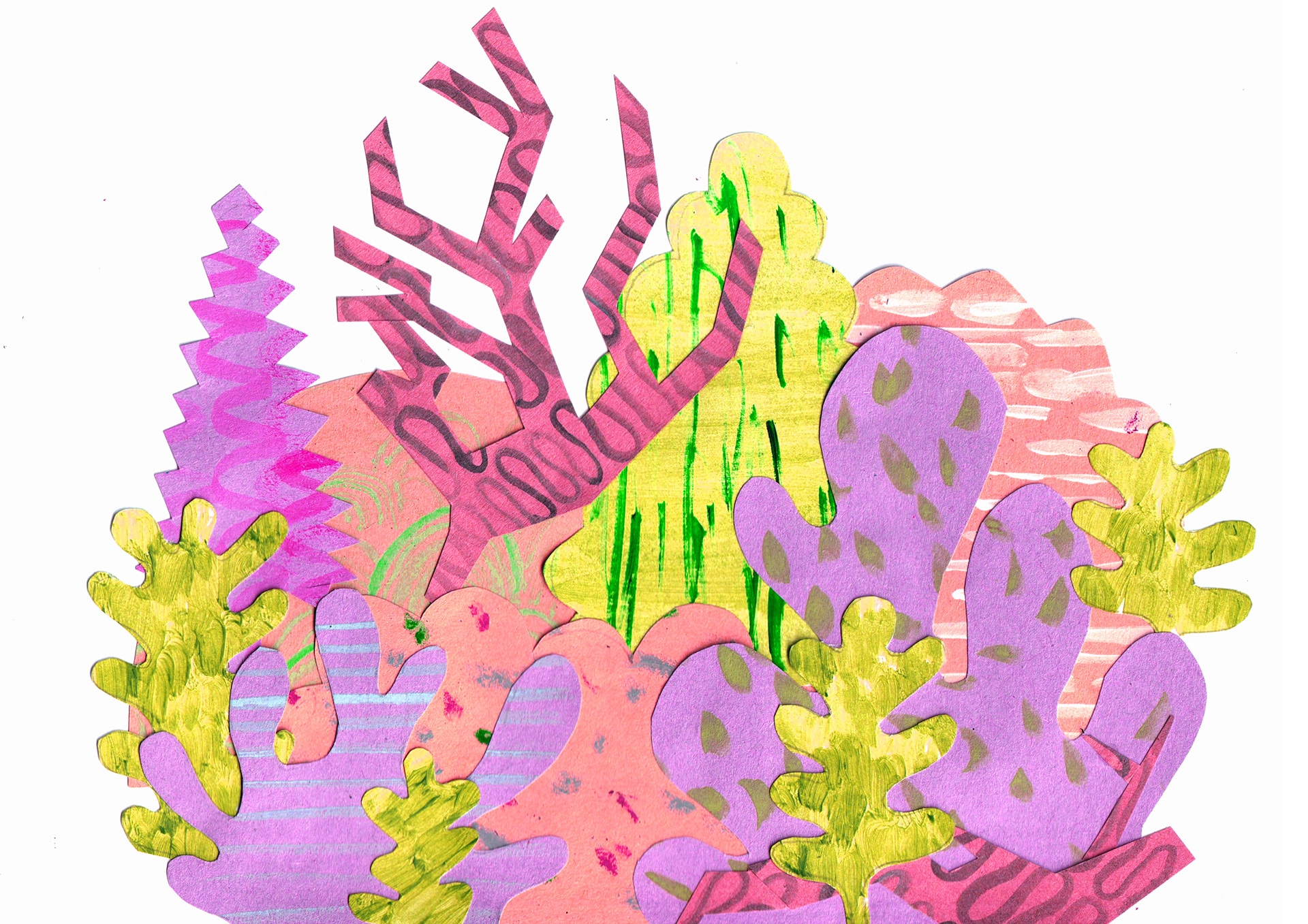
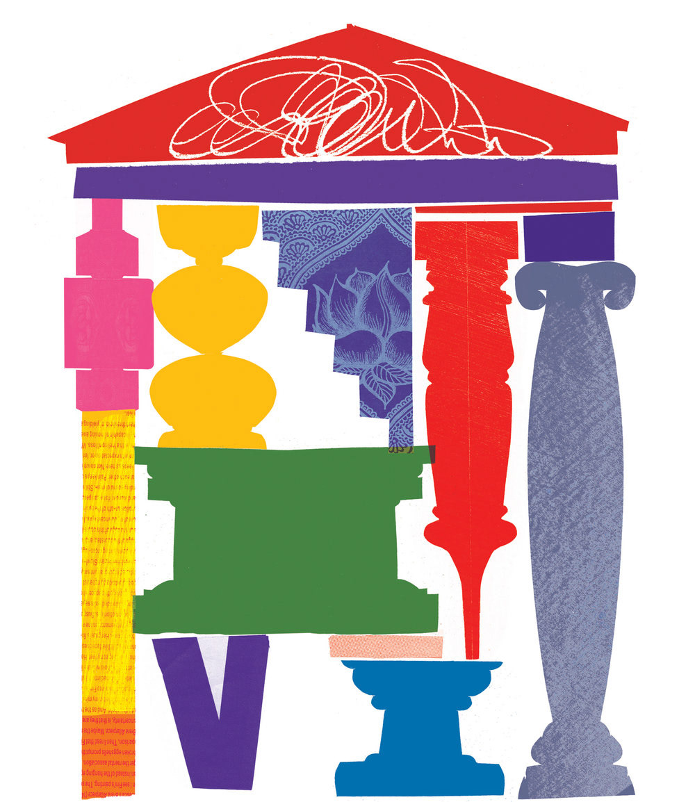
Experimenting with digital collage and silhouette.


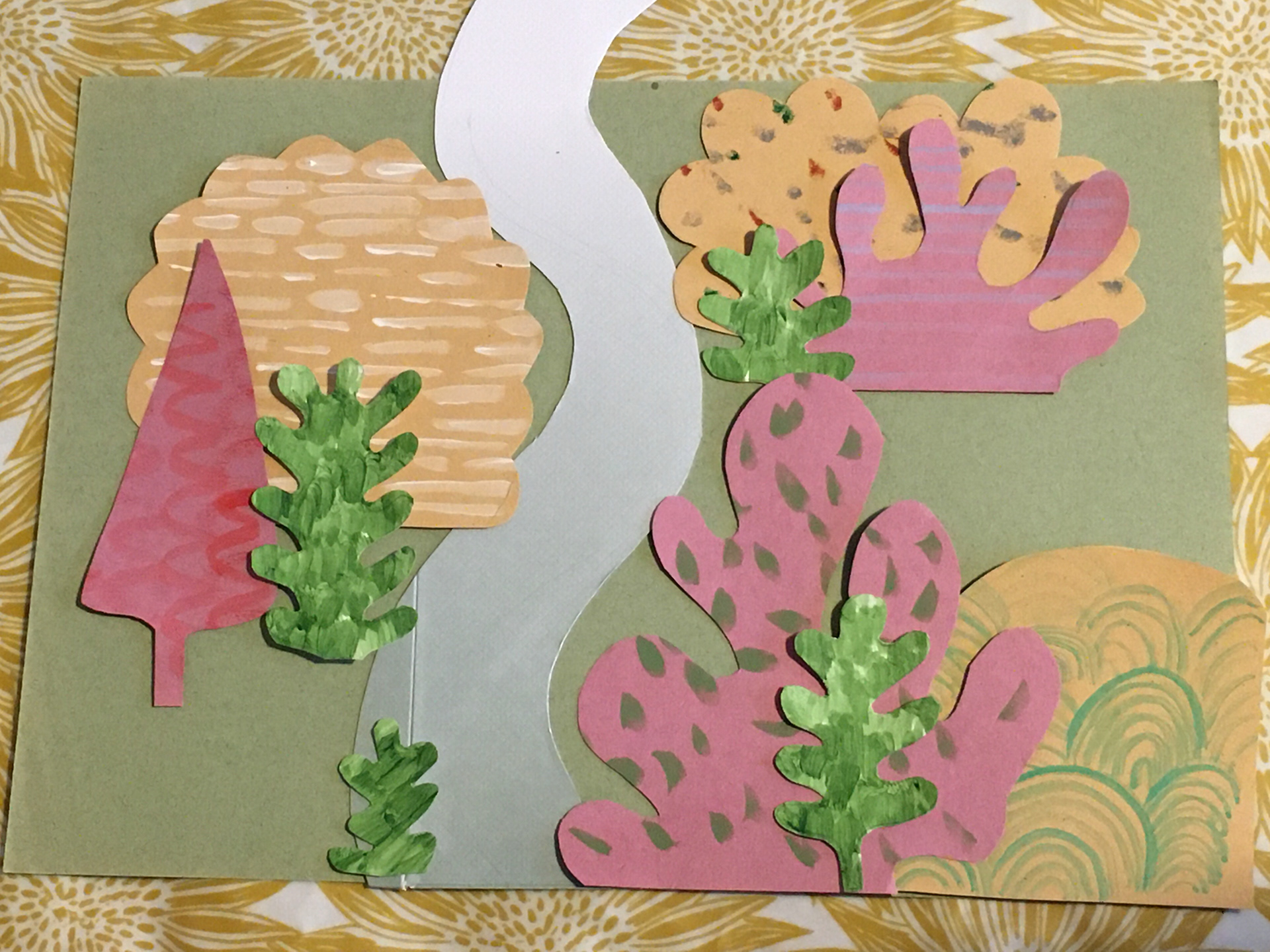

Paper collage ideas
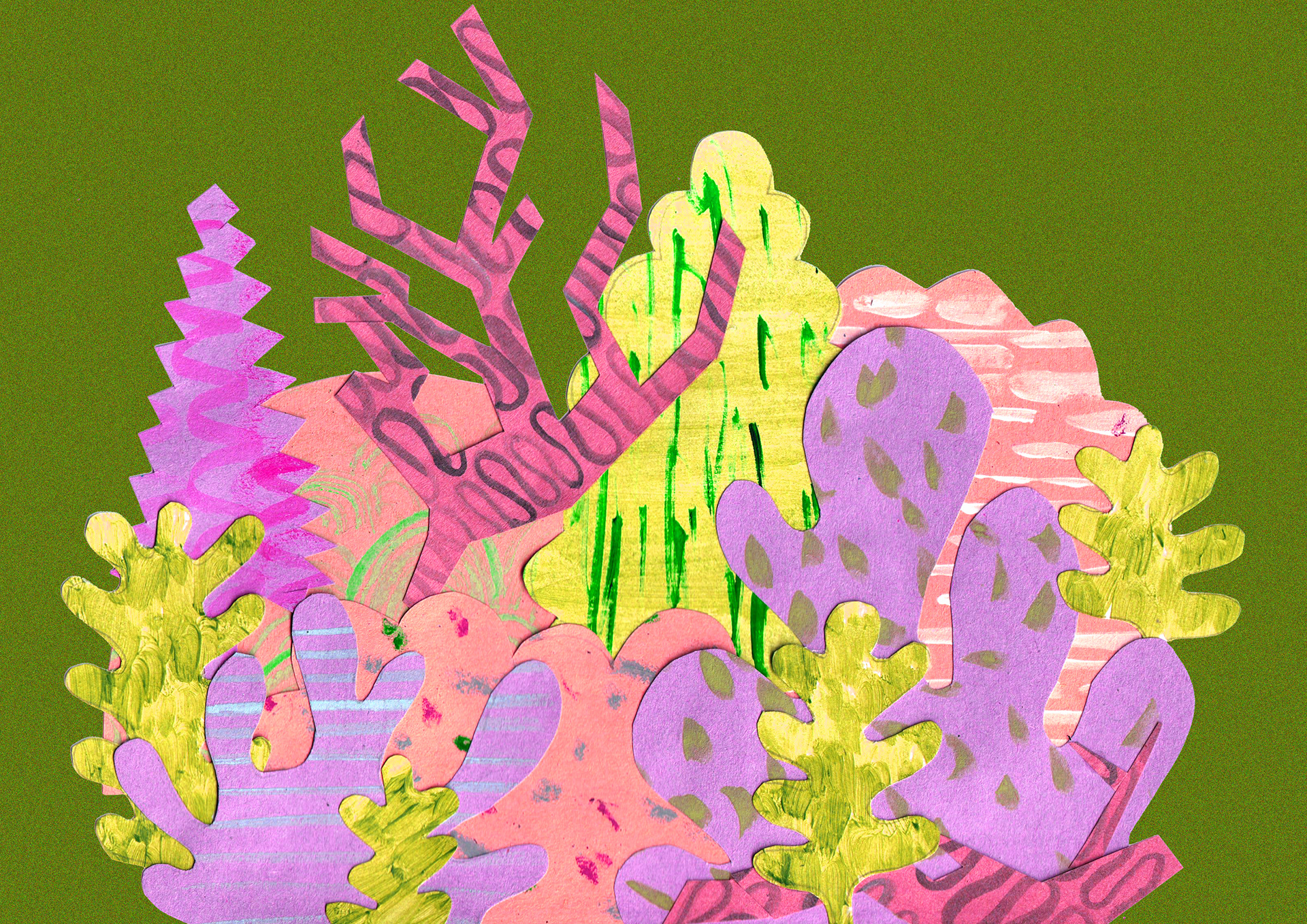
Digitally editing a paper collage idea
Reflection on my collage work:
I persevered with the my collage ideas for a while, using digital, physical and a mix of the two. However I found the process to be uninspiring and ultimately I didn't enjoy making in this way! It was good to experiment with, and through this exercise I learned the importance of contrast in both colours and shape (soft and jagged) as well as how useful I found moving and resizing individual elements digitally. Although the outcomes from this weren't visually successful for me I definitely think it was worth doing.
WORKING ON COMPOSITION: 25TH - 29TH JANUARY
Composition sketches
Composition ideas
Composition ideas
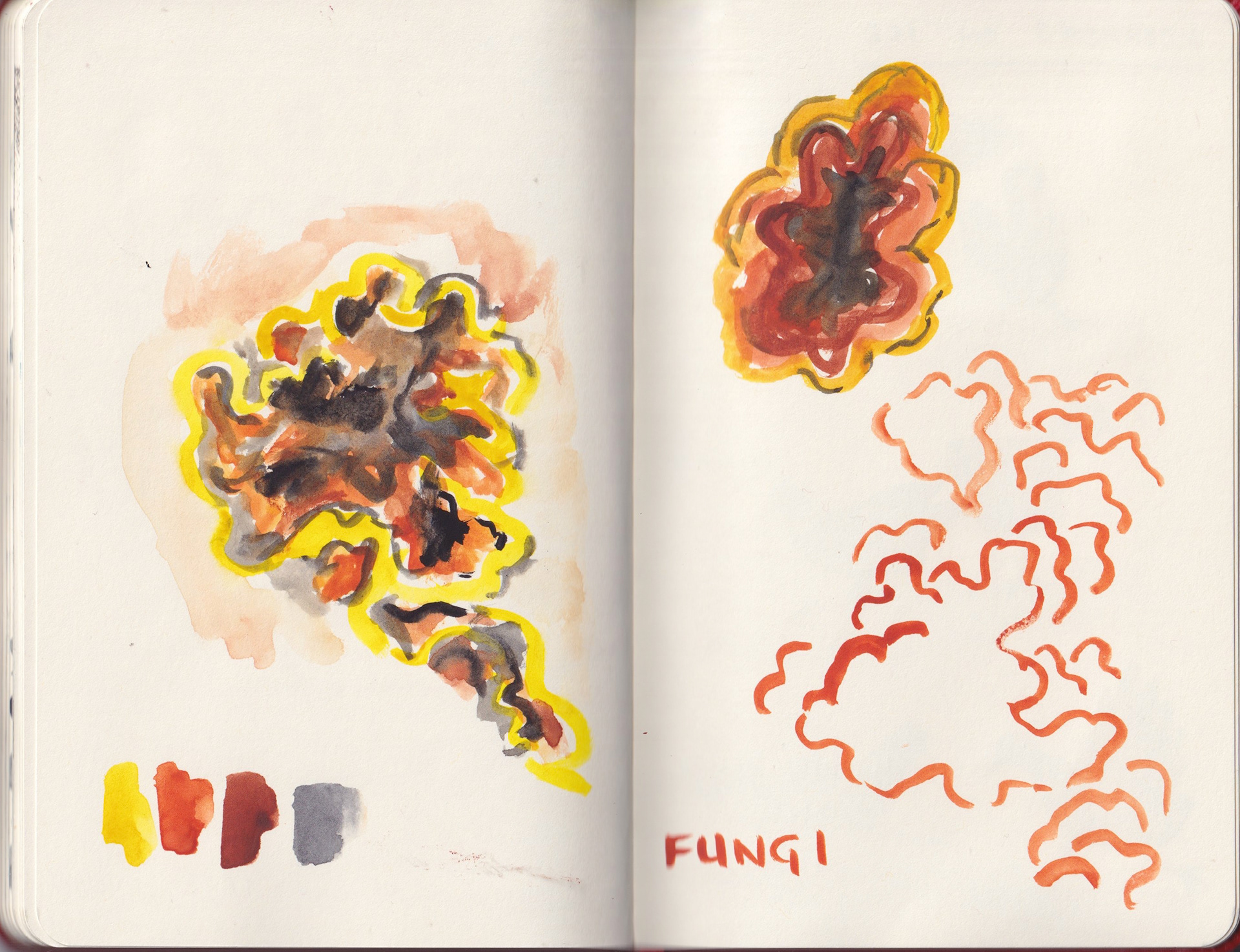
Looking at fungi
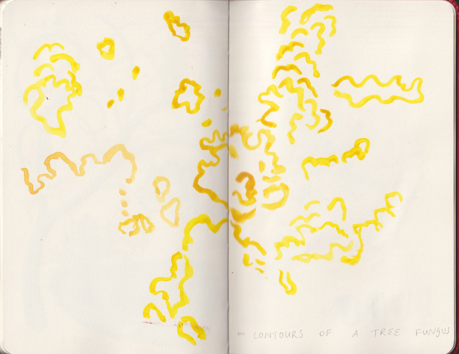
Contours of a tree fungus
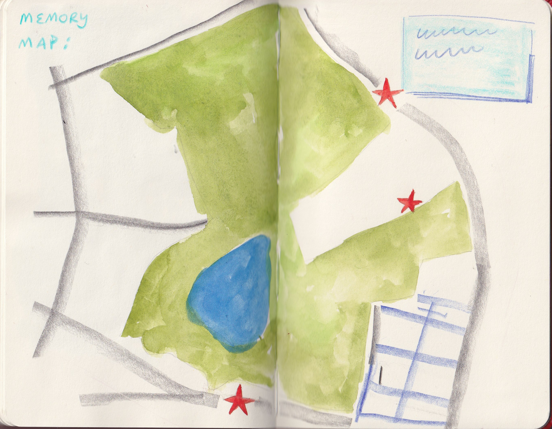
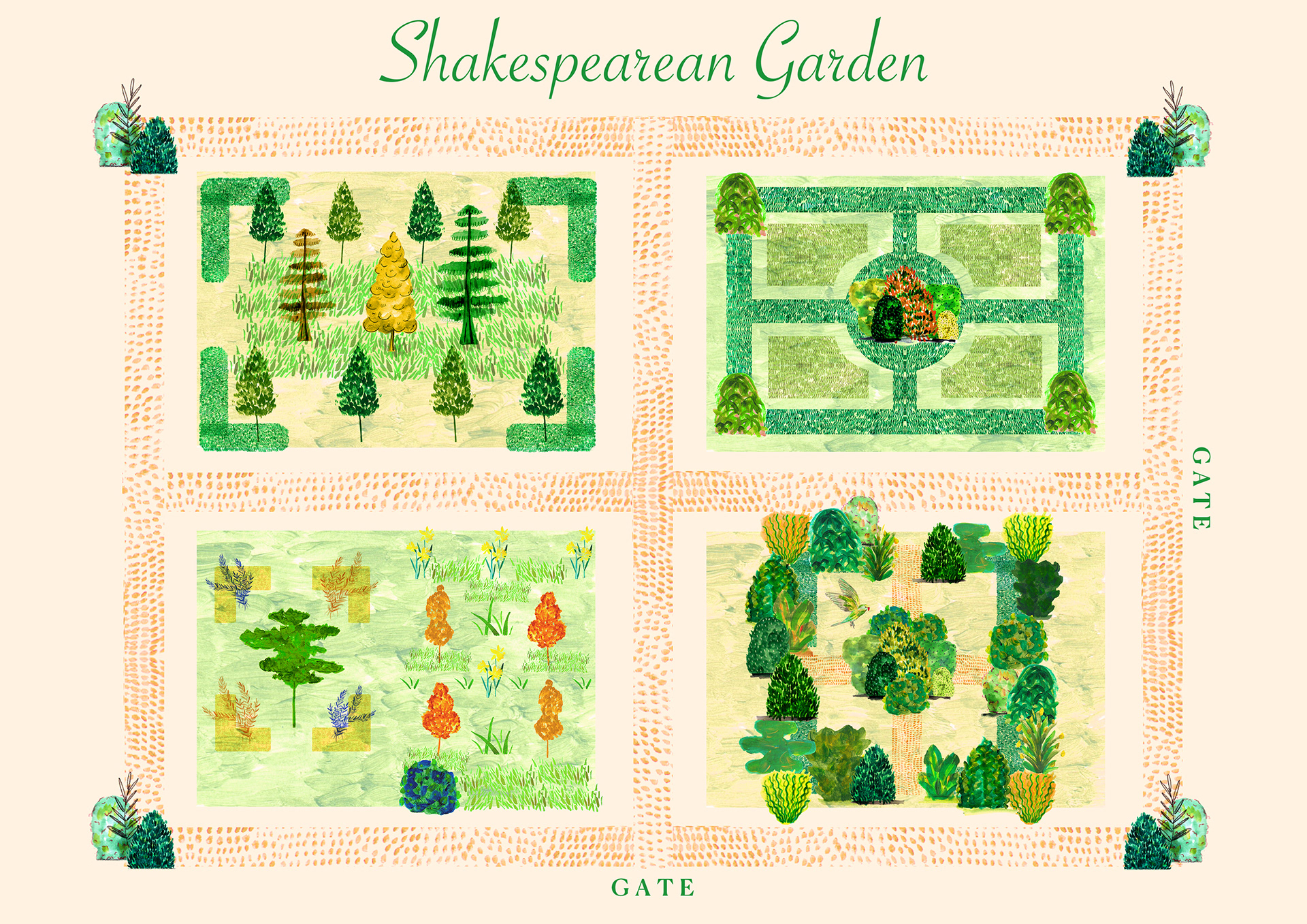
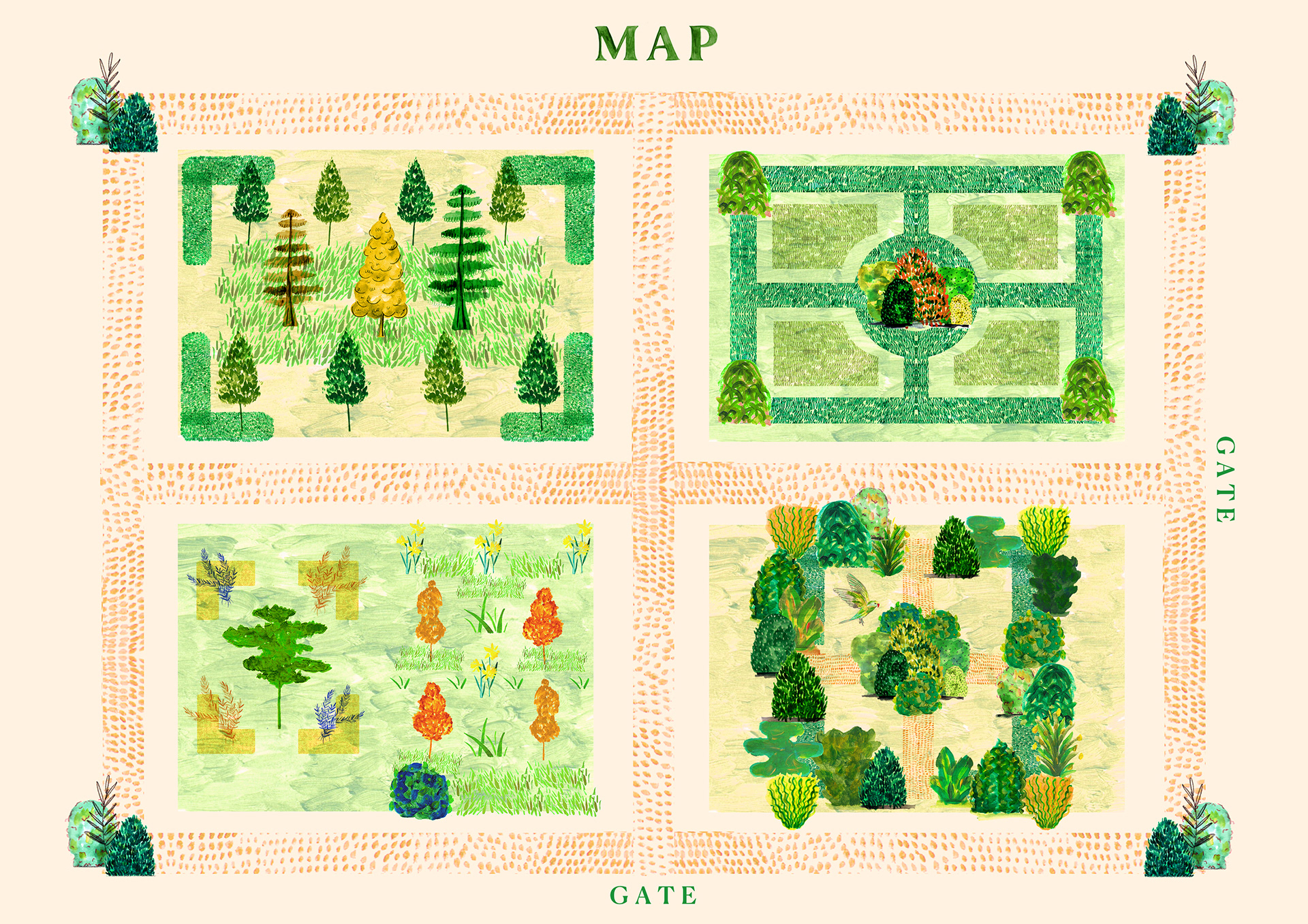
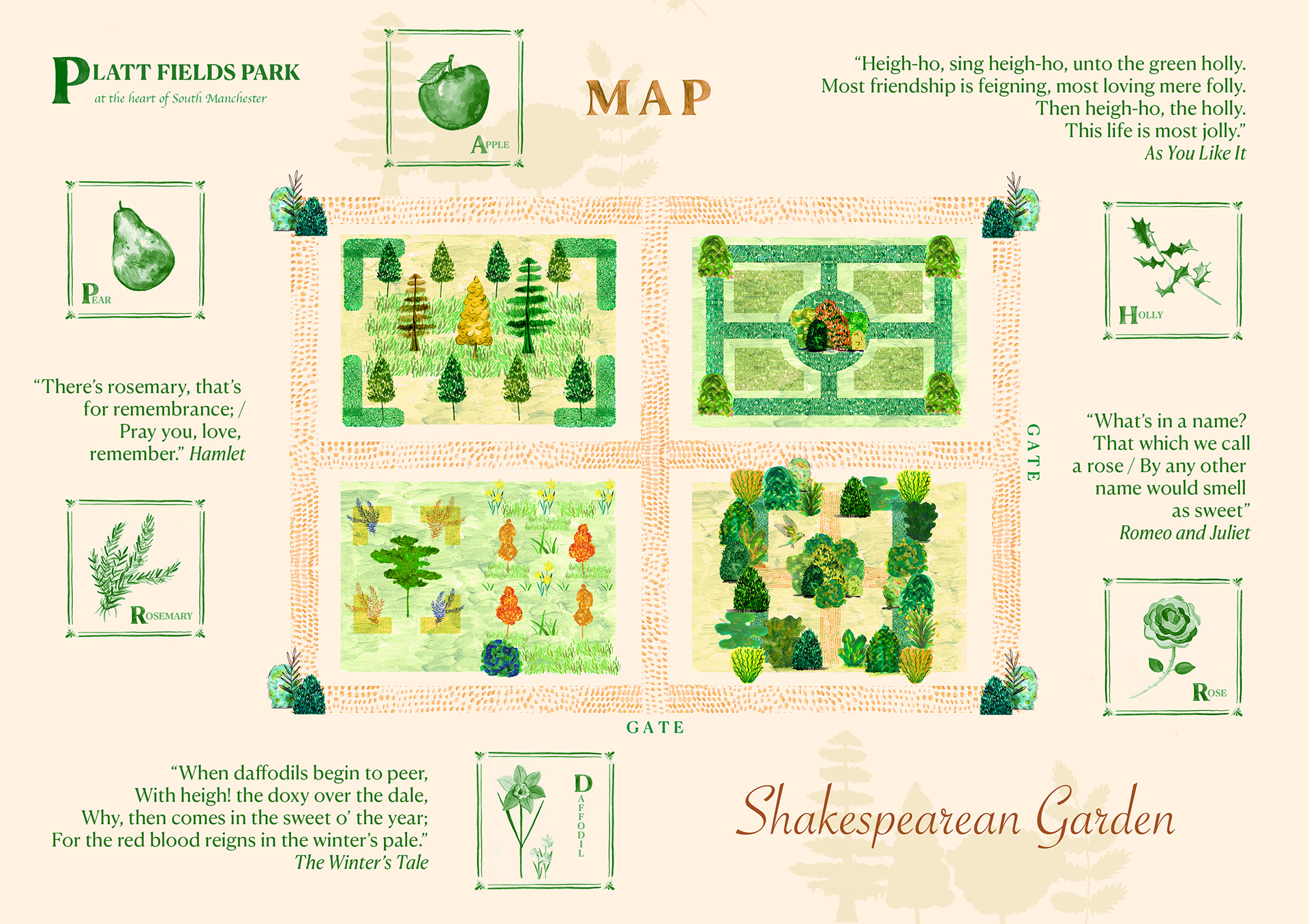
Looking at application of my designs to a map. A map could open the opportunity to apply this site specifically and draw on local stories, and possibly provide a walking route to create this narrative.
Additional research: WALKING AND DRAWING FOR IMPROVED MENTAL WELLBEING
Alex Strauss: The Mindful Walker https://themindfulwalker.com/blog
Boulter, L. (2020) ‘Learning to draw in the natural world brings joy – especially in lockdown’
Fleming, A. 2021 ‘The Joy of Steps: 20 ways to give purpose to your daily walk’
Thomas-Bailey, C. 2014 ‘Put your best foot forward: why walking is good for you’ https://www.theguardian.com/lifeandstyle/2014/jun/05/best-foot-forward-why-walking-good-for-you
Walk of Art, Yorkshire Sculpture Park https://ysp.org.uk/supportus/walk-of-art
Howeson, A. (2018) ‘Drawing and the remembered city’ Journal of Illustration, 5(1)
PRACTITIONER RESEARCH: NILS-PETTER EKWALL
I wanted to pursue the idea of an illustrated map, and came across Nils-Petter Ekwall, a Swedish illustrator who specialises in "highly detailed illustrations, cityscapes, pictorial maps, infographics." I was drawn to his work because of the structured approach he uses in his designs as well as how he utilises space to create focus on individual elements. I also enjoy how he uses the shape of the landscapes he is depicting help to dictate the composition.
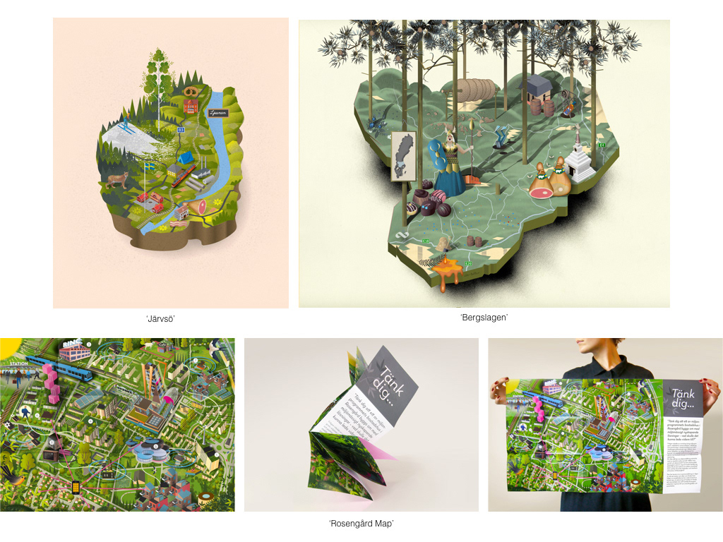
Work by Nils-Petter Ekwall.
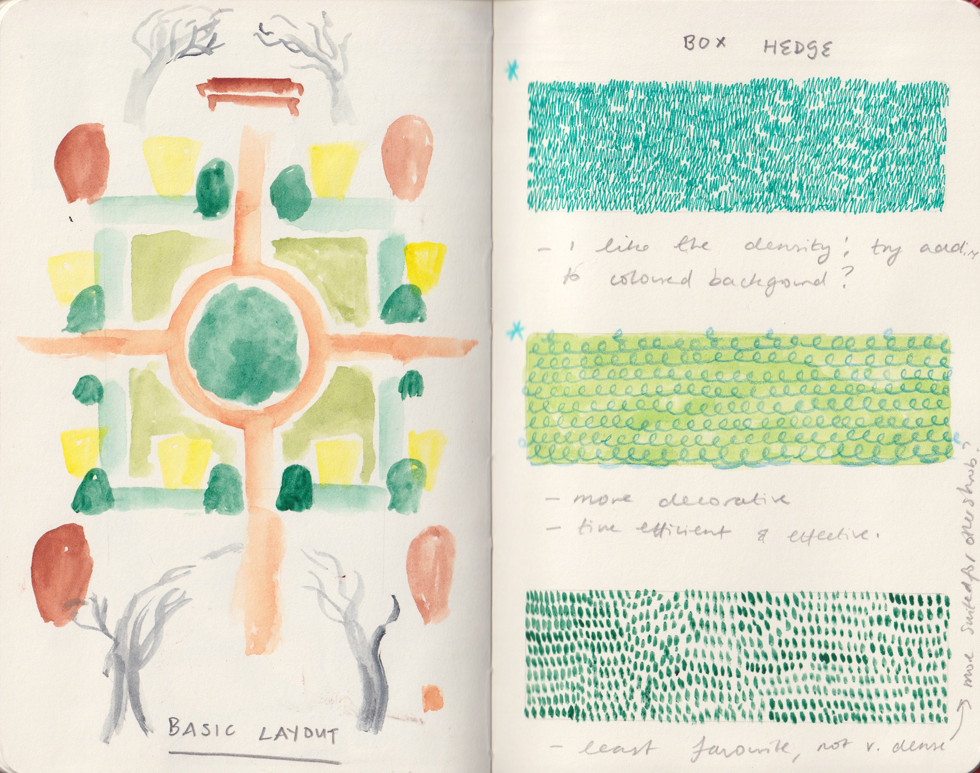
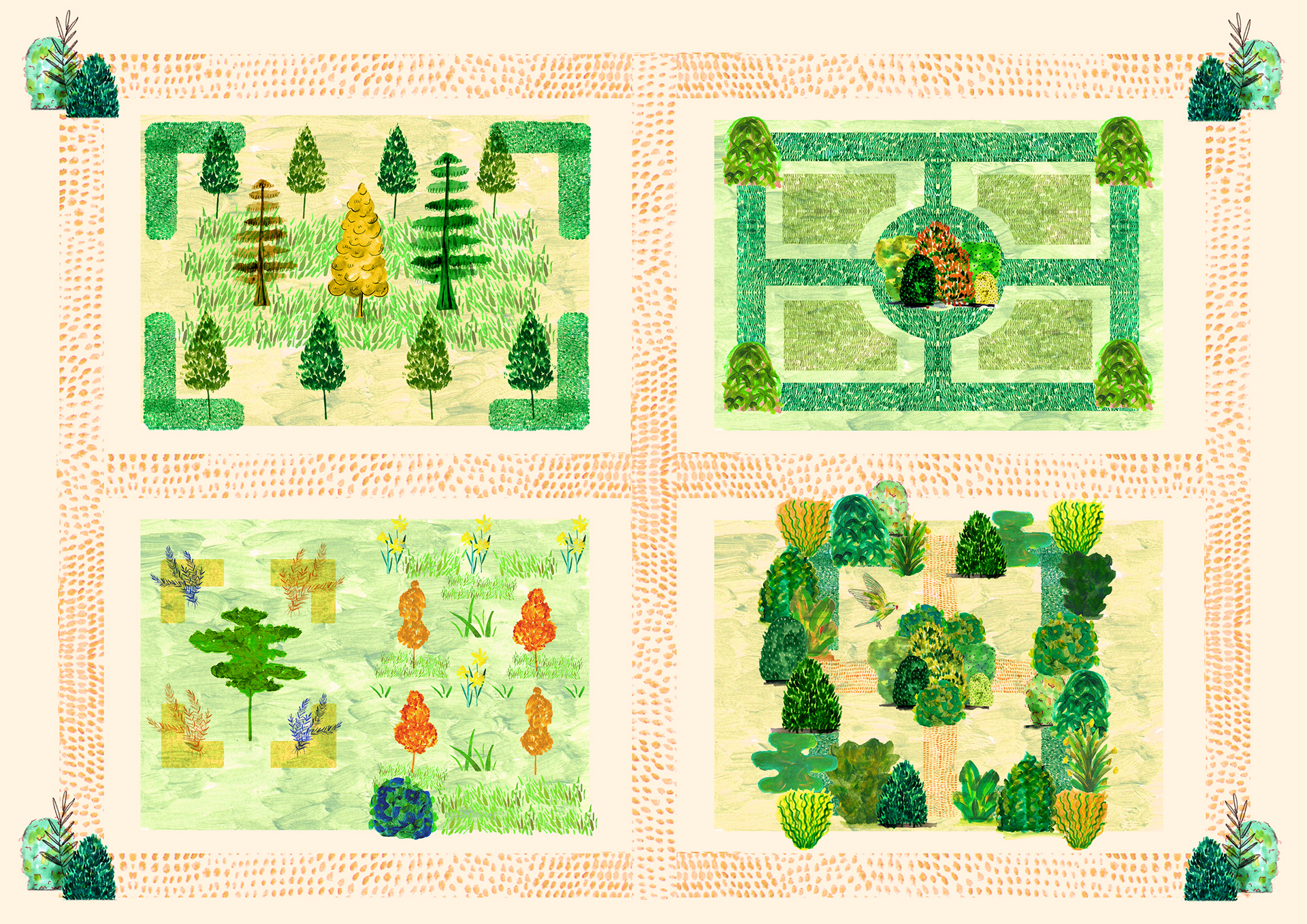
APPLYING STRUCTURE TO MY OWN WORK
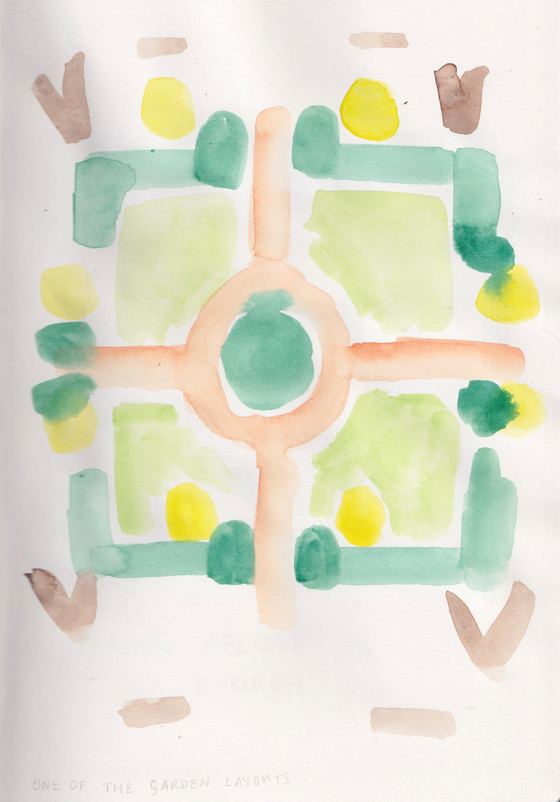
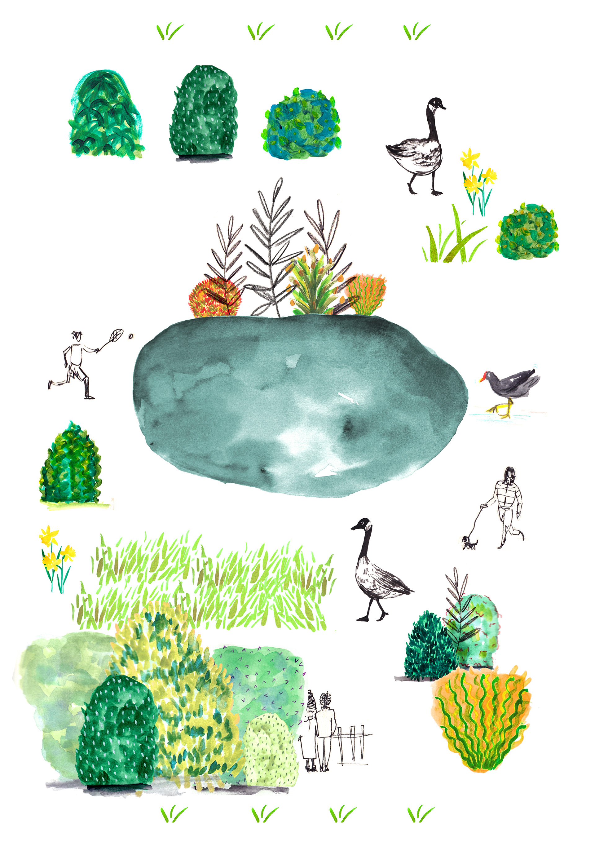
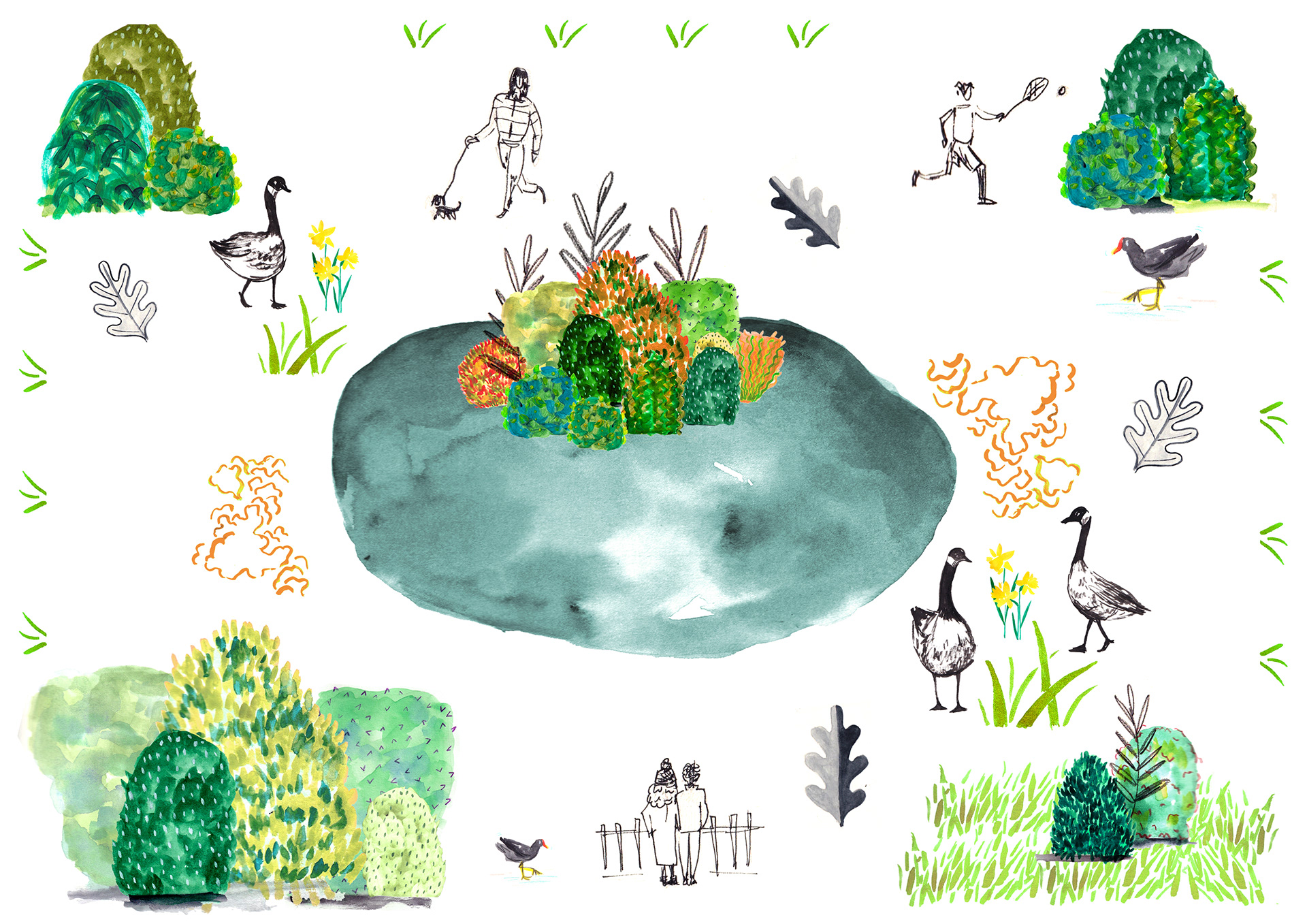
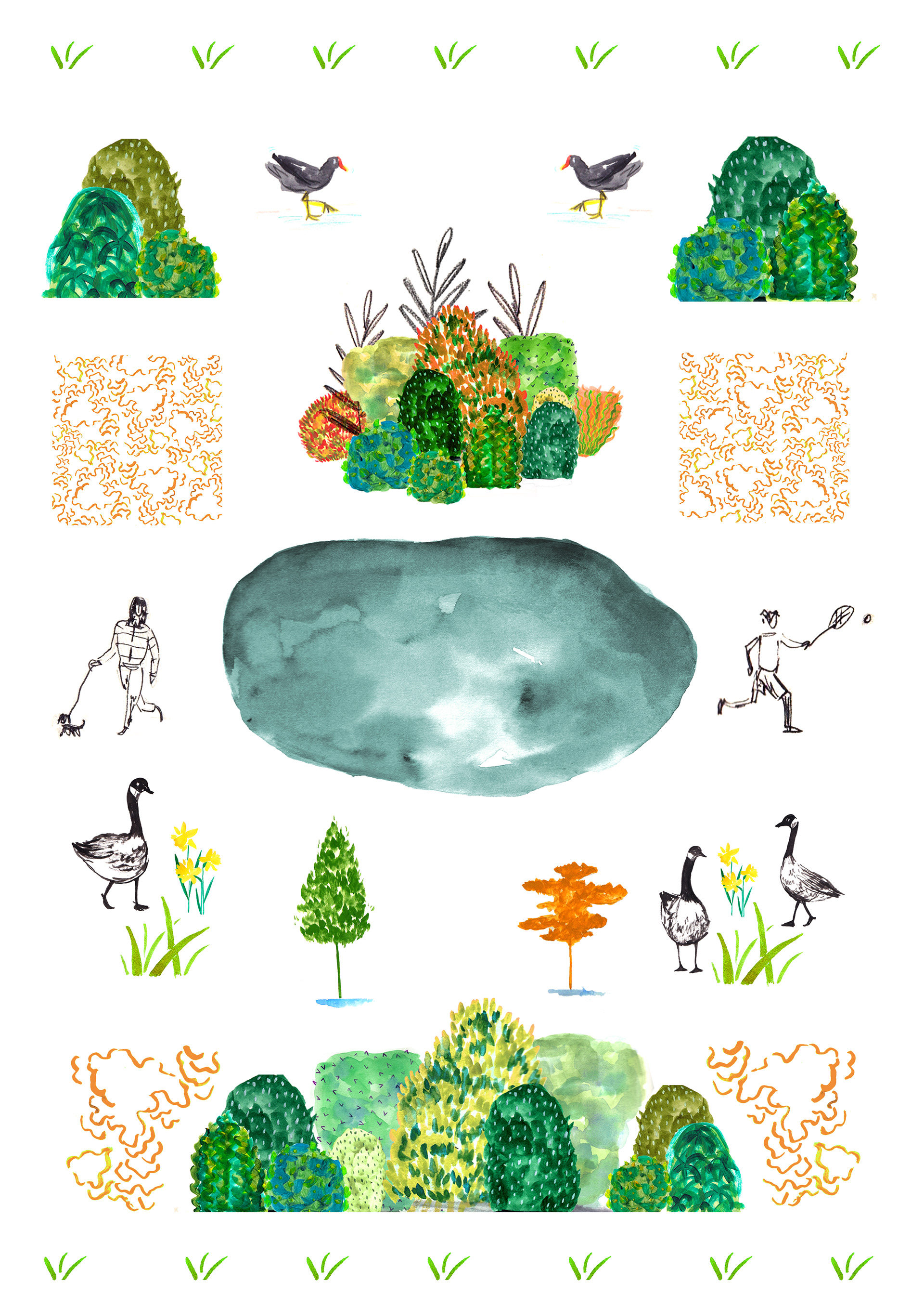
Applying design to the garden structure
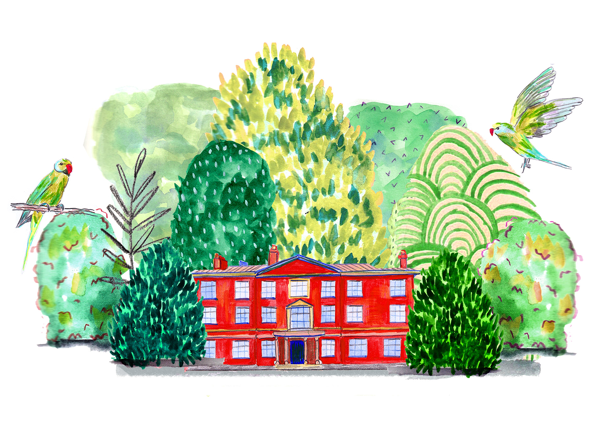
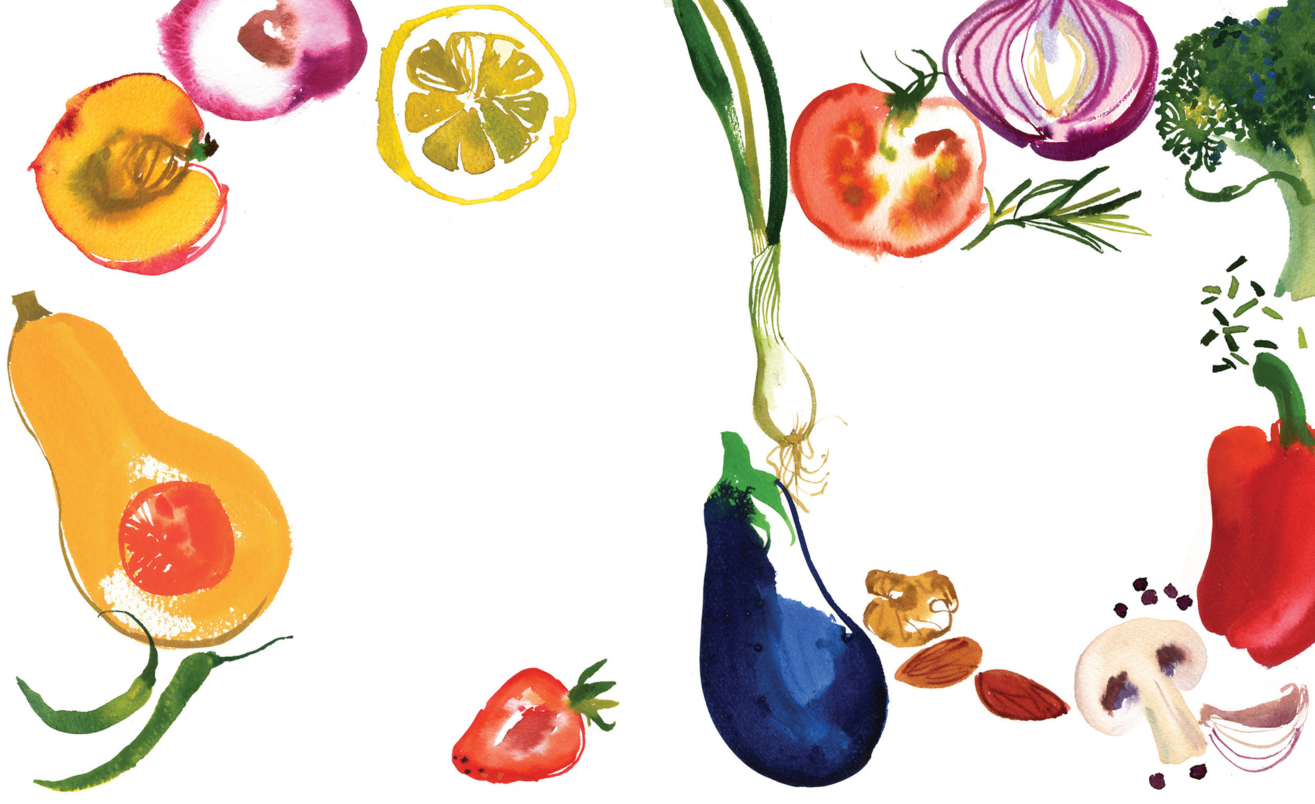
Compiling my drawn assets to design with
Applying design to the garden structure
PRACTITIONER RESEARCH: MARC MAJEWSKI
I like the painterly approach to Marc's work and how vibrant and lively his compositions are. His use of form and pattern really appeal to elements of my work I'm working on developing, especially when looking at depicting different foliage and plant life.
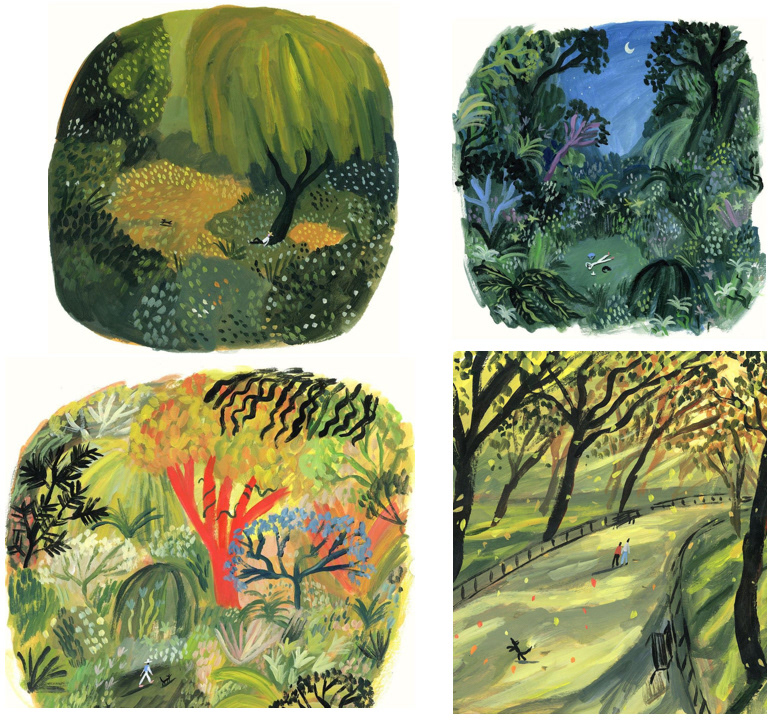
Work by Marc Majewski
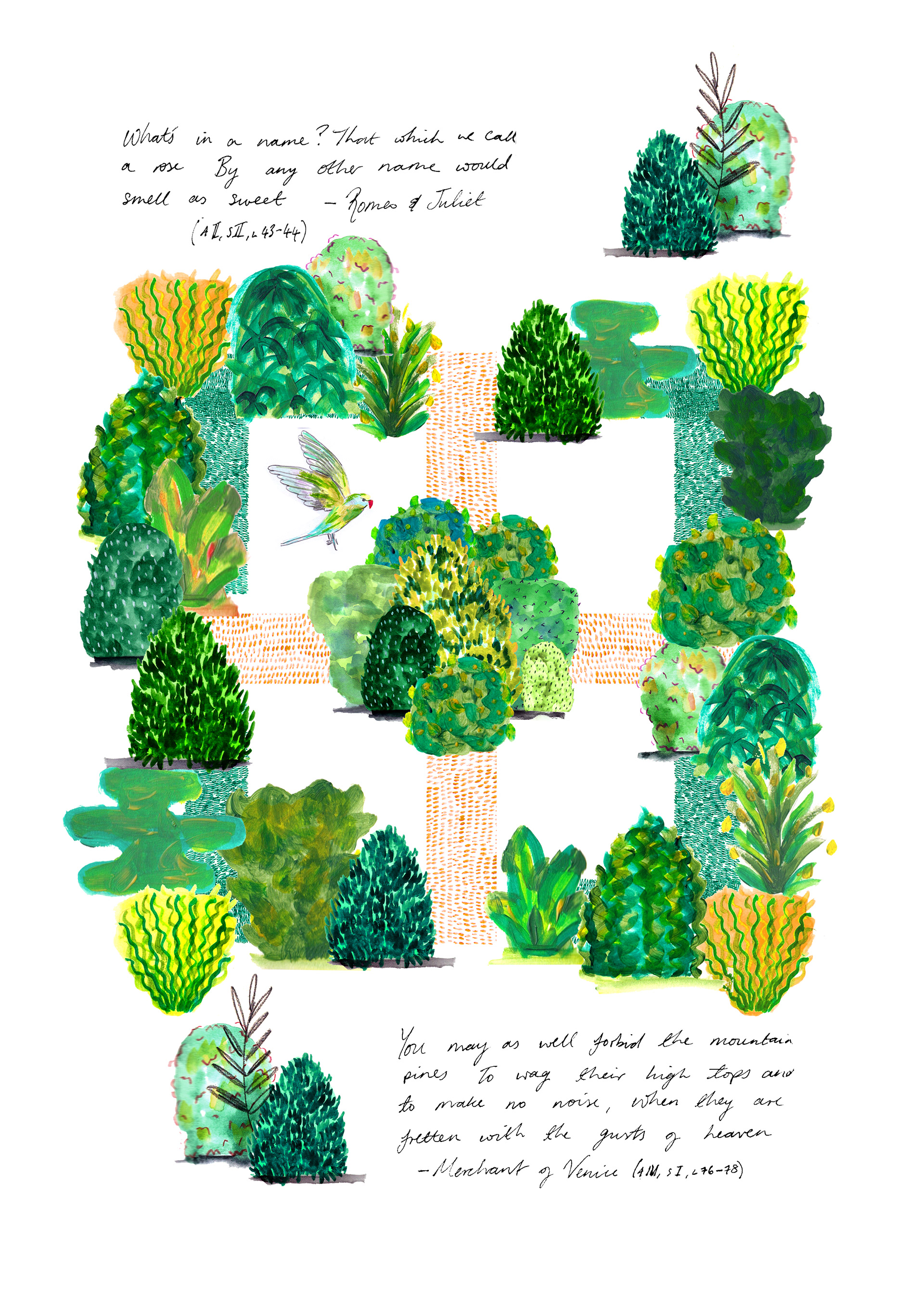
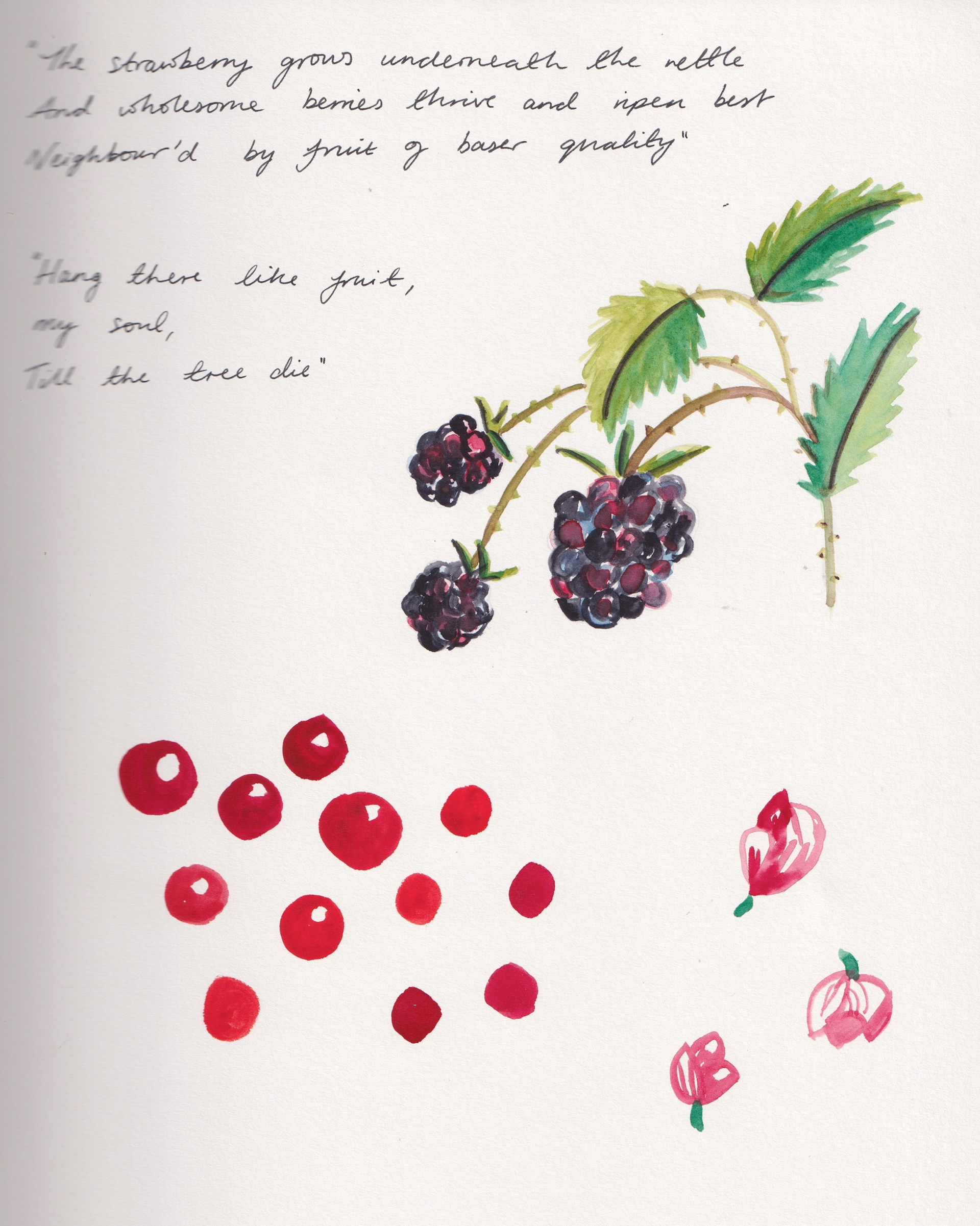
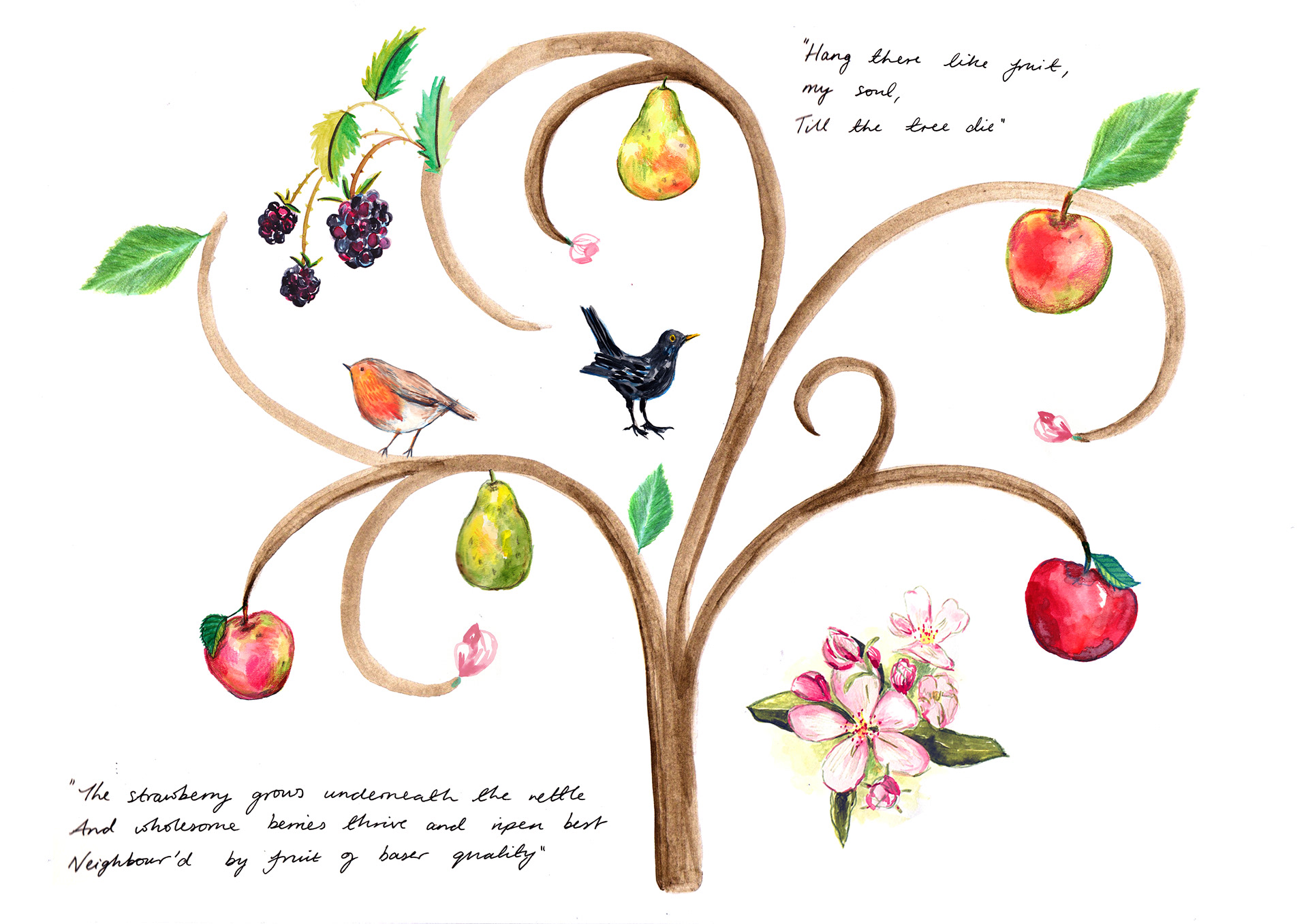
Adding in more painterly assets to my own work as well as handwritten extracts from relevant Shakespeare works. I wanted it to echo gardeners journals.
Using the structure of the existing gardens to compose my work also helped a lot in creating a richer and more impactful piece of work. I now know that beginning with an underlying structure before adding my drawings will be helpful.
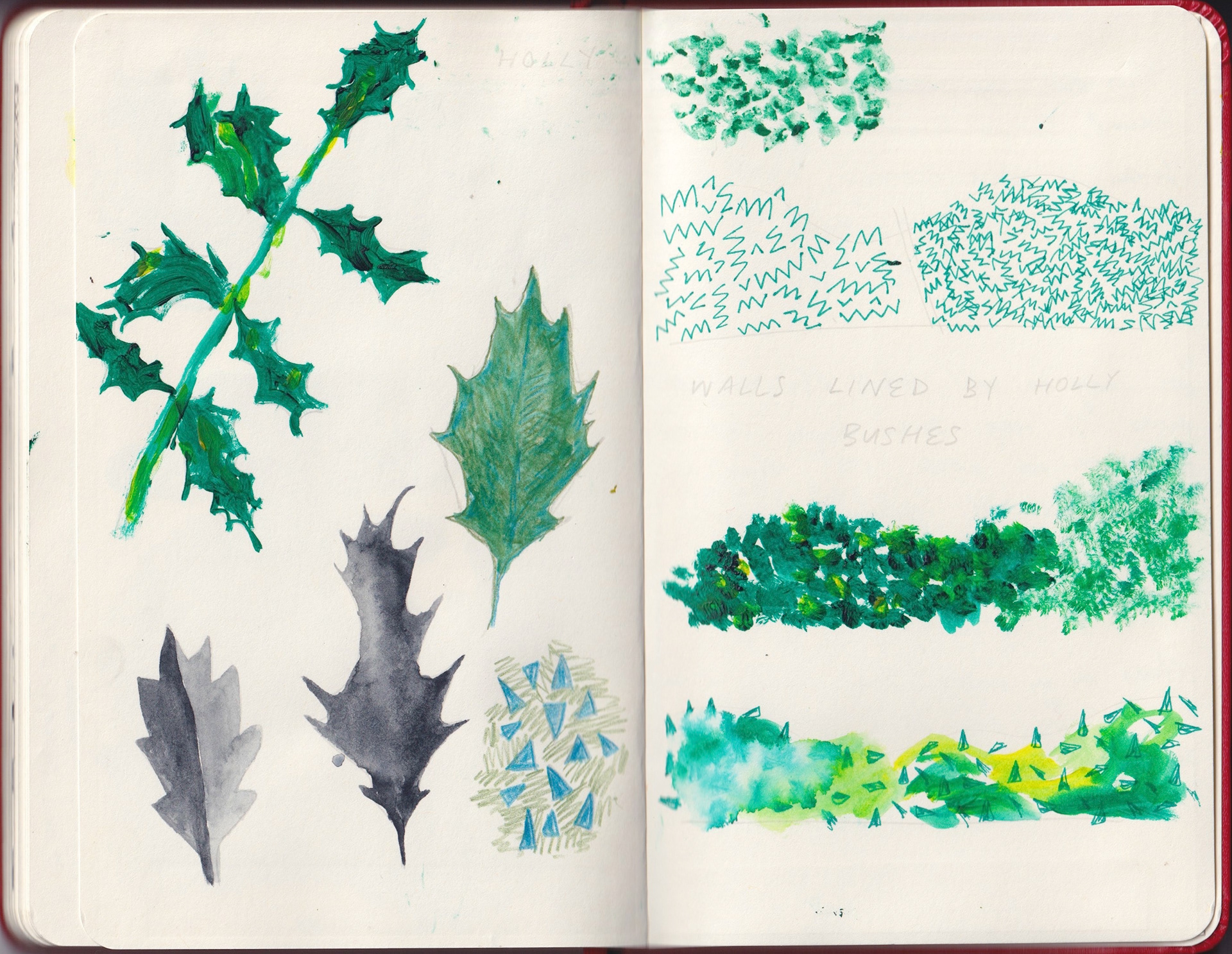
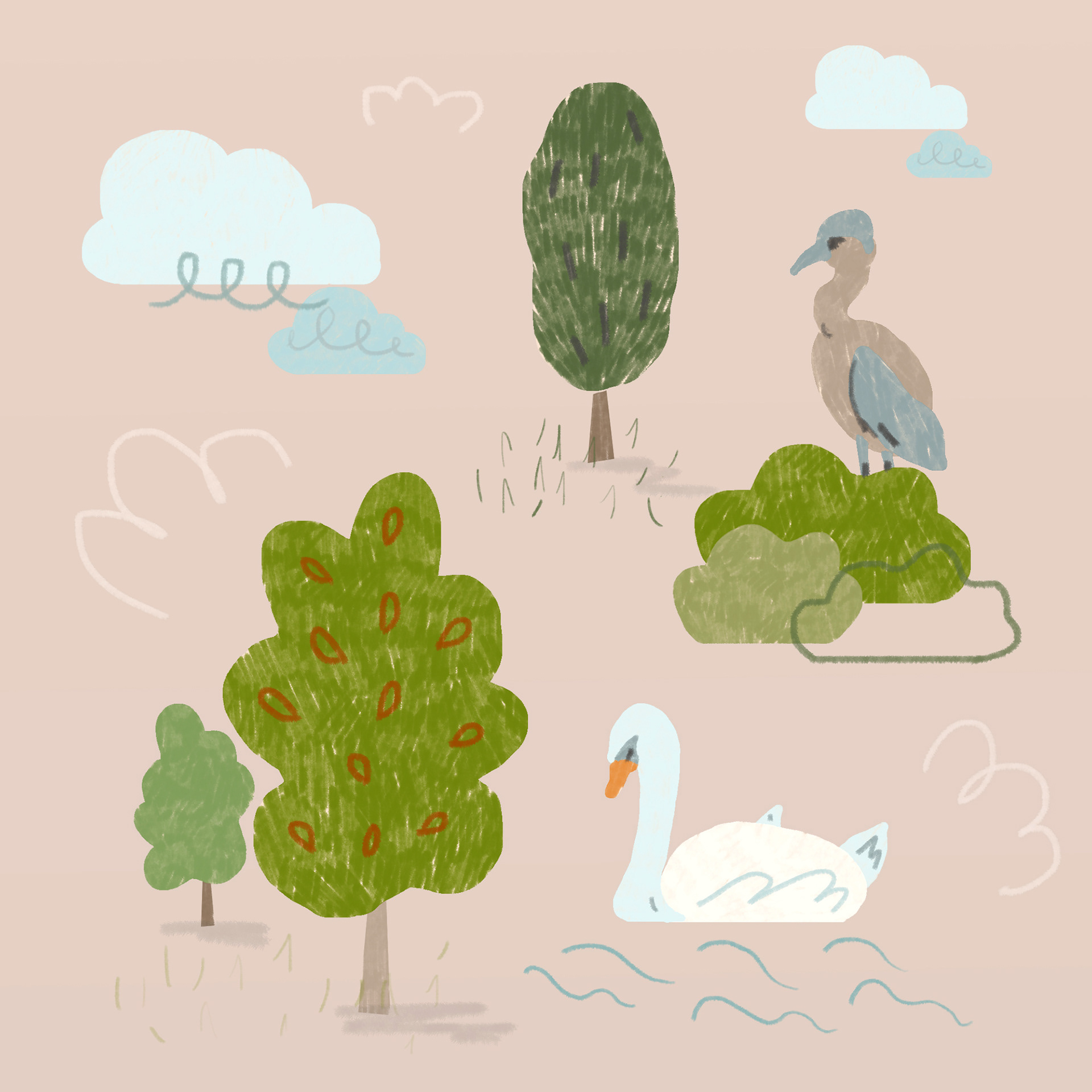
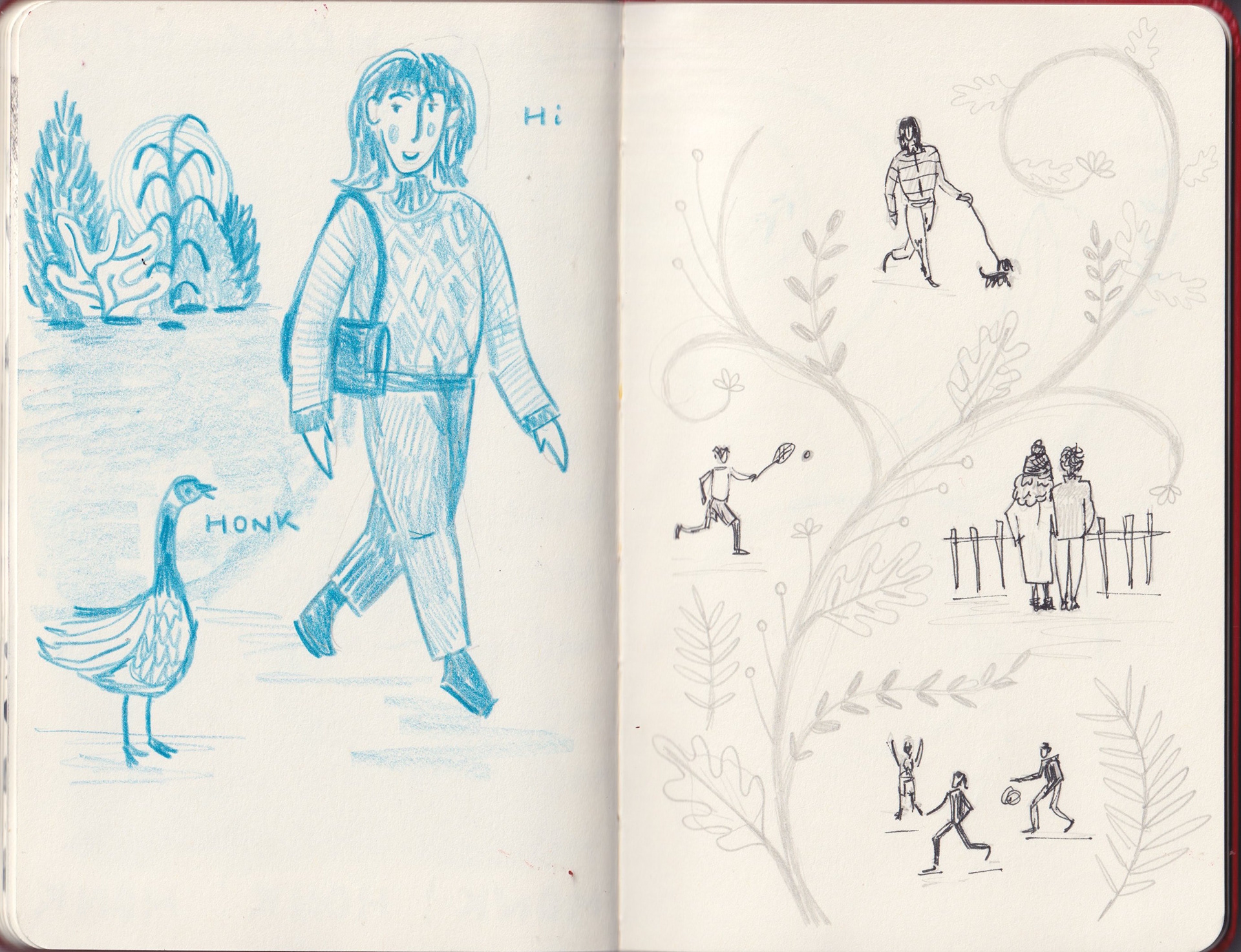
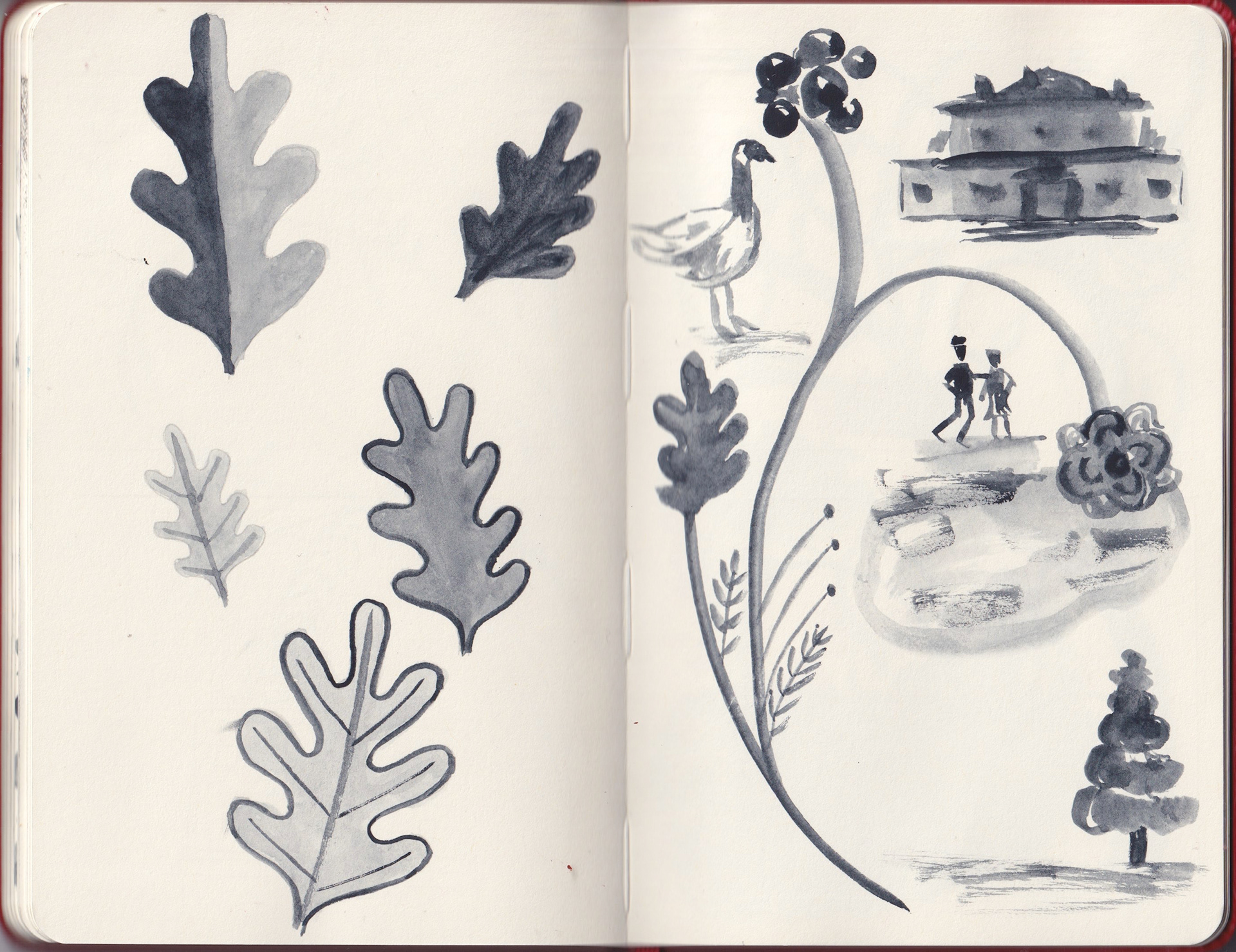
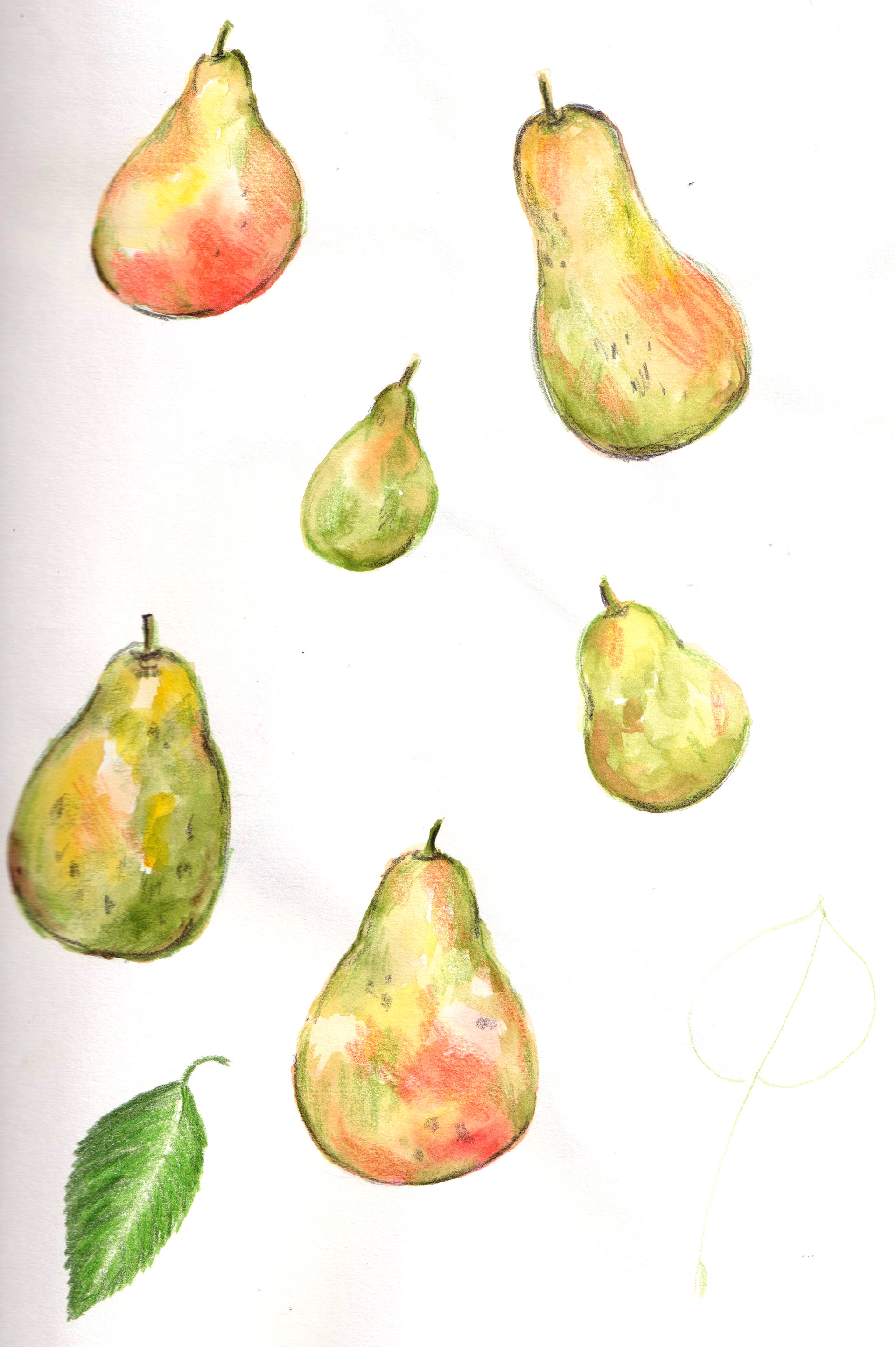
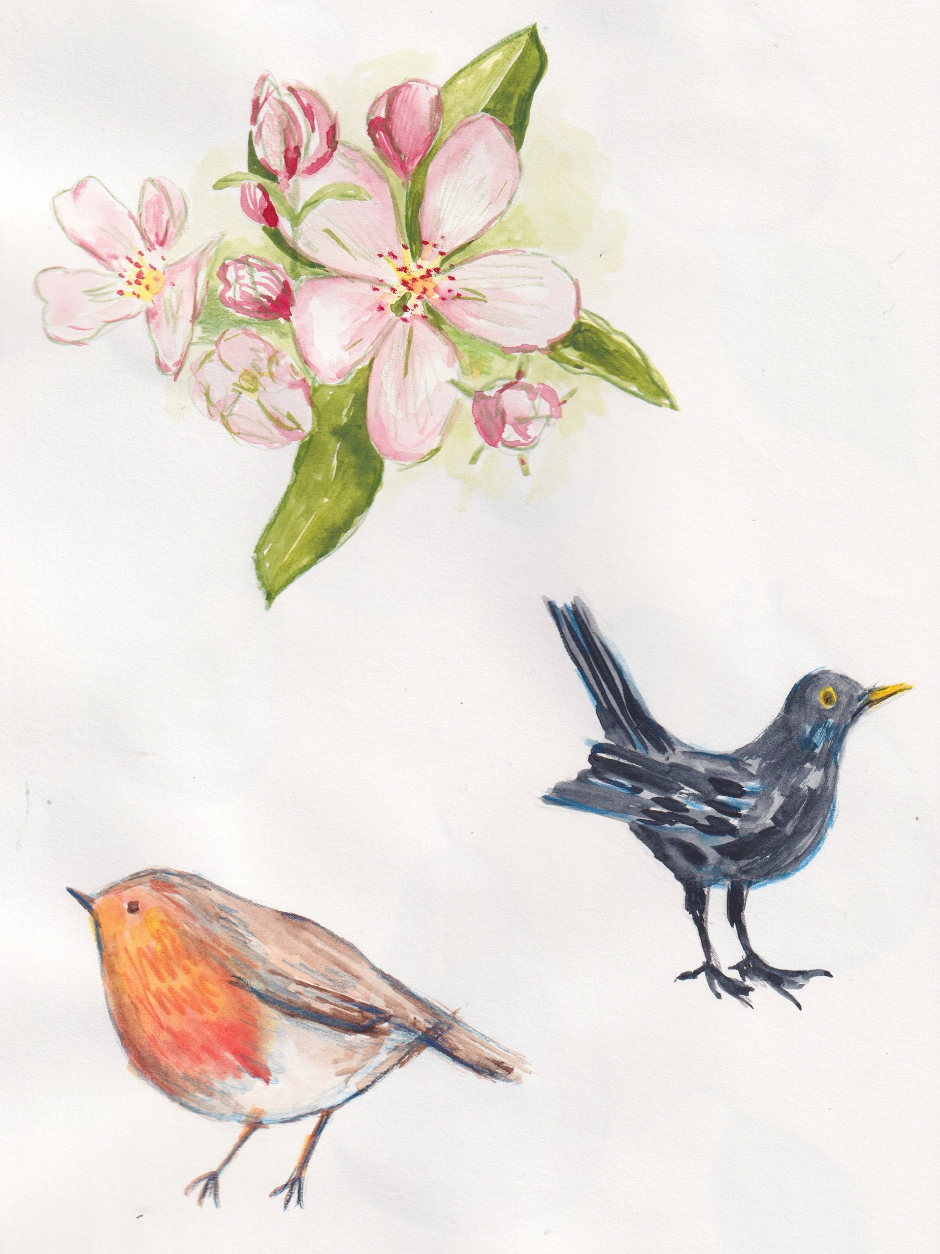
Sketchbook: holly
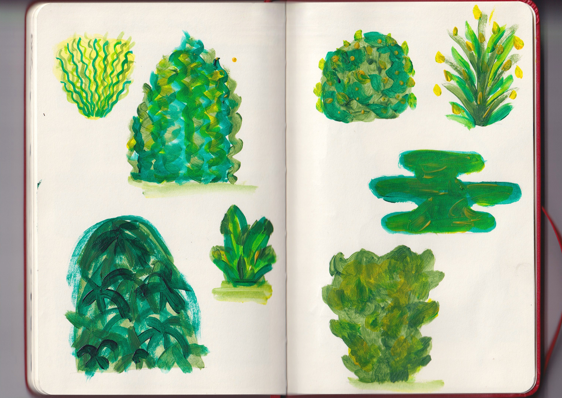
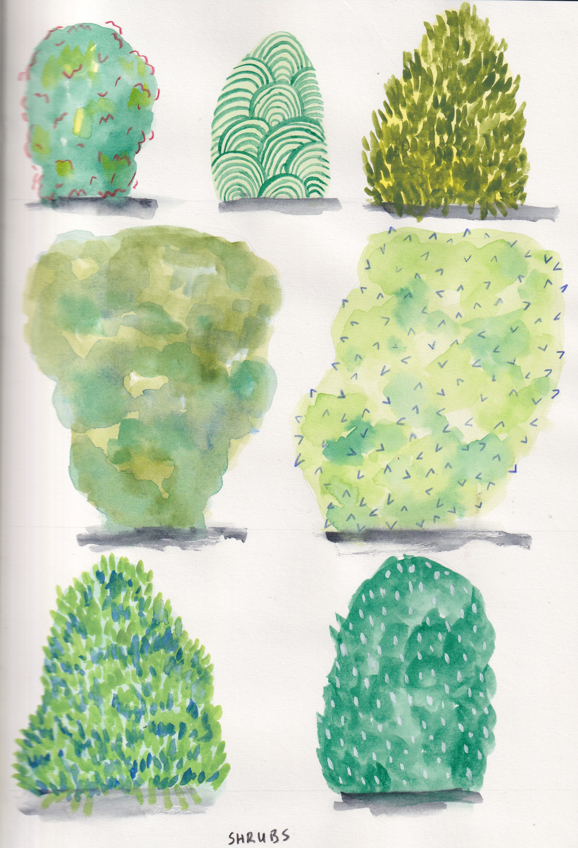
Sketchbook: shrubs
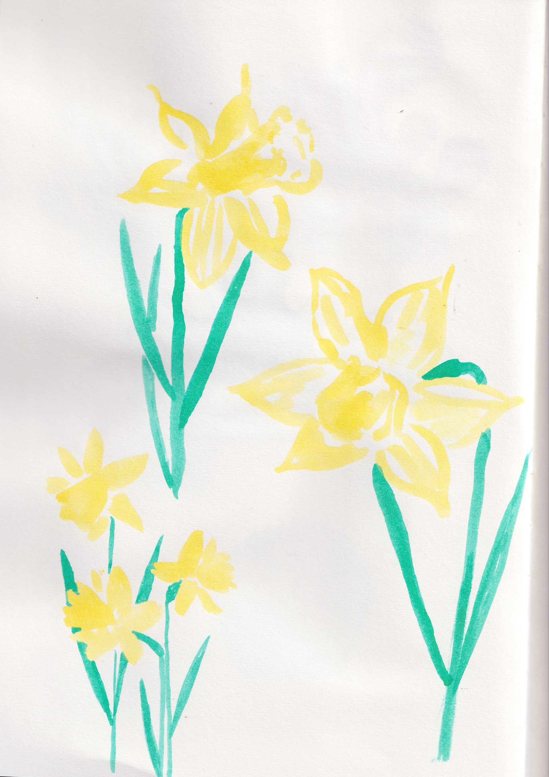
Sketchbook: daffadils
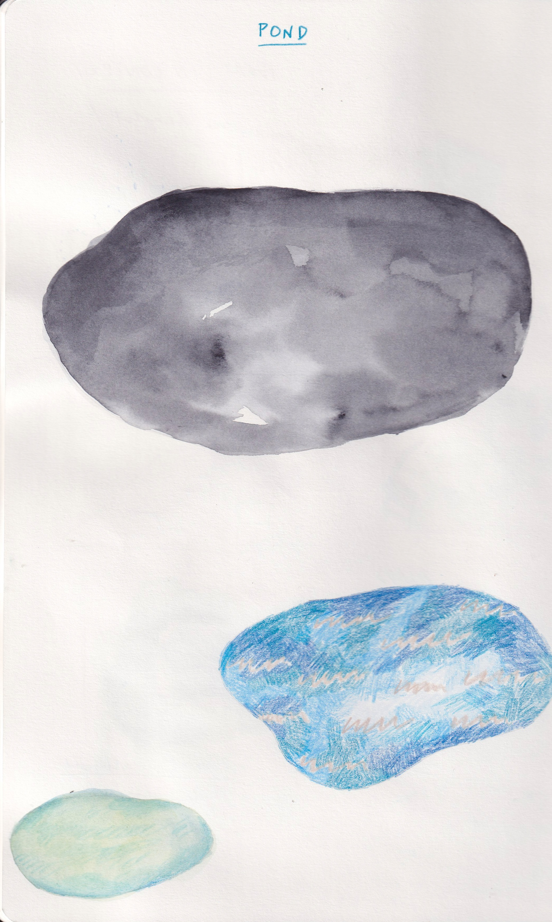
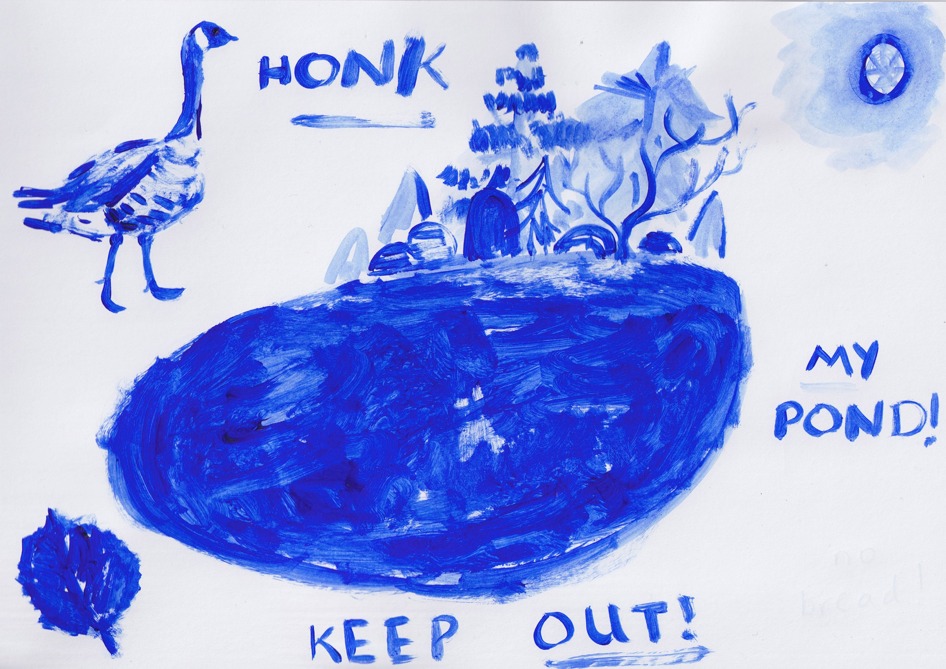
Sketchbook: ponds
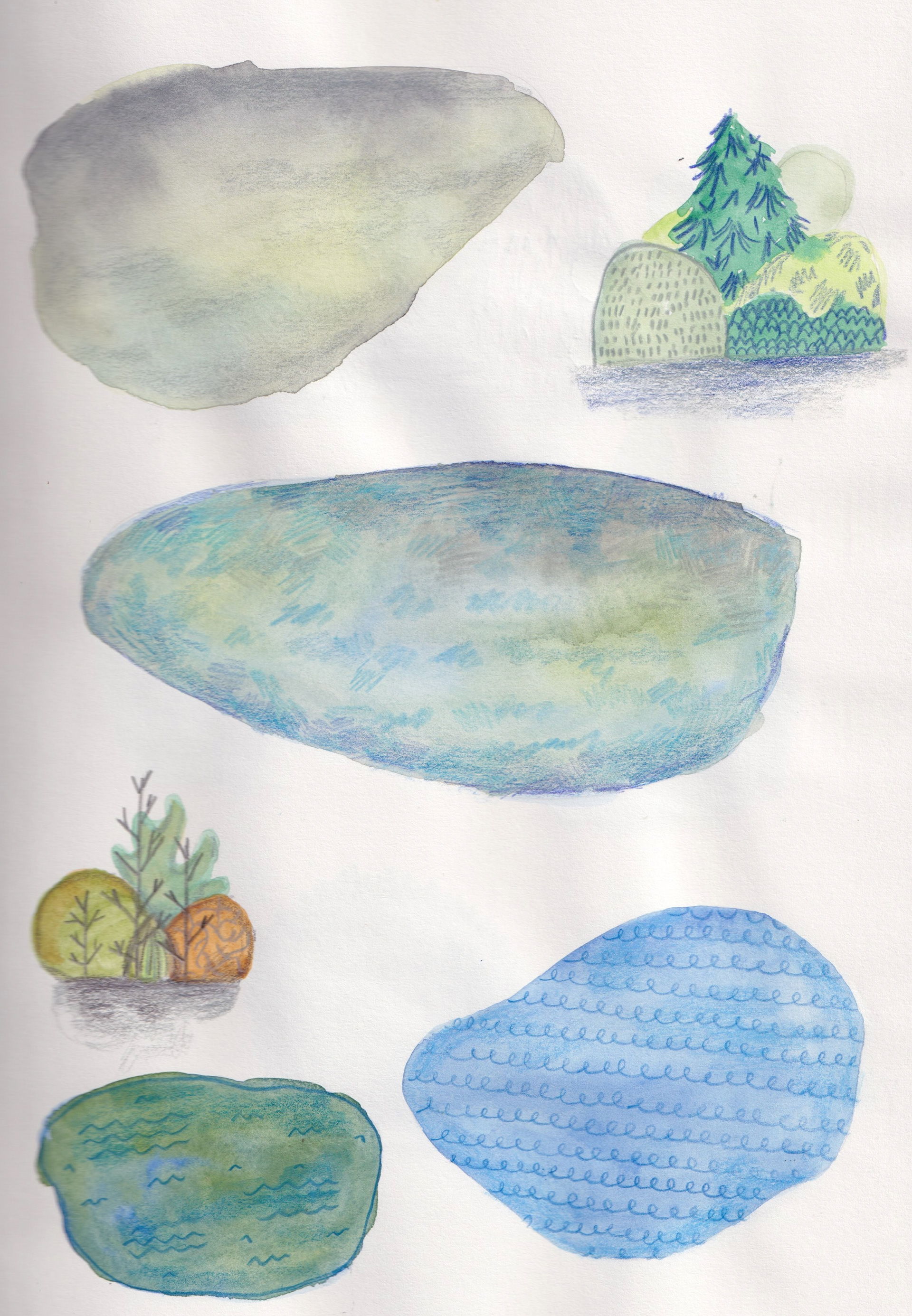
Sketchbook: ponds
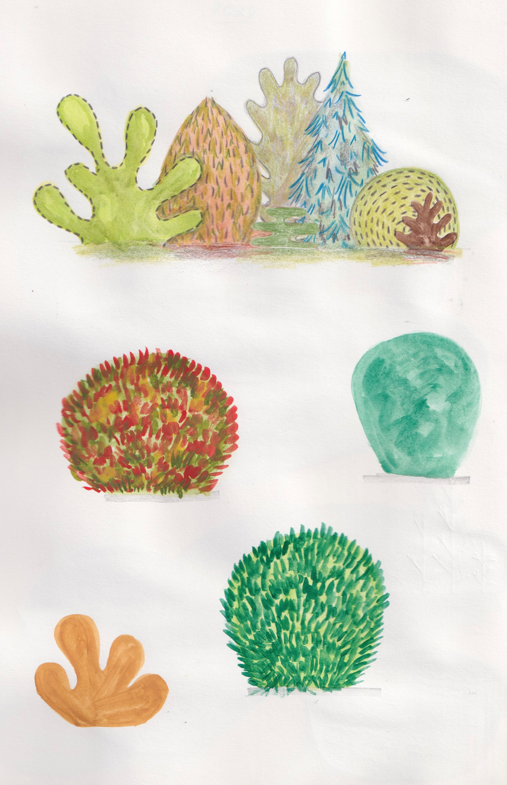
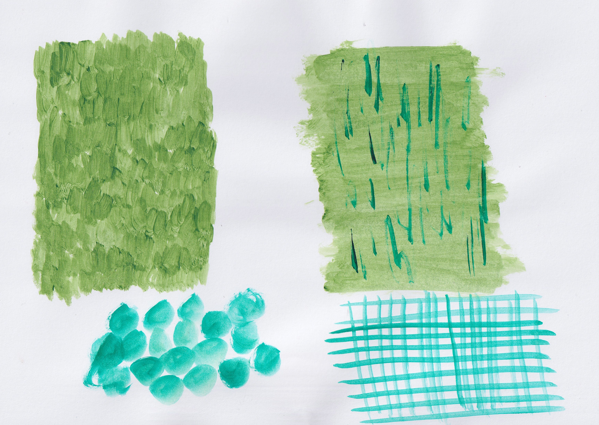
Sketchbook: shrubs
Sketchbook: shrubs
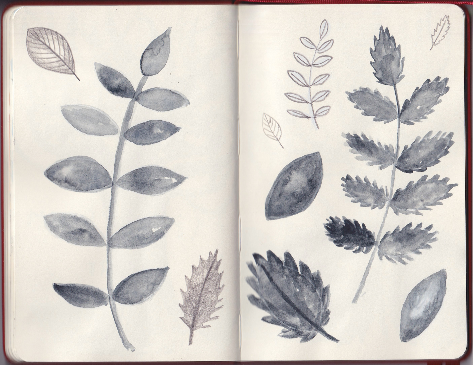
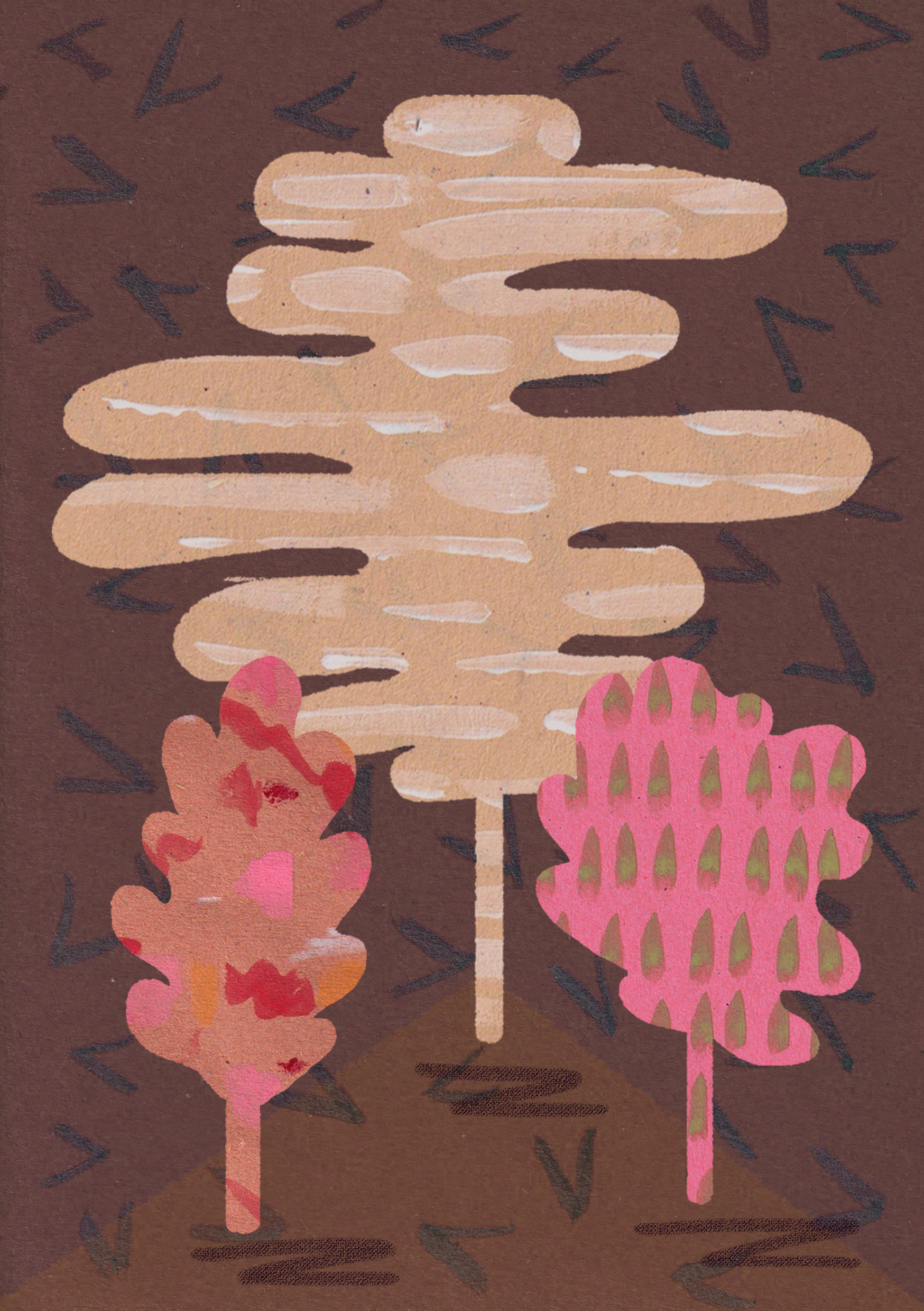
Sketchbook: foliage
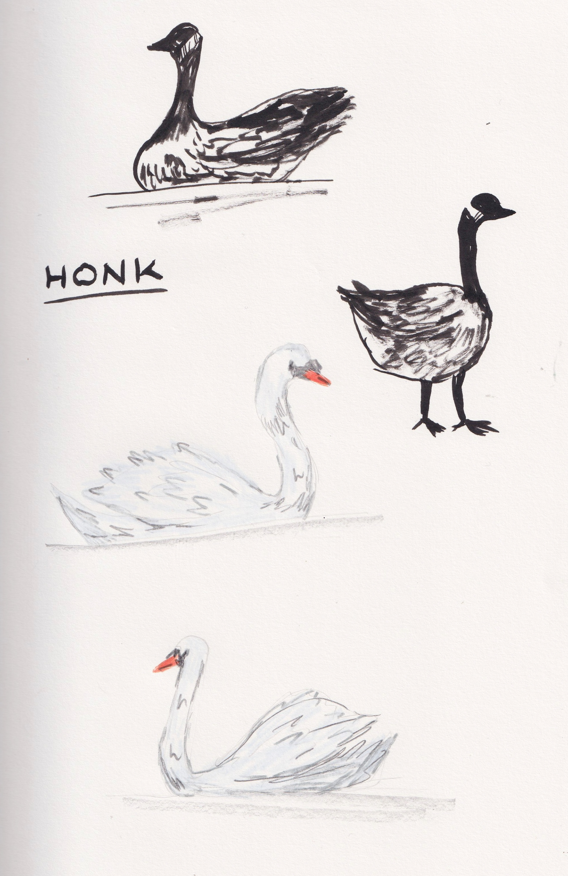
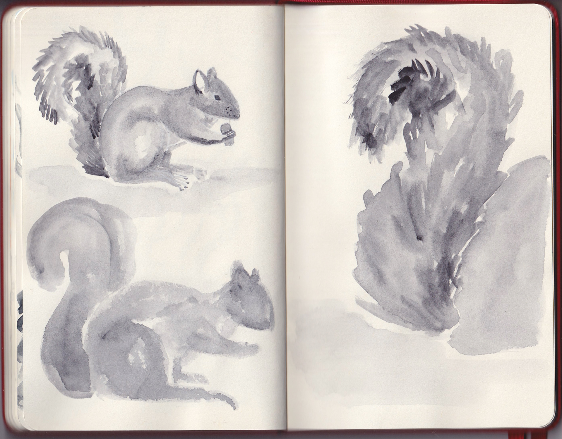
Sketchbook: birds
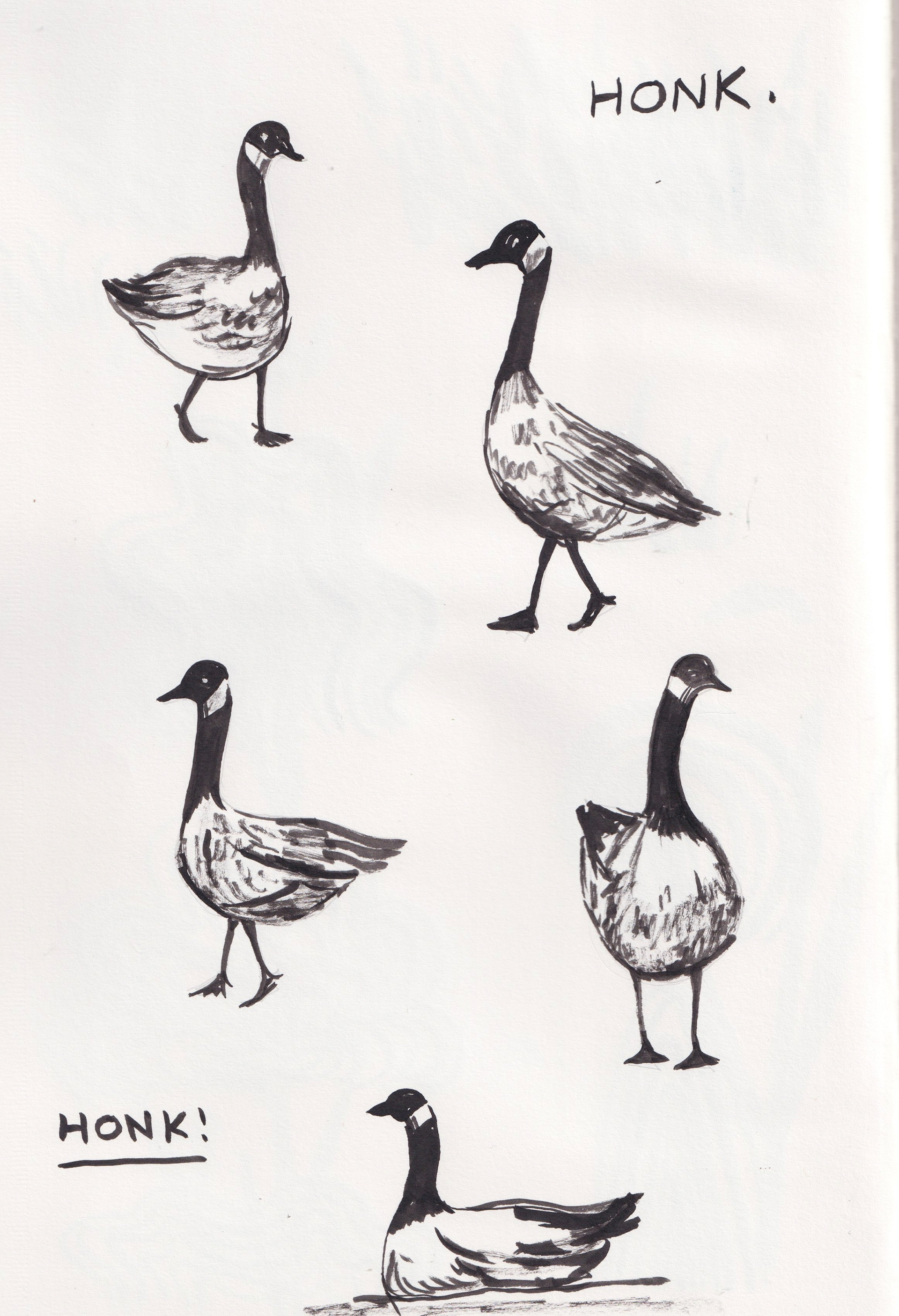
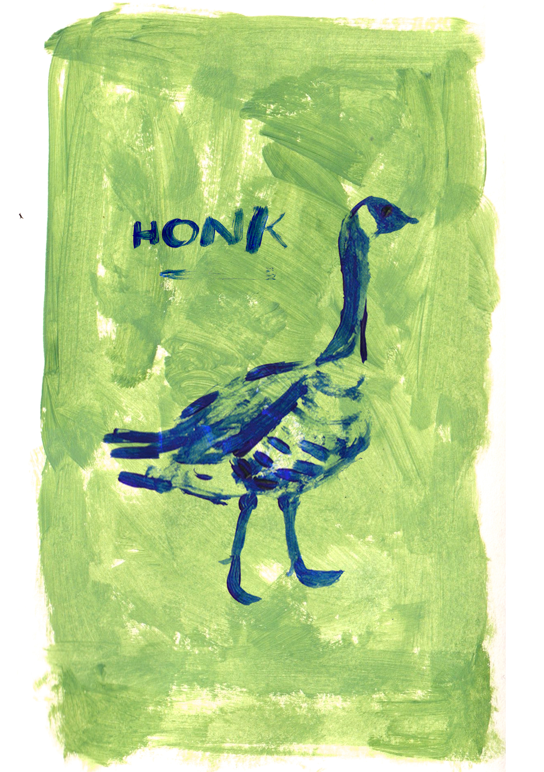
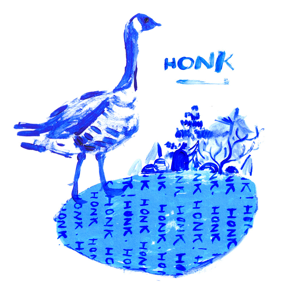
Sketchbook: geese
PRACTITIONER RESEARCH: LARA HARWOOD
Looking at utilising space in compositions.
I enjoy how Lara Harwood's work relies as much on the blank space around it as the colourful images themselves to create an impactful illustration. It gives the assets more space to 'breathe' and be absorbed by the viewer and means compositions can be more abstract and playful with perspective and layout. Both pieces pictured use a broad array of colours that might otherwise seem overpowering, but by incorporating blank space and using bold structure, the pieces jump off the page instead. This is definitely something I need to bear in mind when creating my own work, as I often have a temptation to fill space or create pictures in their entirety. Being able to move individual elements and play with the space around them is something I can take from Lara Harwood's practice and implement into my own.
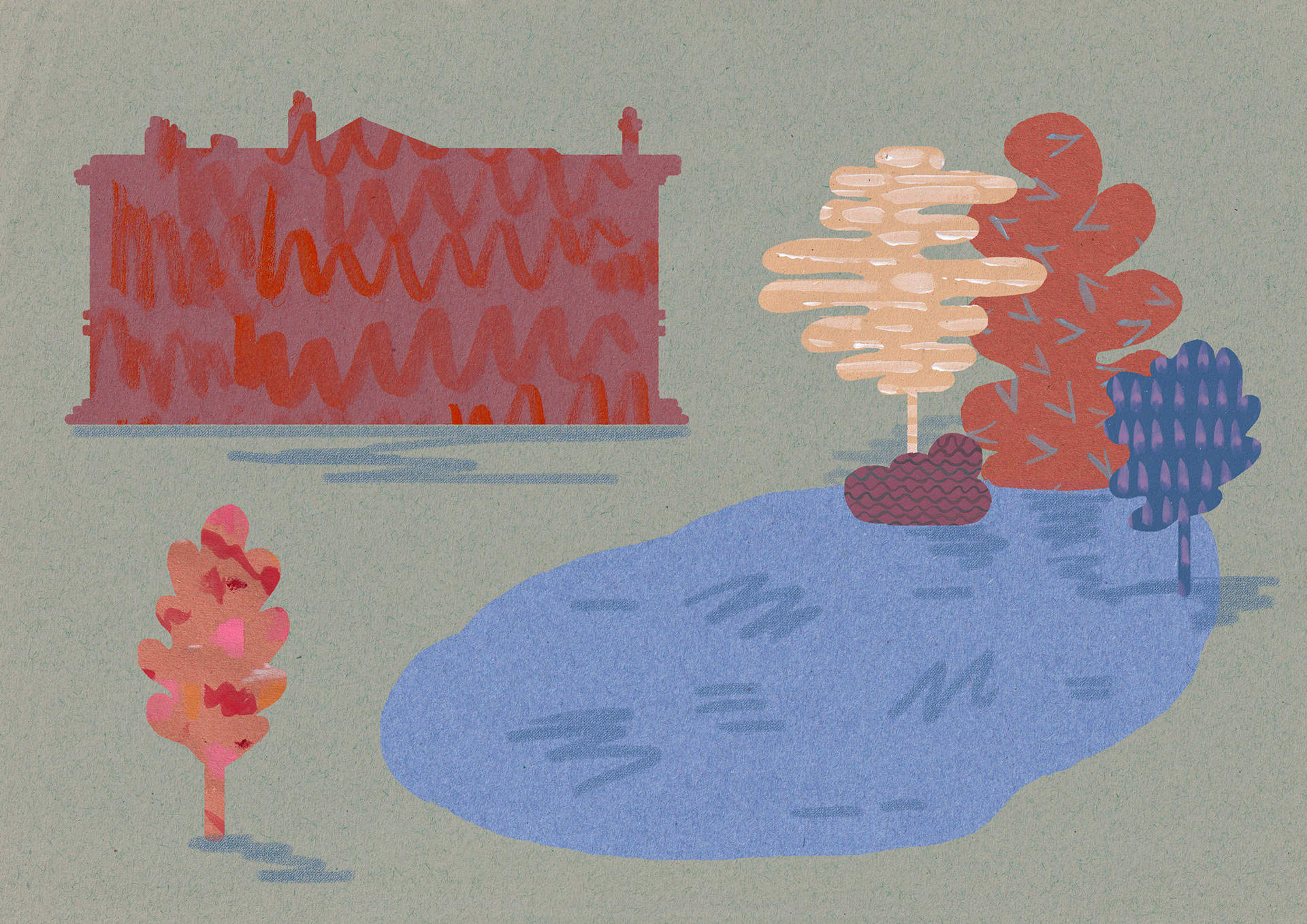
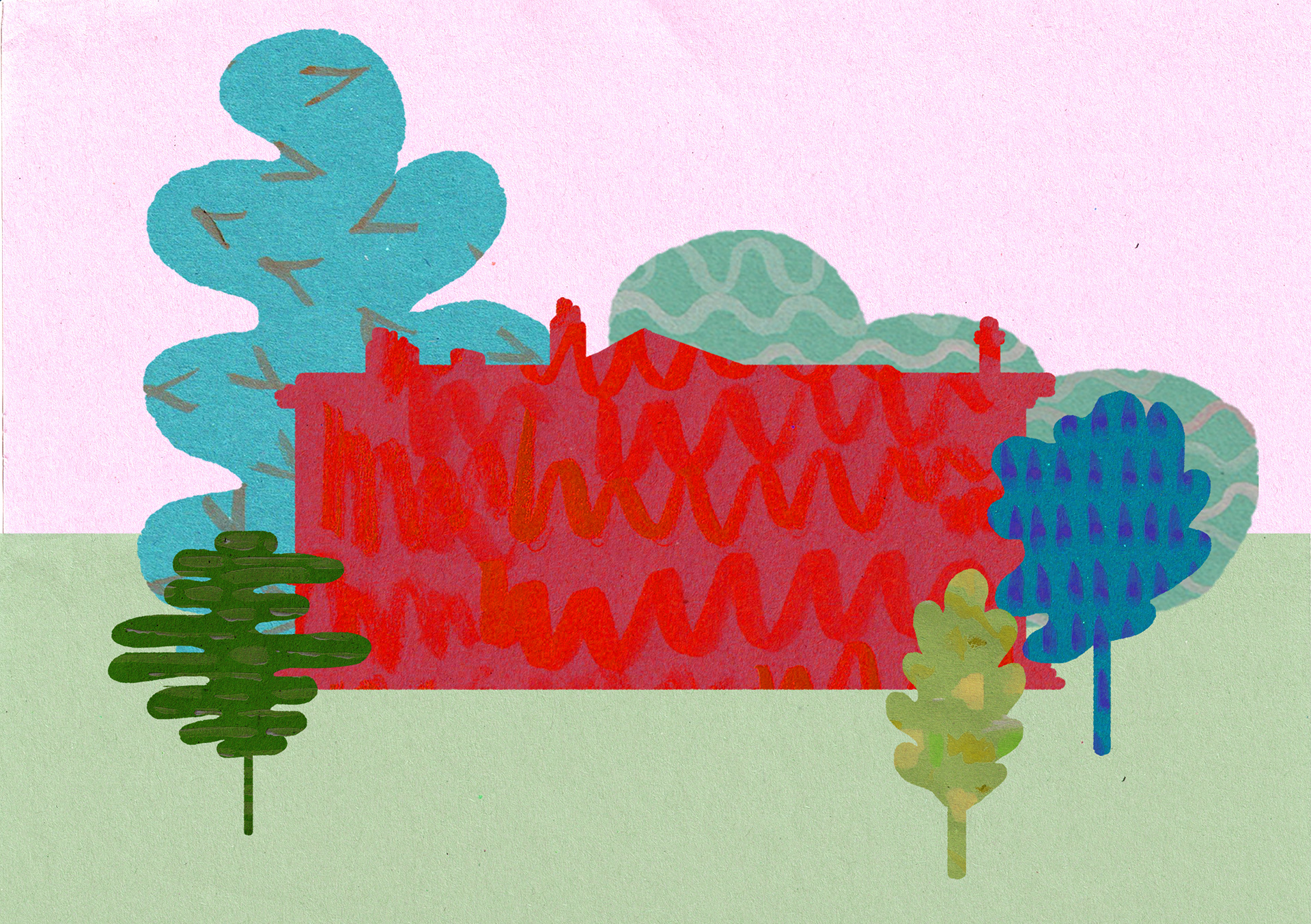
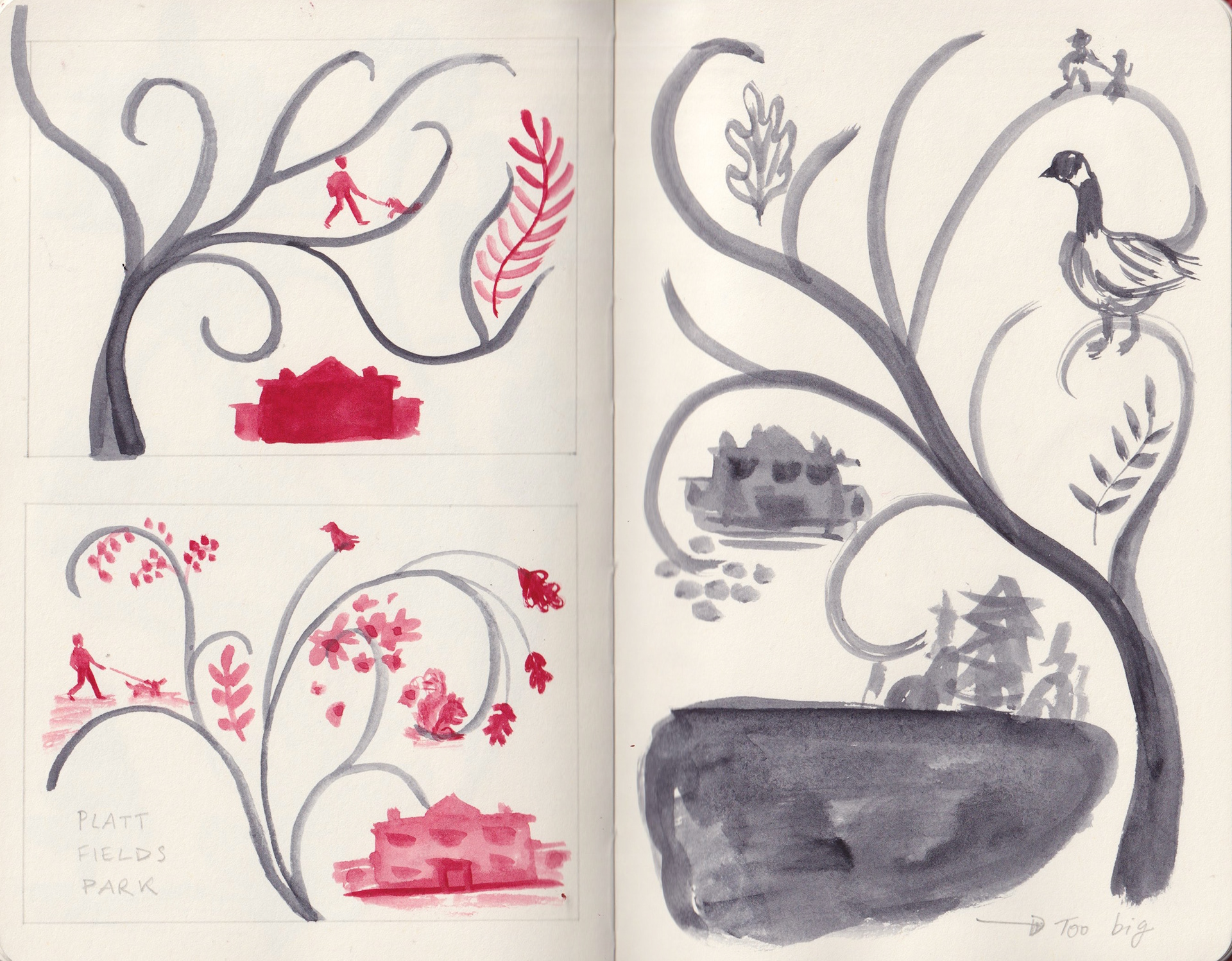
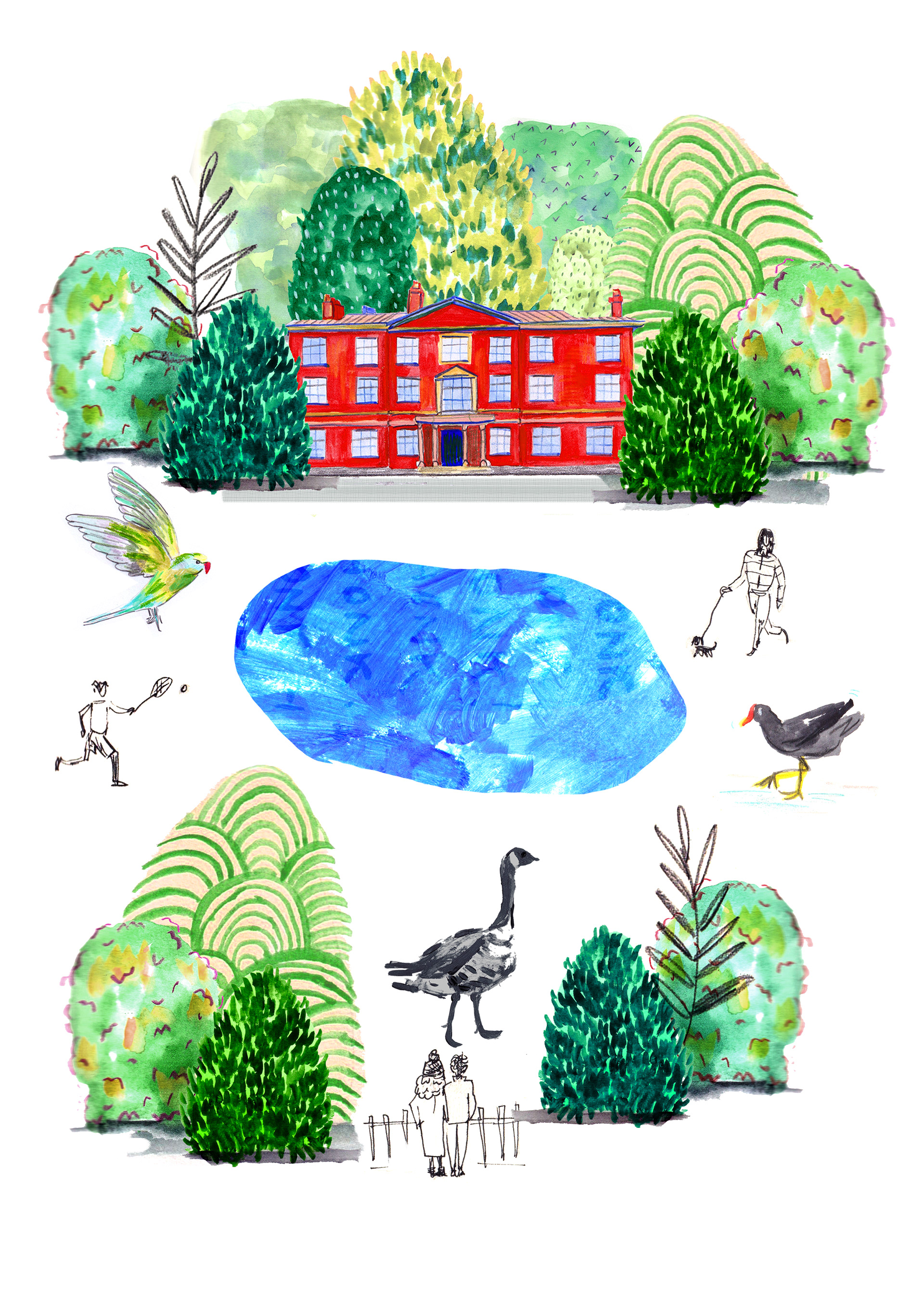
THE POND
Draft composition
Draft composition
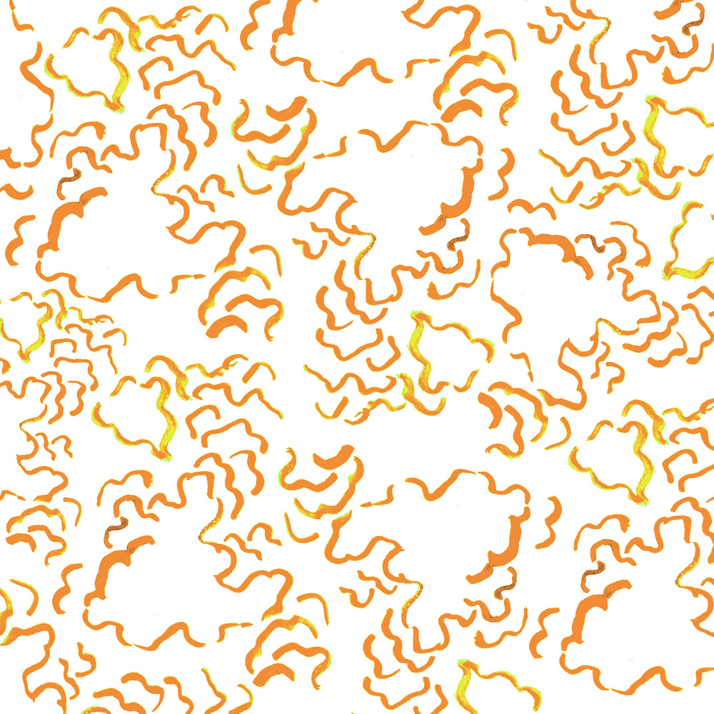
Creating a pattern from a study of fungi
Draft composition
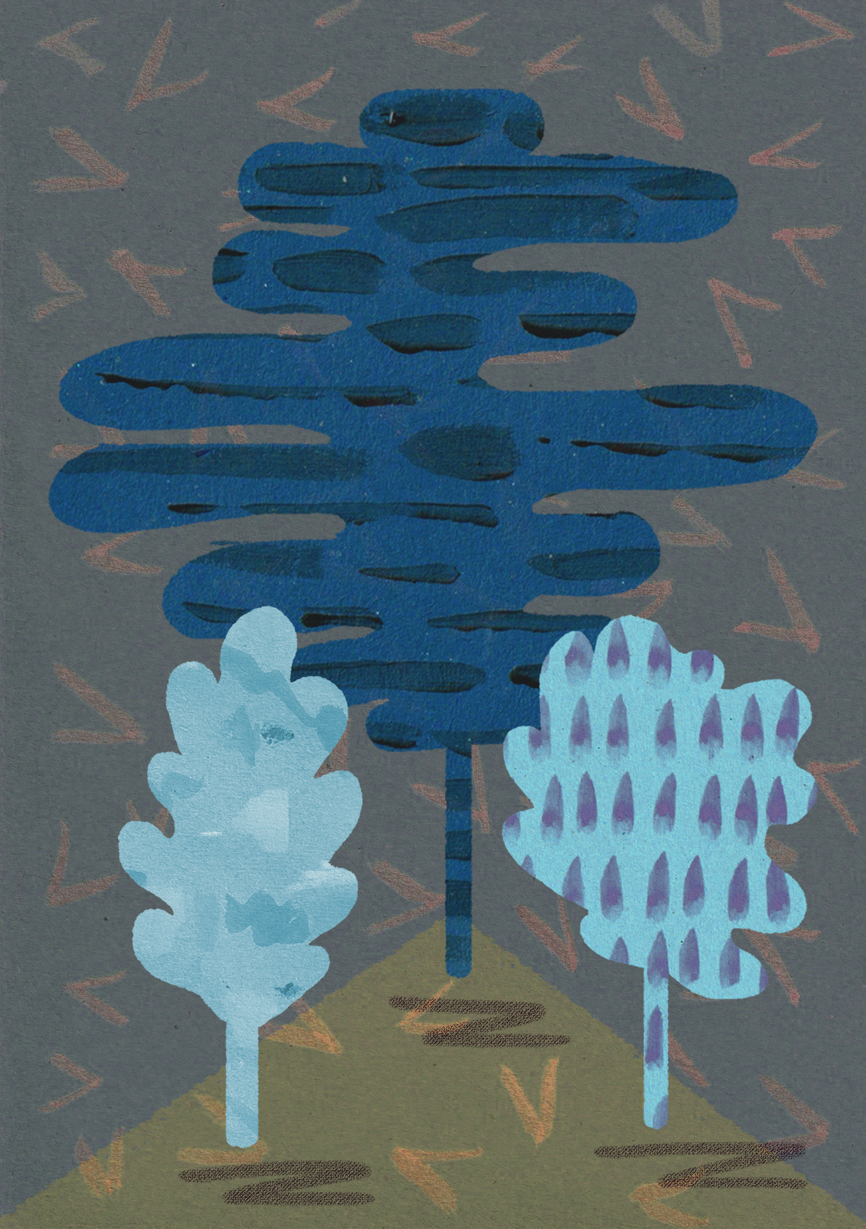
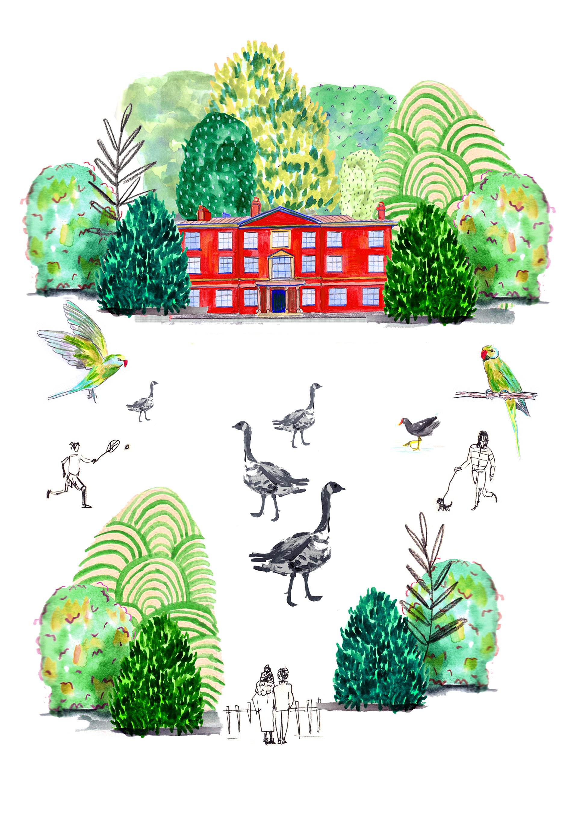
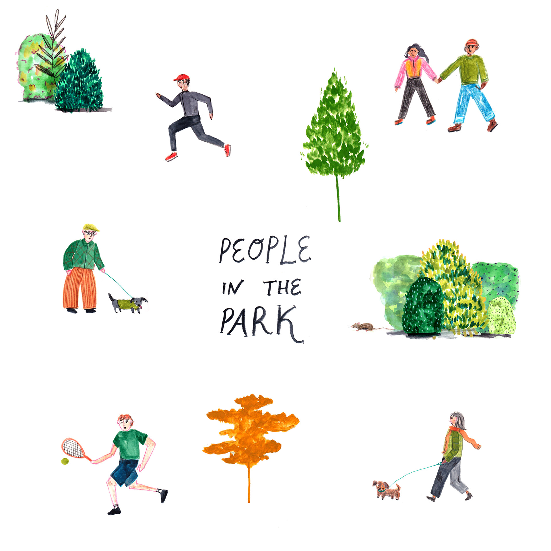
PEOPLE IN THE PARK
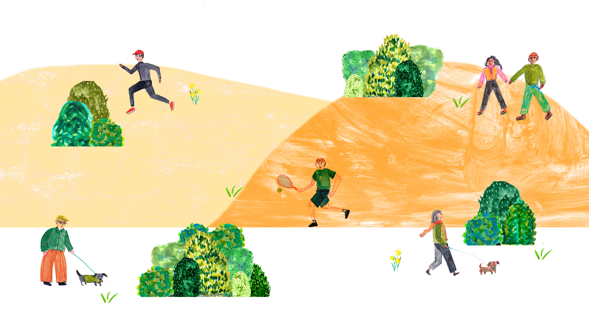
Playing with background
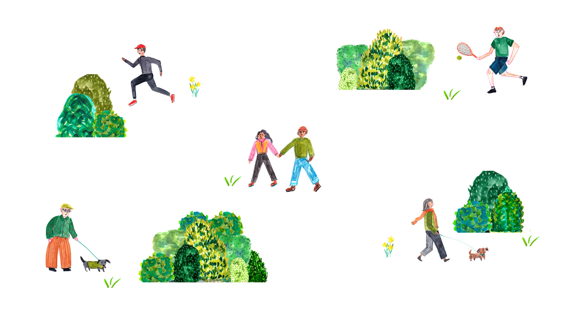
Working with more blank space around my own work, inspired by Lara Harwood. I think this gives me a lot more freedom and makes the colours stand off the page/screen more.
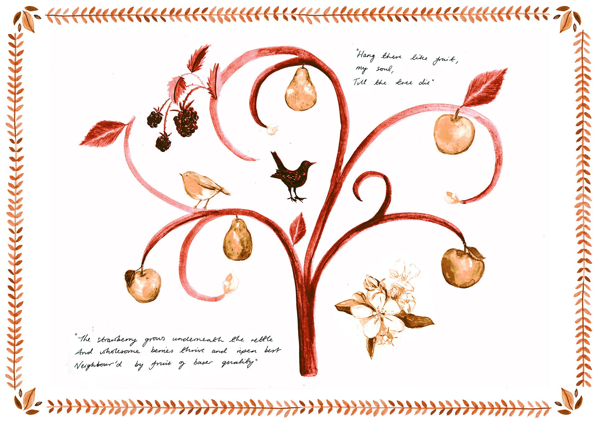
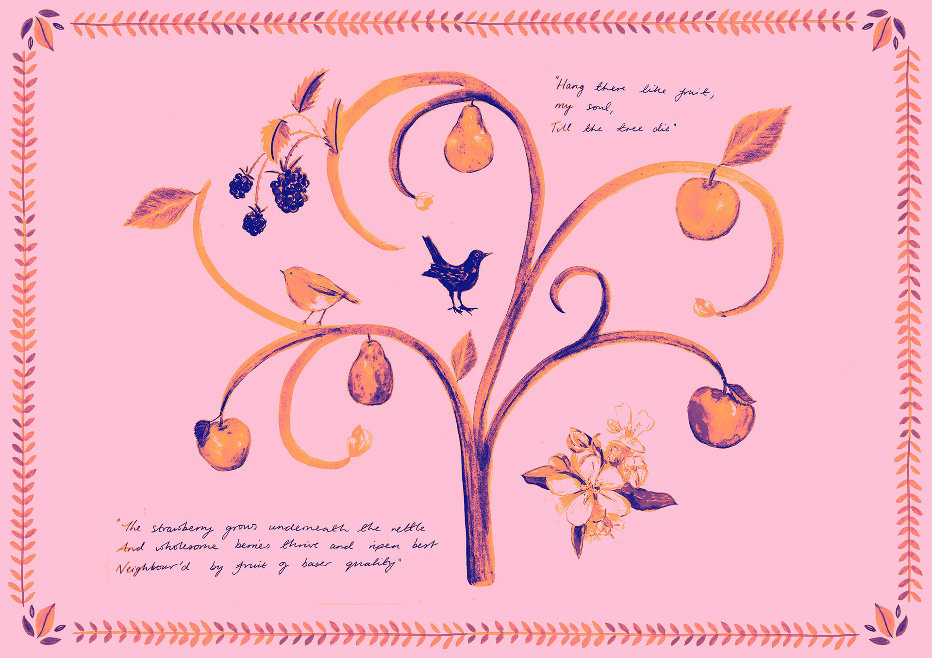
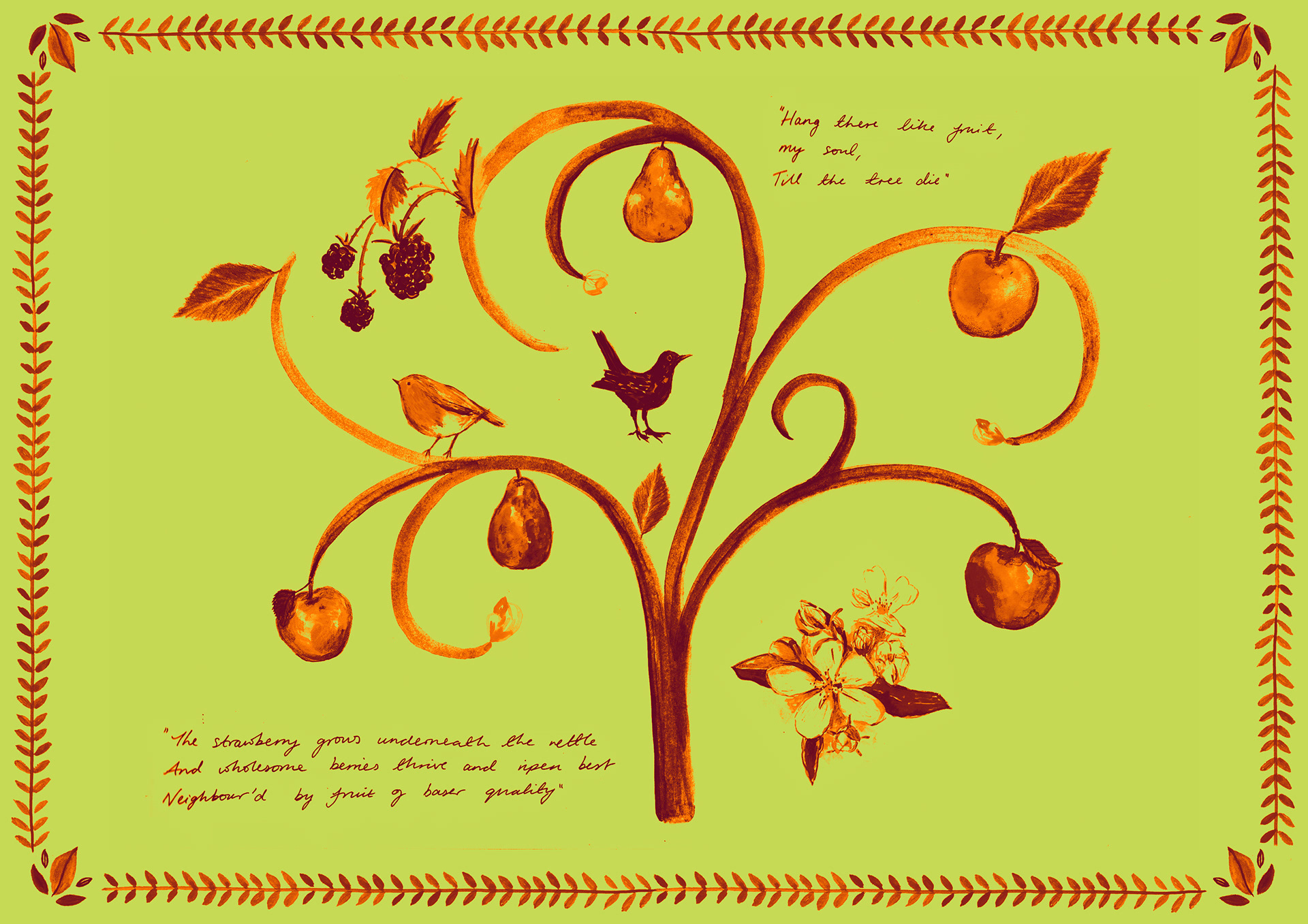
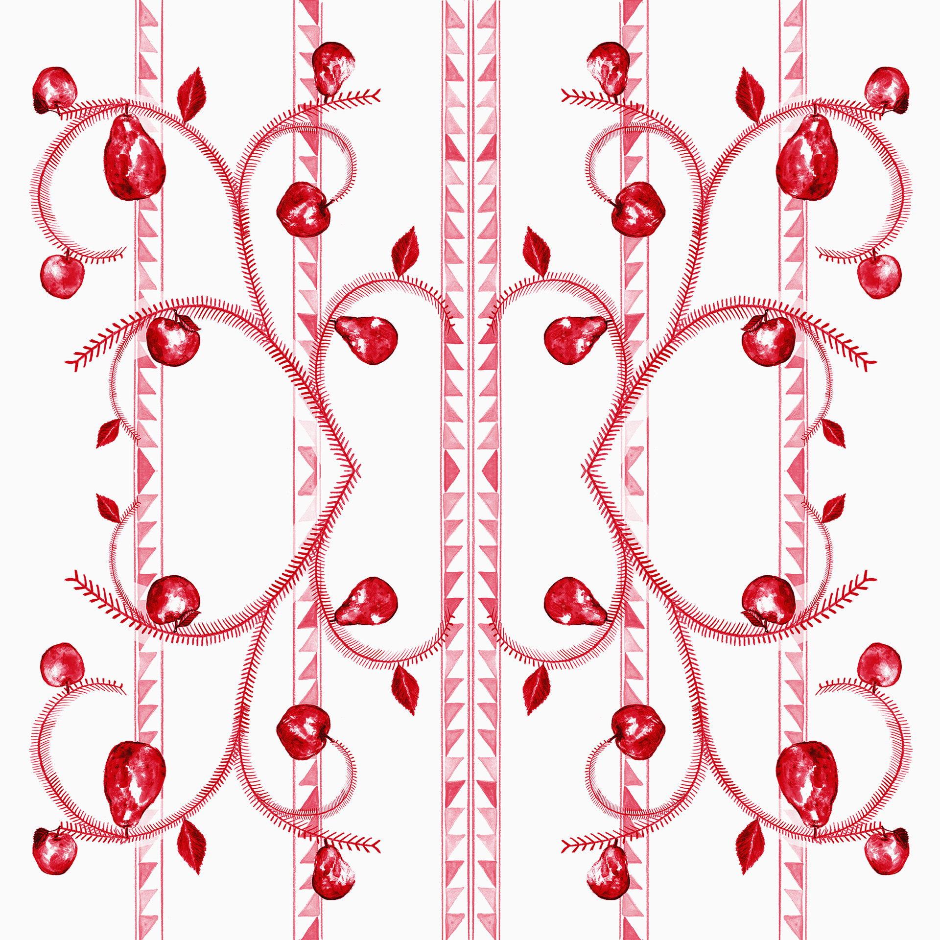
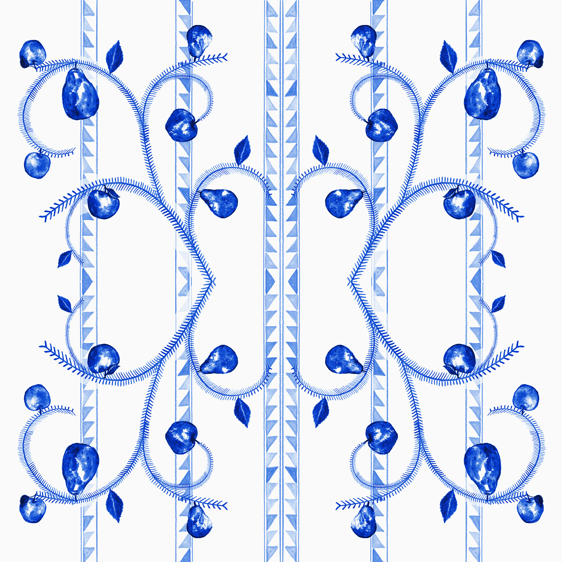
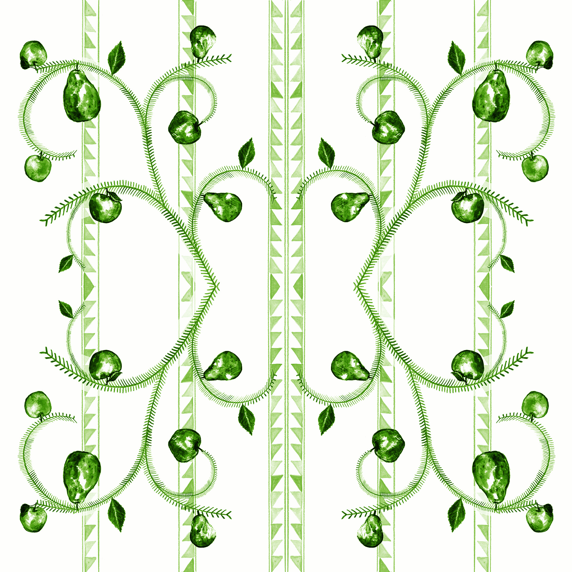
REPRESENTING 'THE ORCHARD'
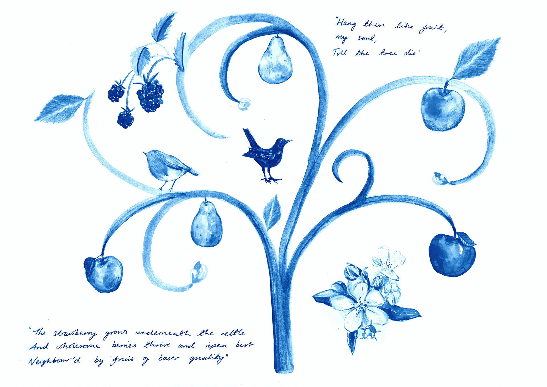
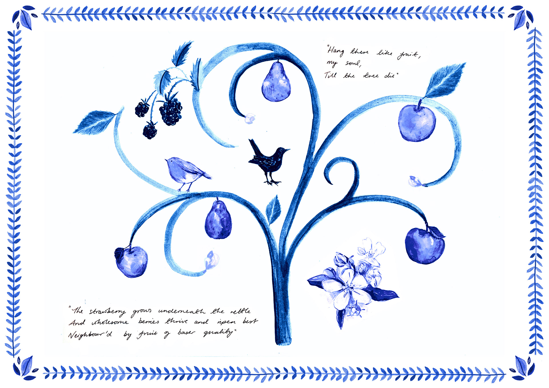
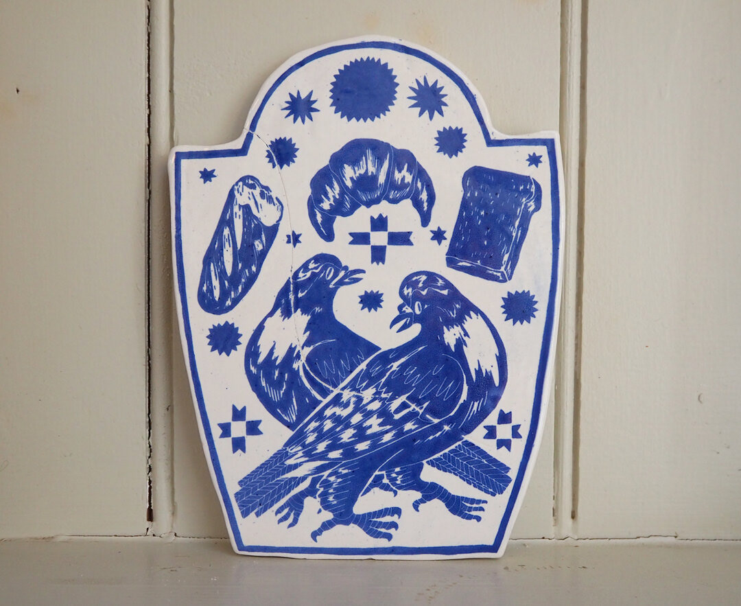
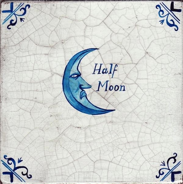
RESEARCH: DELFTWARE
Delftware is a form of pottery that is most recognisable for it's use of blue and white colours in its decoration. The style began to be produced in the1600's, and the height of popular production was between 1640–1740. In the 17th and 18th centuries Delftware was a major industry, exporting all over Europe, but is still produced to this day.
by Evie May Adams
by Paul Bommer

“English Landscape No. 4” (2007) by Paul Scott (my photo from The Whitworth last year). Made from a 1960's vintage Cotswold plate.
On a purely aesthetic level, I think the monochrome use of blue is a really lovely and bold choice and allows the images and shapes to be the focus. But in application to my own work I also enjoy the visual link to the 18th century during which there was the common practice of ‘taking an afternoon promenade,’ or a walk. Something that has started up again in a much more modern way. The COVID-19 restrictions mean that a lot of people have relied on the government sanctioned time spent outdoors exercising and walking, in a similar way promenading was relied on. Although the link is subtle, I think it adds an extra layer of interest and meaning to my work on a historical level.
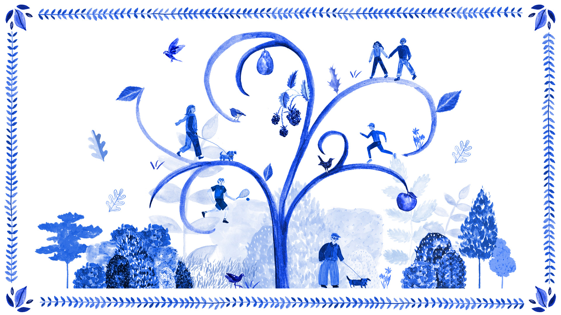
Using assets to create a composition. I like how a monochrome palette creates cohesion and doesn't make the image seem too busy.
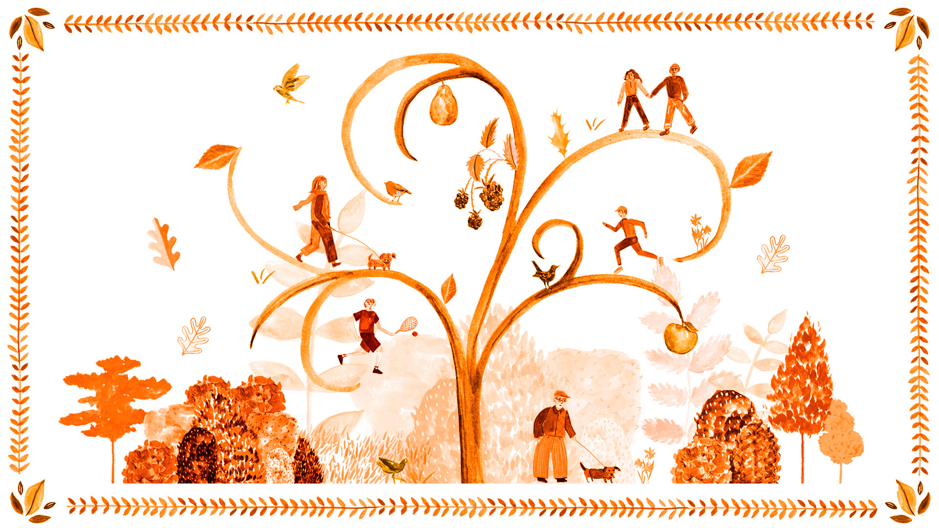
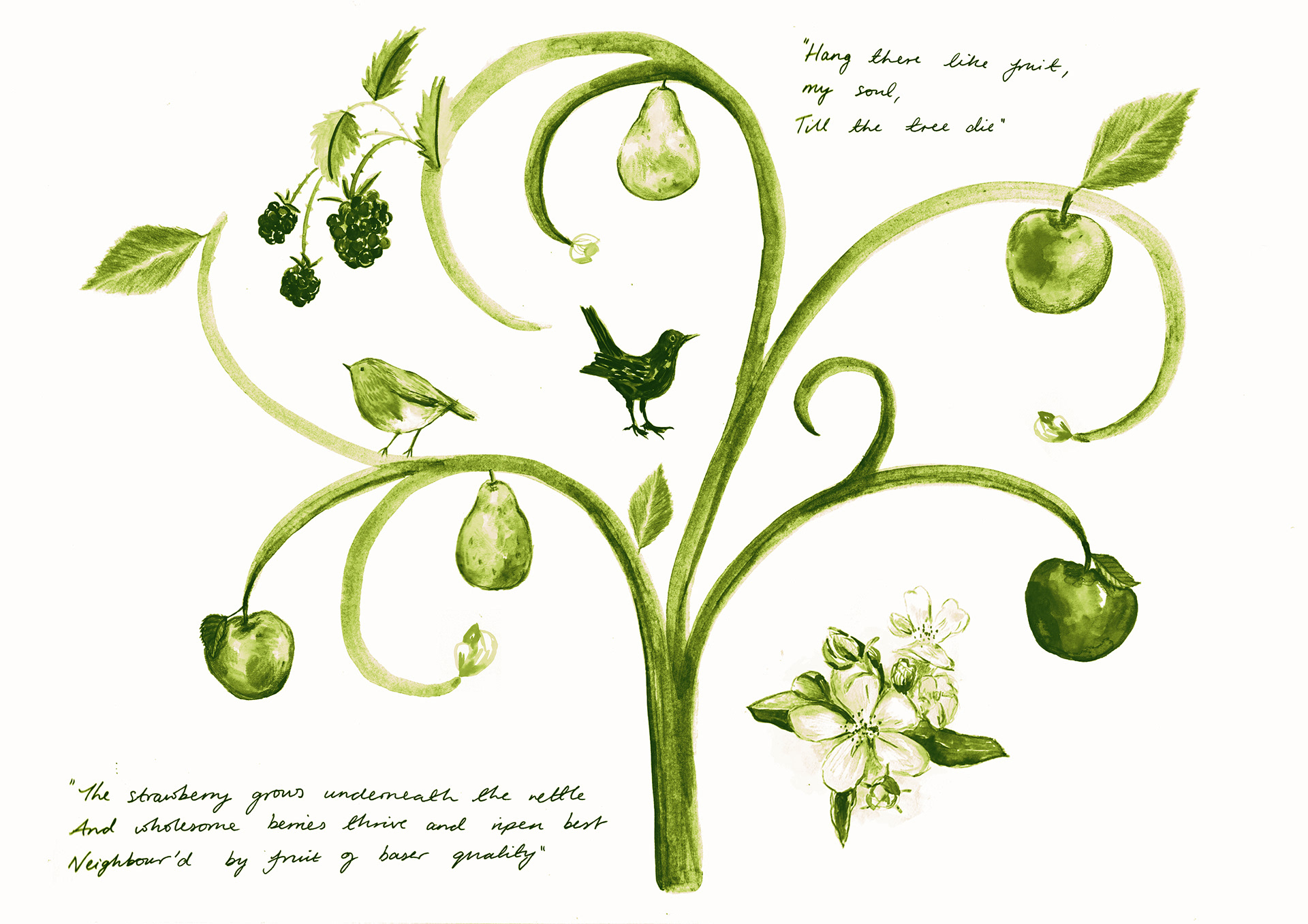
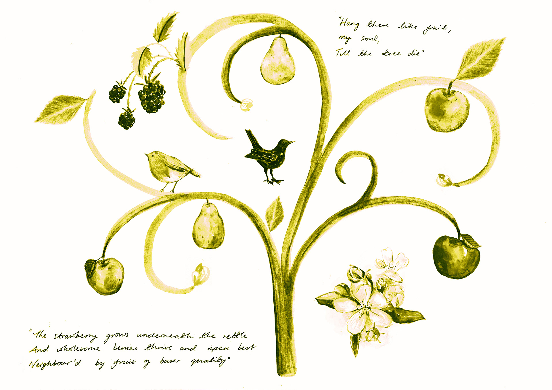
Recoloured to a warm orange. However I prefer the blue which looks more classic and I think communicates a more serene experience.
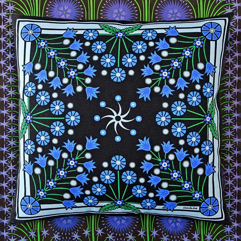
PRACTITIONER INSPIRATION: CRESSIDA BELL
I tend to think of pattern as more decorative rather than informative, however in terms of composition and layout I think I can learn a lot. Especially creating work from individual assets. Cressida Bell's work highlights the strength of repetition and symmetry in a composition.
RESEARCH: WALTER CRANE AND THE ARTS AND CRAFTS MOVEMENT
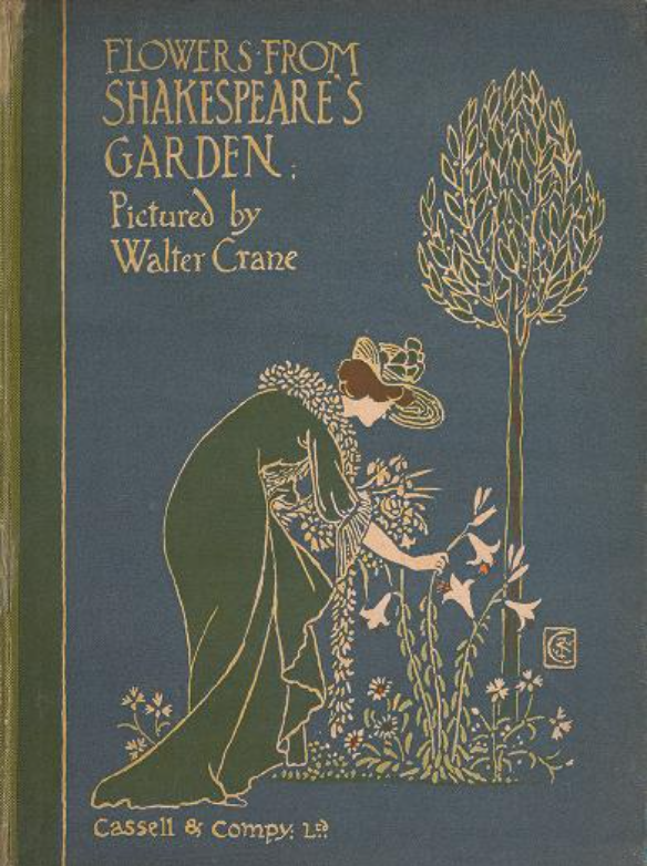
Walter Crane
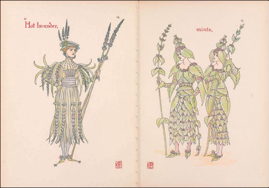
Walter Crane
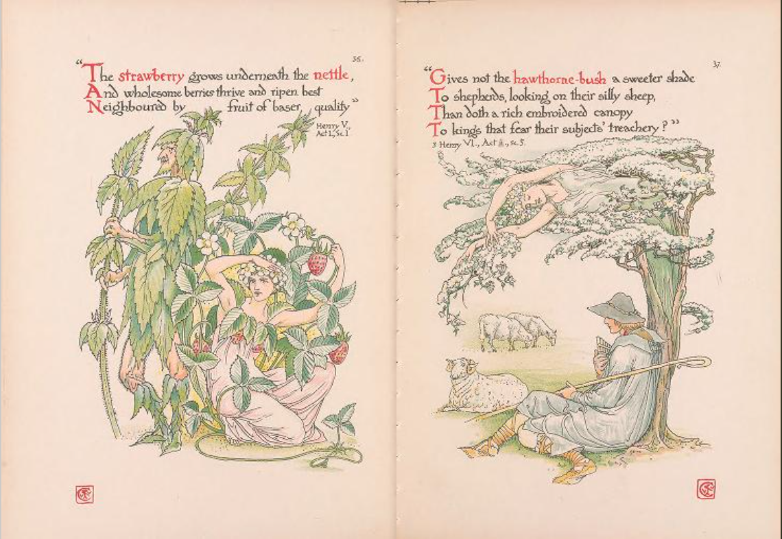
Walter Crane
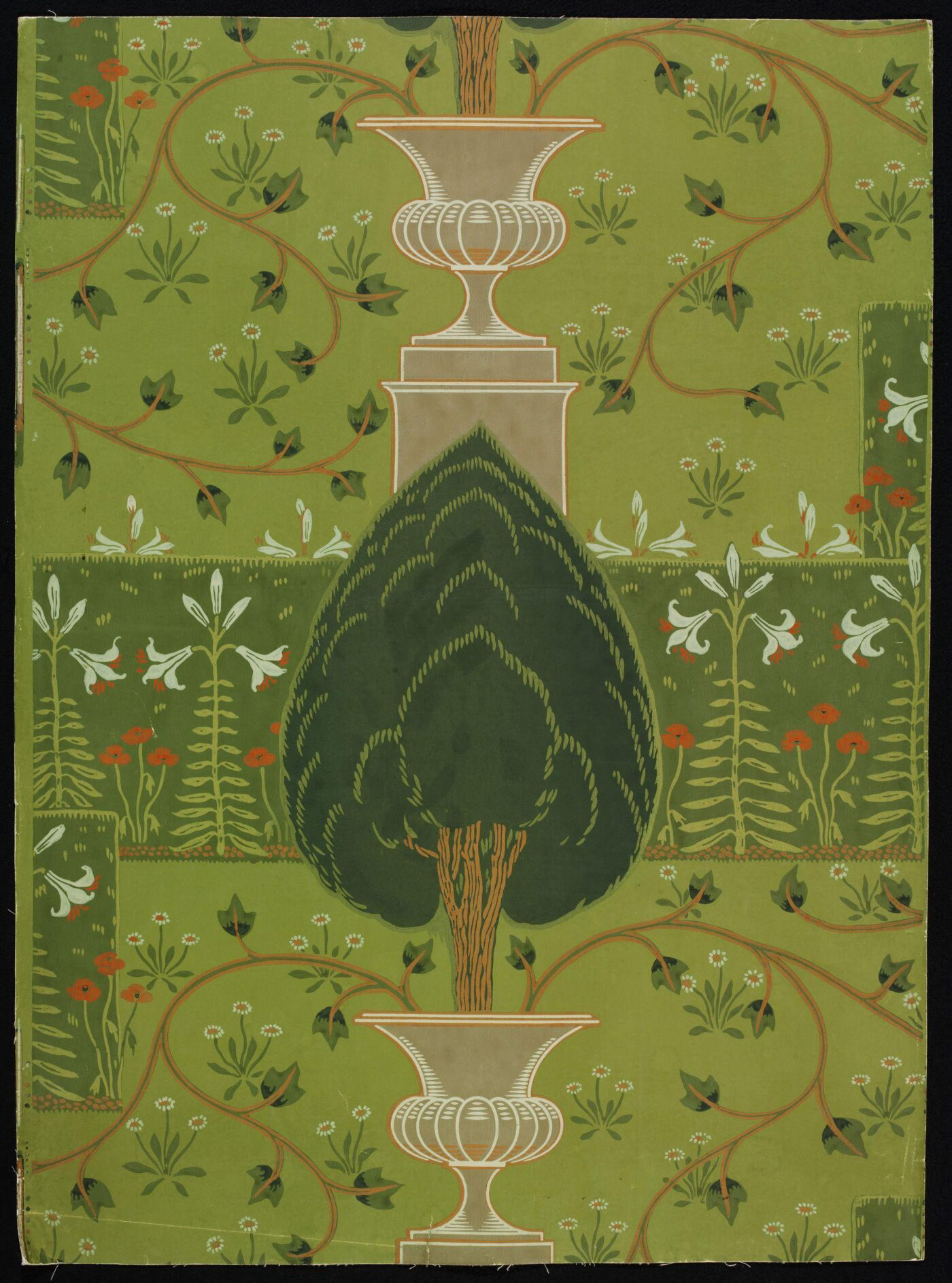
Walter Crane
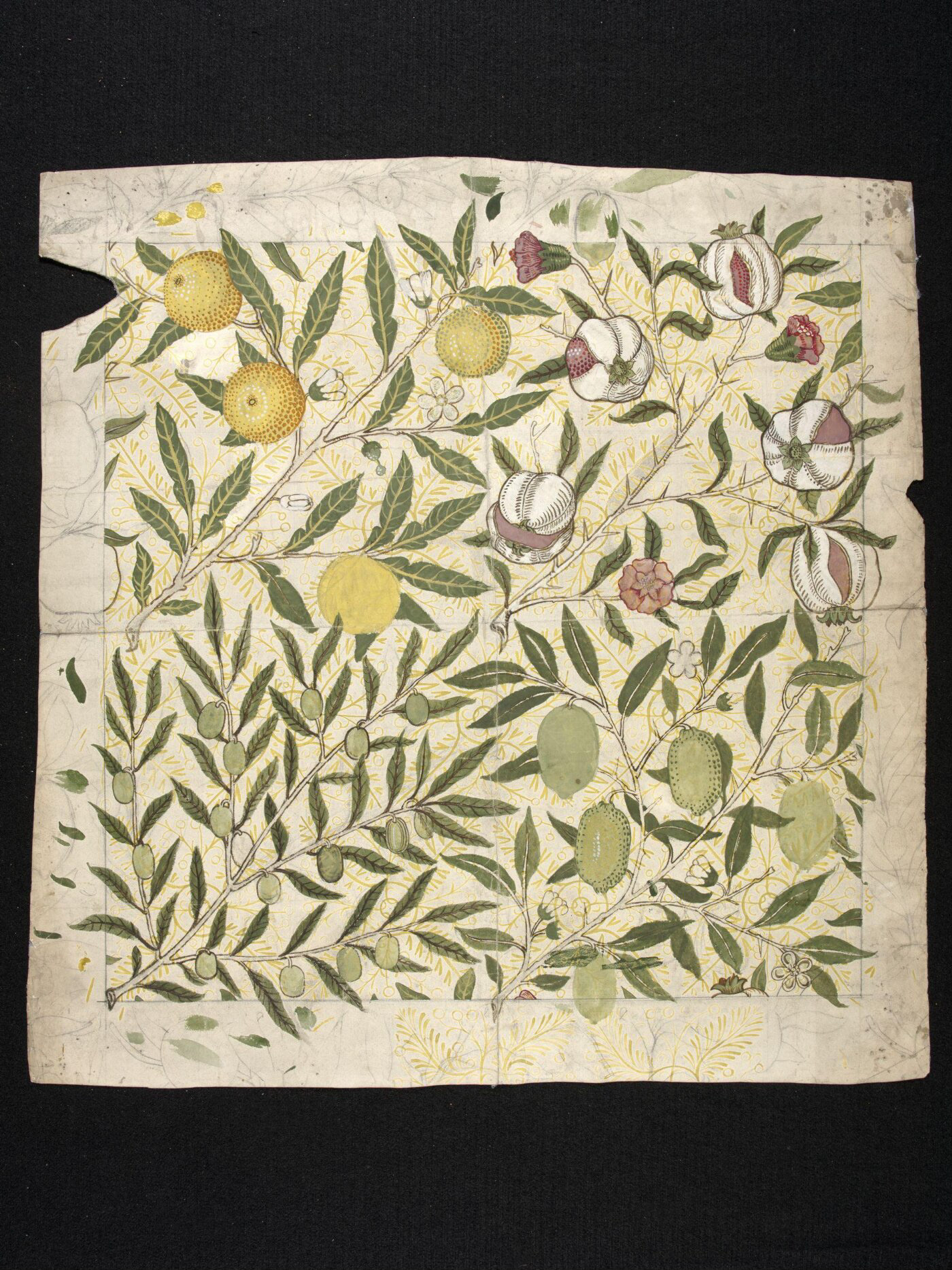
William Morris
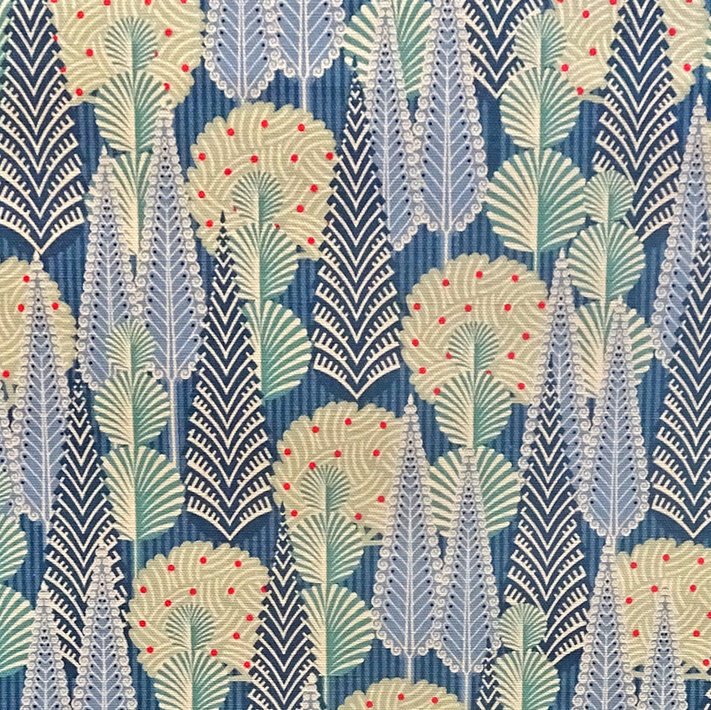
I was recommended Walter Crane’s work based on flowers mentioned in Shakespearean works following my piece based on the Shakespearean Garden. His illustrations are very intricate and fanciful, entirely removed from reality. They remind me a lot of the Flower Fairies illustrations by Cicily Mary Barker and Margaret Tarrant that I looked at briefly before the 20% summative assessment point. The look and feel of these illustrations don’t particularly resonate with me or my work, however some of his pattern work in his wallpaper designs were much more inspiring and relevant to this project. His work is based in the Arts and Crafts movement; a response to the “social and environmental impact of the factory-based system of production that Victorian Britain had so energetically embraced.” (V&A, ‘Arts and Crafts: An Introduction’ [Online]). The slower and more mindful practice of the Arts and Crafts movement fits well with the ethos of my project; implementing mindfulness to benefit mental health. It seemed apt to try integrating the stylistic choices of this period into my own work.
Initial pattern block
Colour experimentation
Colour experimentation
Colour experimentation
Colour experimentation
LOOKING AT TYPE
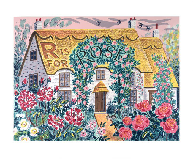
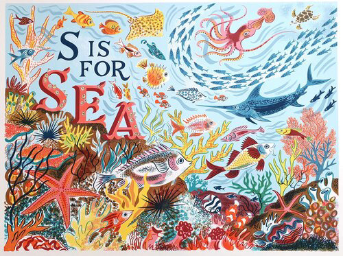
PRACTITIONER RESEARCH: EMILY SUTTON
I like how type is integrated in a decorative and informative way in Emily’s work. The type is refined and clear and is purposefully added to the design itself, not as an ‘add on.’
I like how you can clearly read everything, but it doesn’t interfere with the overall image. It has a great mix of clarity and being blended into the composition. I think part of the way of achieving this is using elements of the surroundings to design the type, e.g. adding the texture of the thatched roof to the letter R or the barnacles to the letters of ‘SEA’ while still using a clear typeface to ground the lettering.
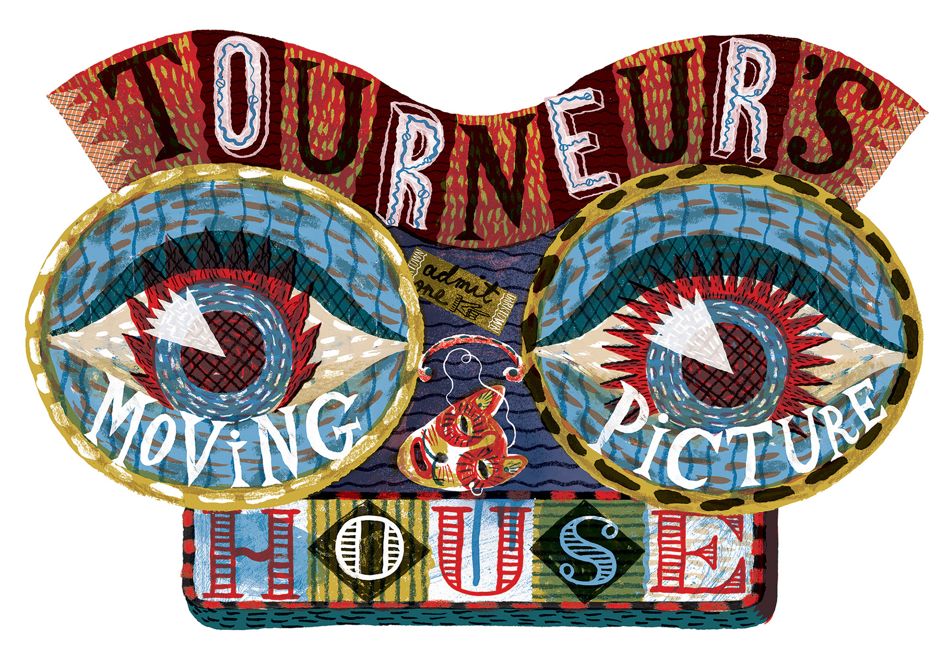
PRACTITIONER RESEARCH: JONNY HANNAH
Like Emily Sutton, Jonny Hannah also uses type as a part of the illustration itself. Although I would say his lettering is much more integral to the overall style and design of the pieces he makes. It has an almost collaged look to it and is quite busy. A succinct and narrow use of colour keeps the use of pattern and texture from becoming overpowering. Jonny's style of working is less applicable to my own, however I do like how enmeshed type can become in imagery and this might be something to explore in my own work.
ADDING TYPE TO MY WORK
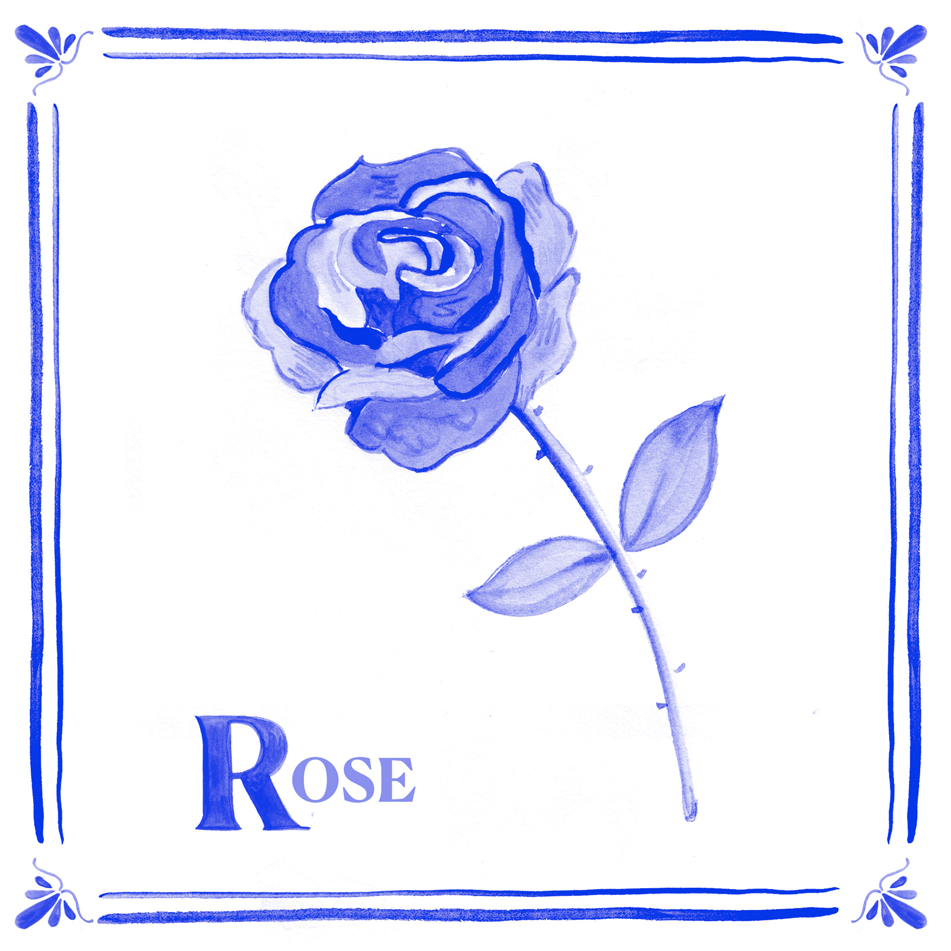
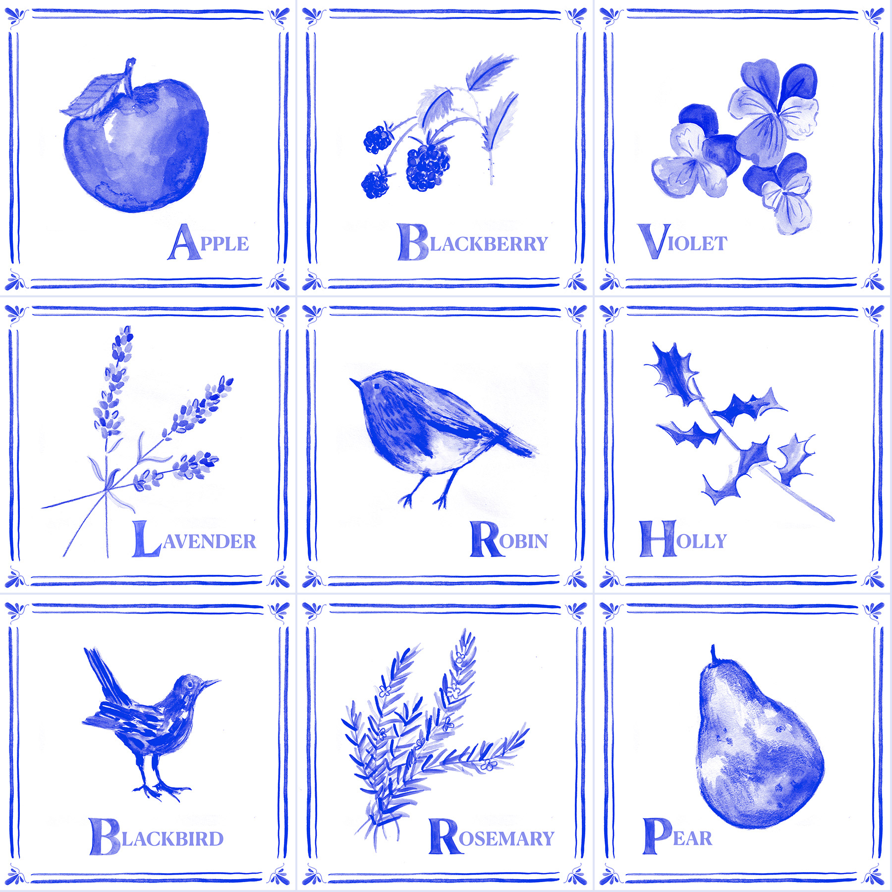
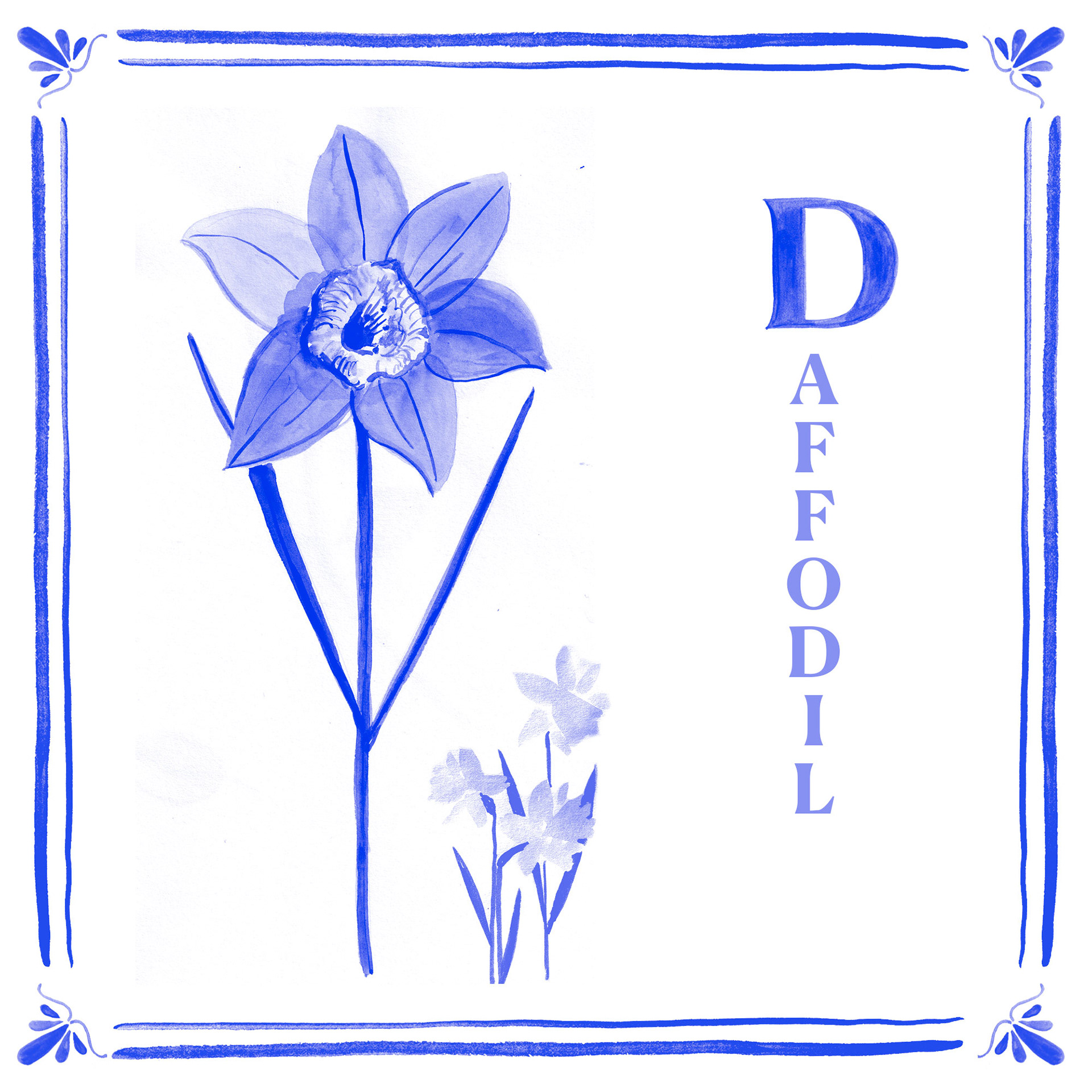
I wanted to expand on my work based in the delftware colour palette, so decided to design a series of tiles based on the plants in the Shakespearean Garden. I decided to accent the first letter of each word by increasing its size and hand painting them, to add some texture and further link the text with the drawings.
I'm really pleased with how they turned out and think they look particularly effective together. I also think they look a bit like stamps!
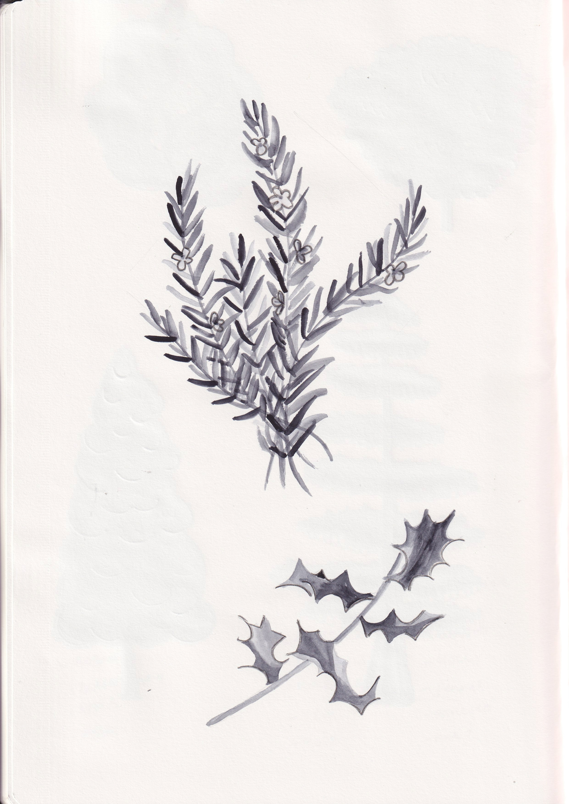
Rosemary and holly
Trees
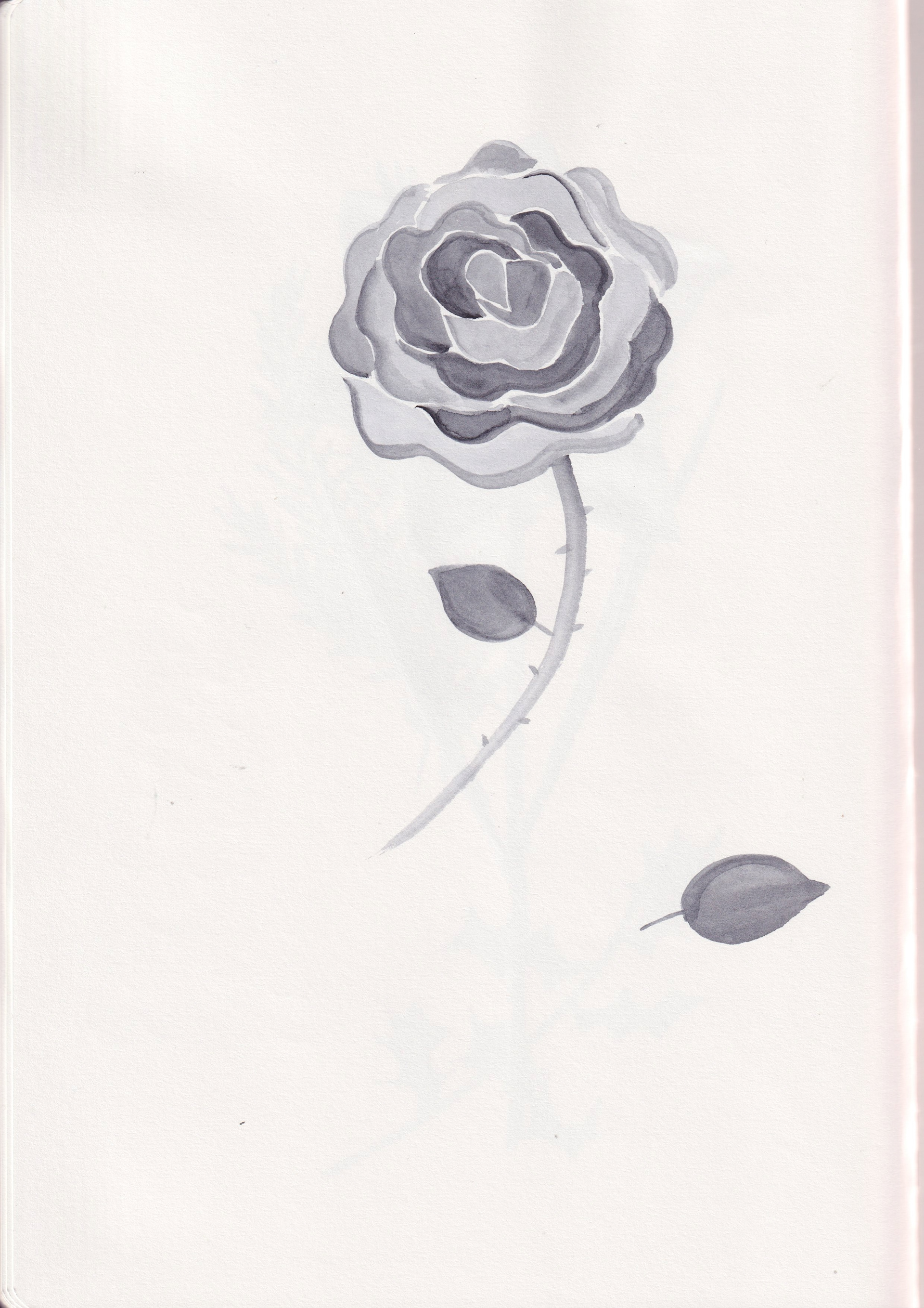
Rose
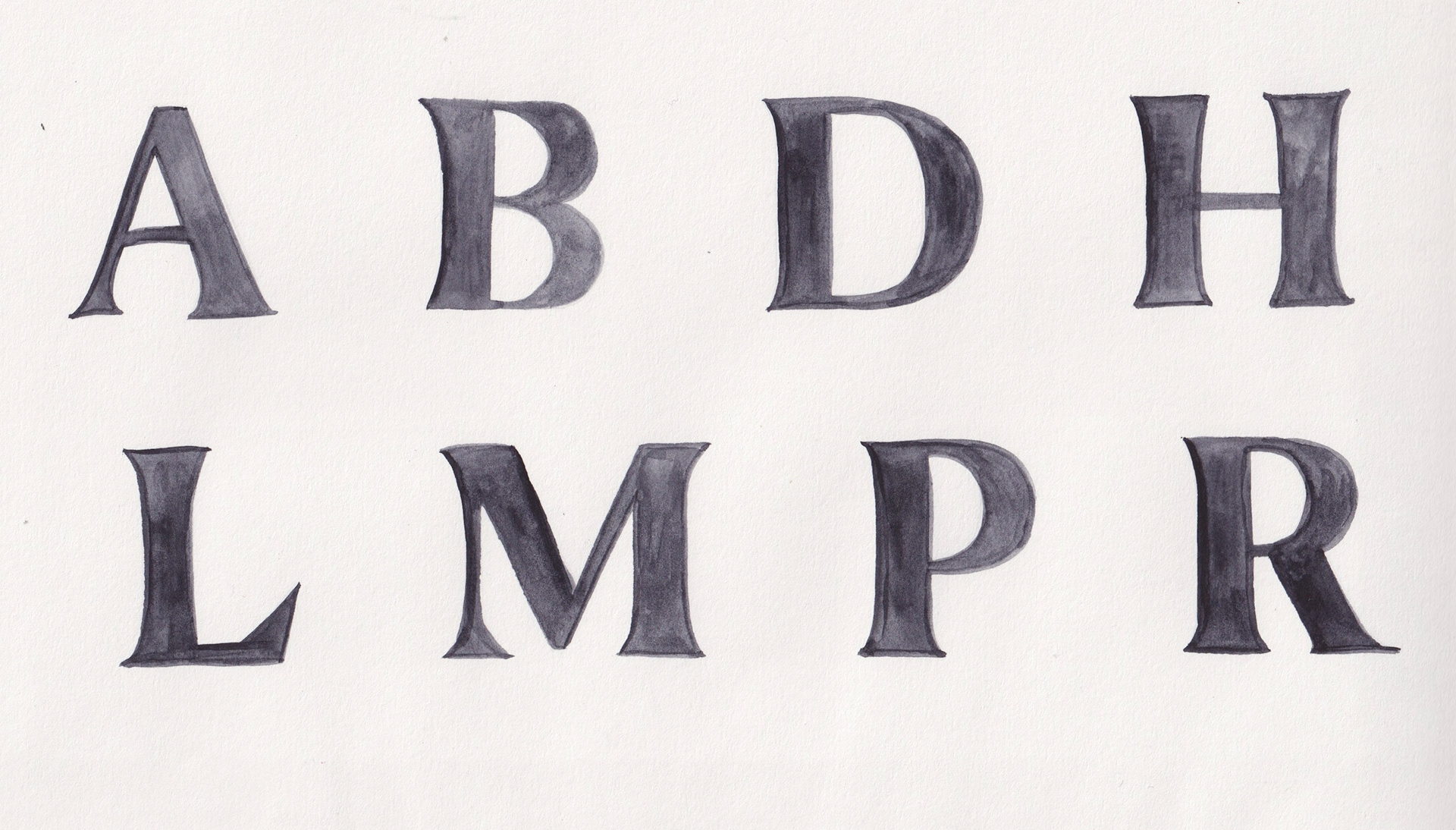
Lettering
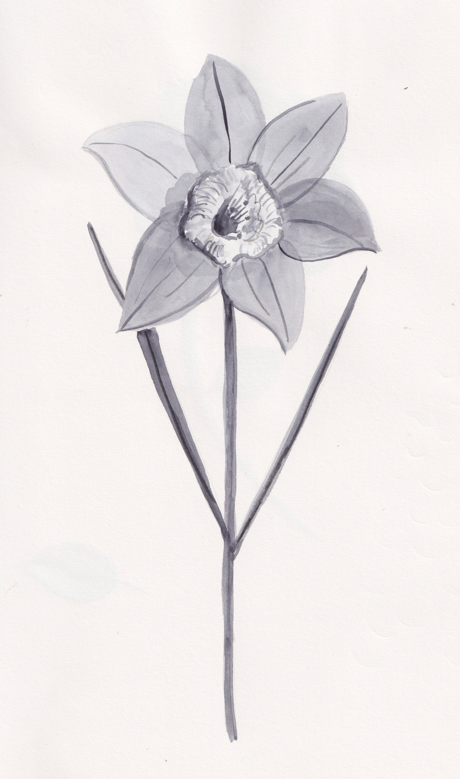
Daffodil
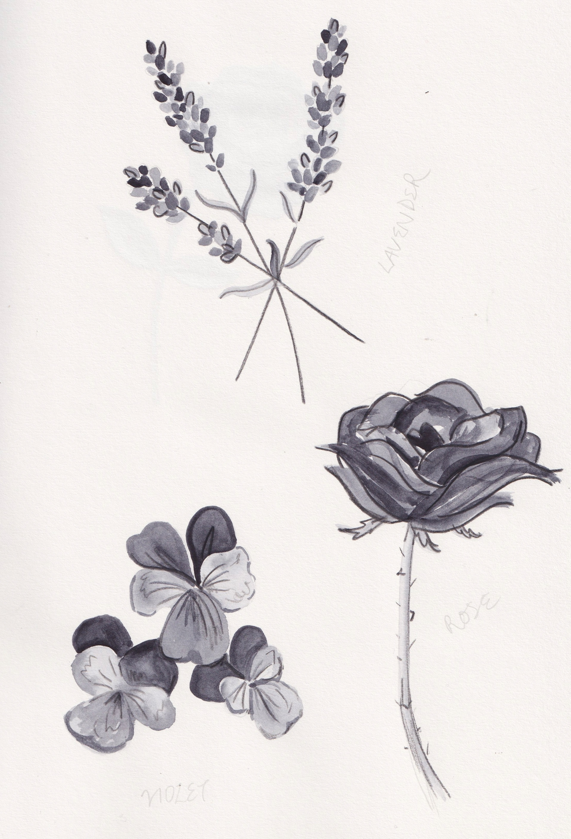
Lavender, violet and rose (sketch)
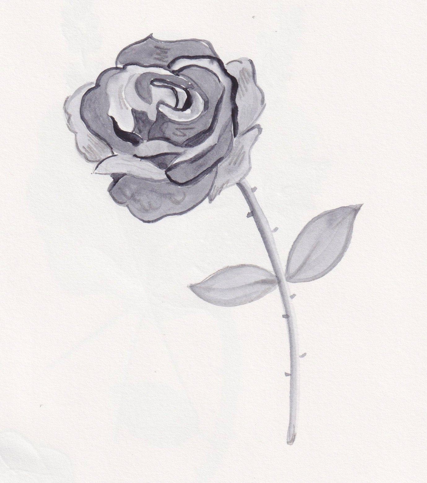
Rose
Original drawings for the tiles
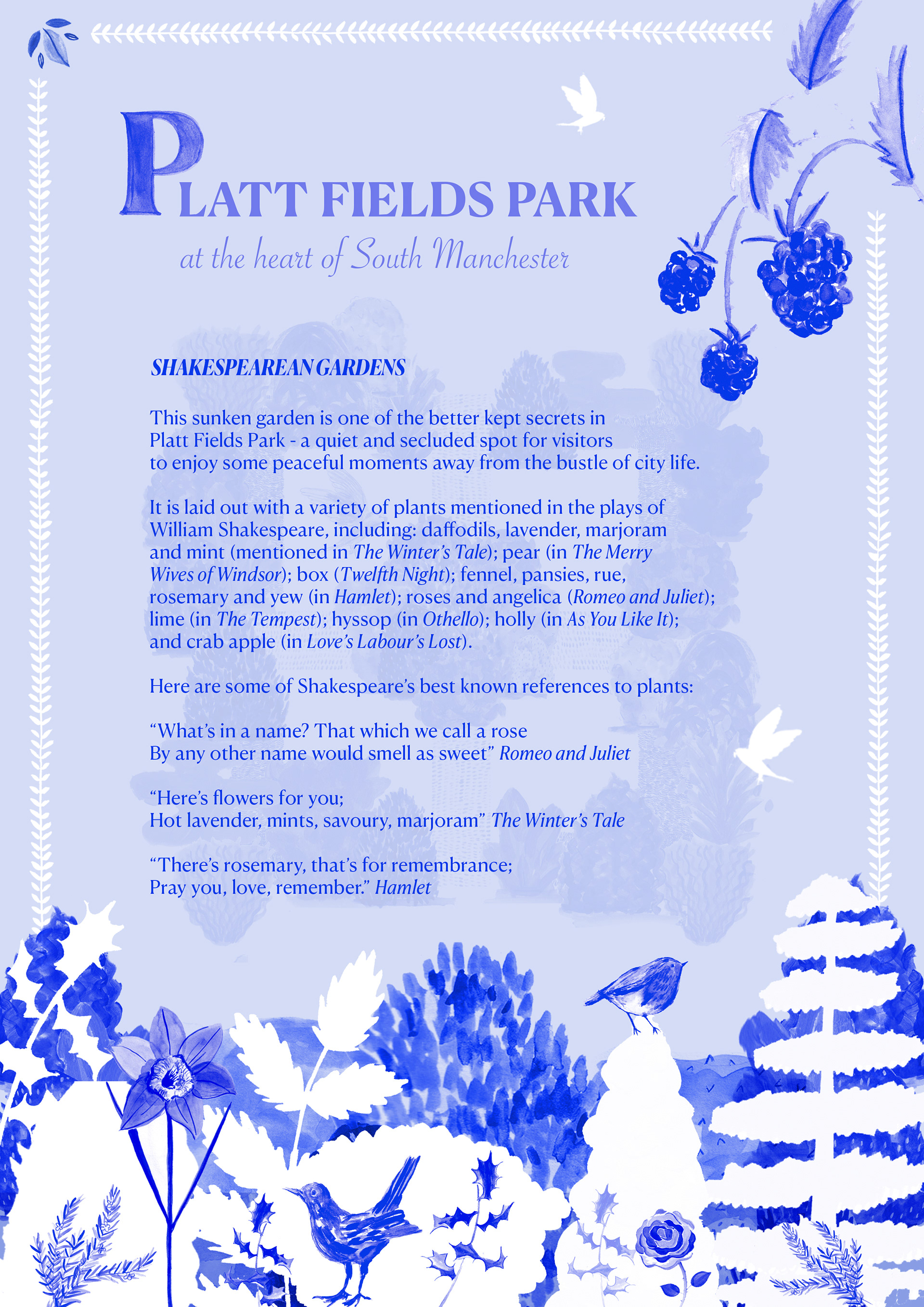
Redesign of information board
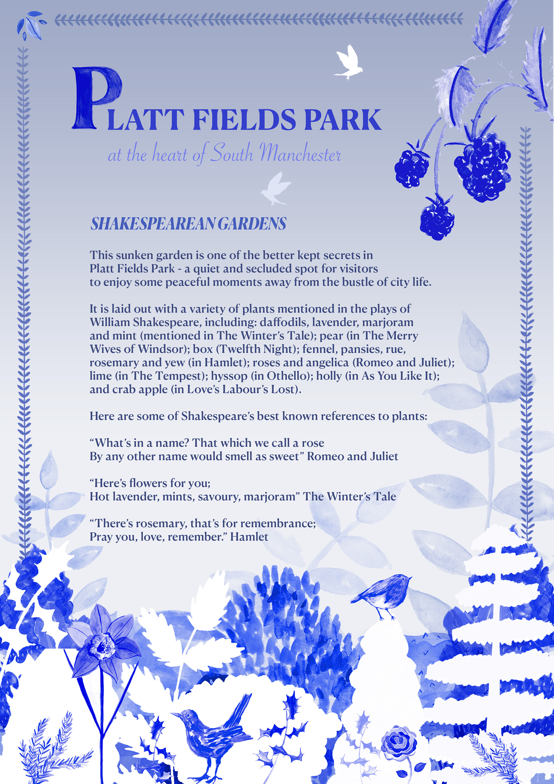
Redesign of information board, decreasing the 'blueness' for legibility

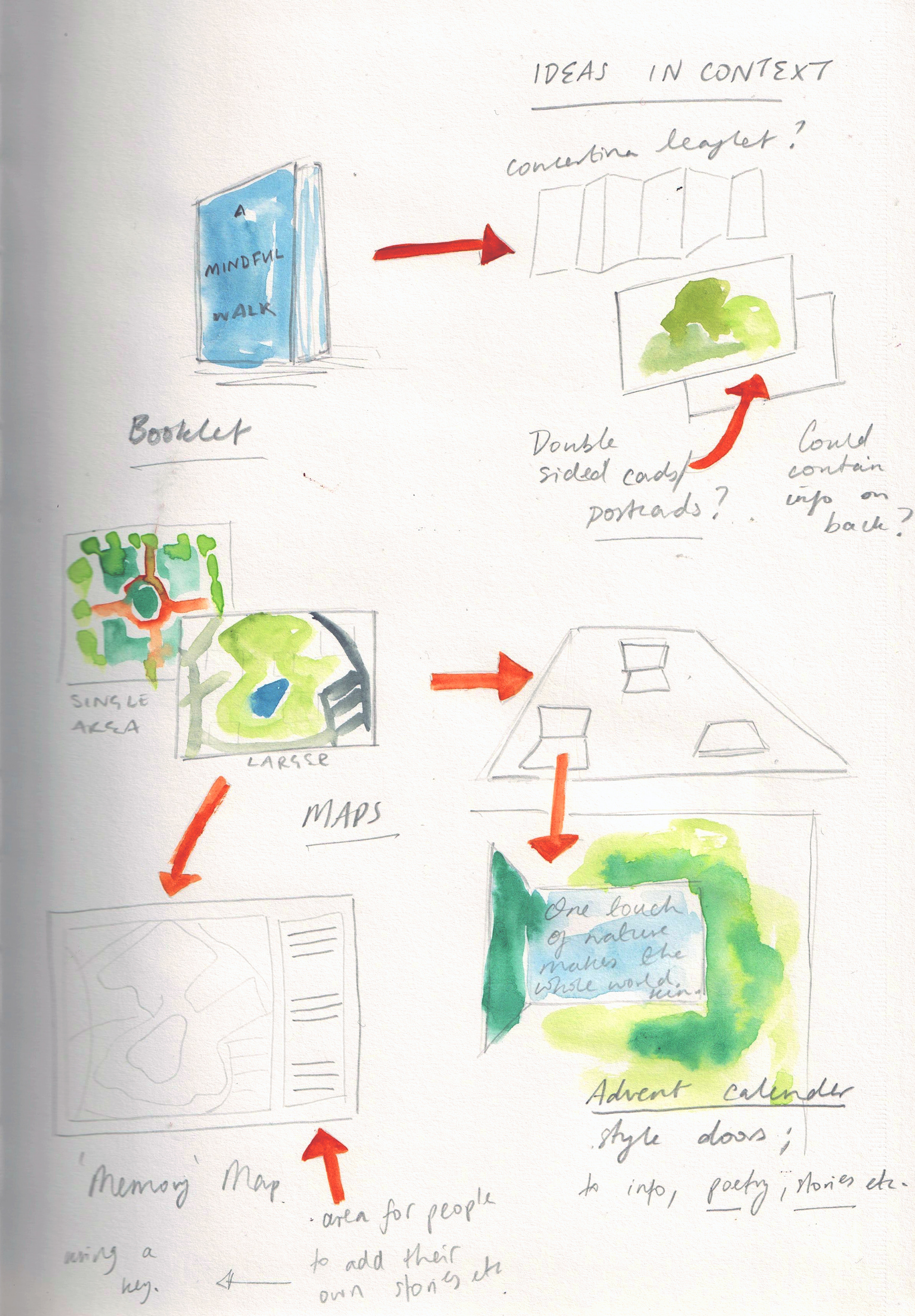
Foldable mini booklet idea
Postcard design
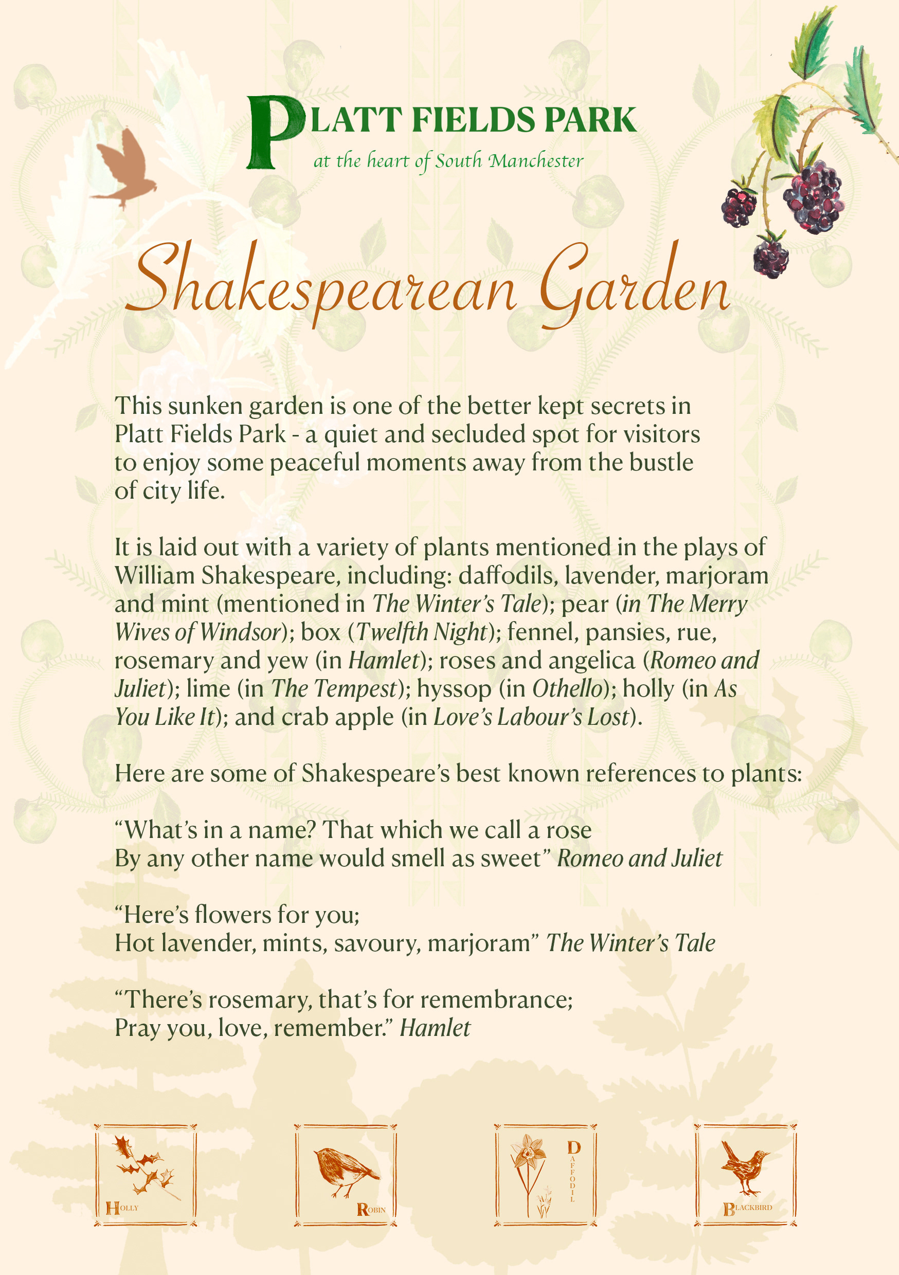
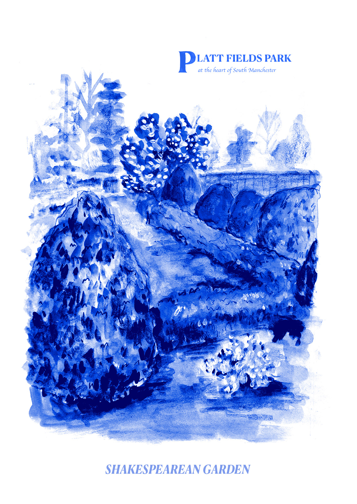
Redesign of information board in full colour; I think this reflects the garden better and the consistent motifs keep it in touch with the delftware style tiles
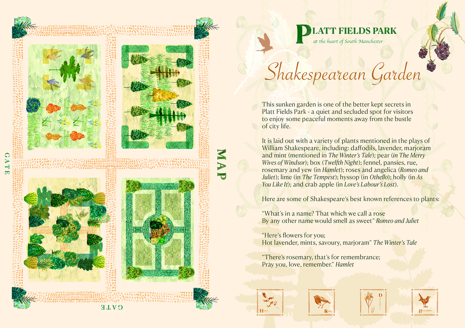
Information with map in full colour for a leaflet?
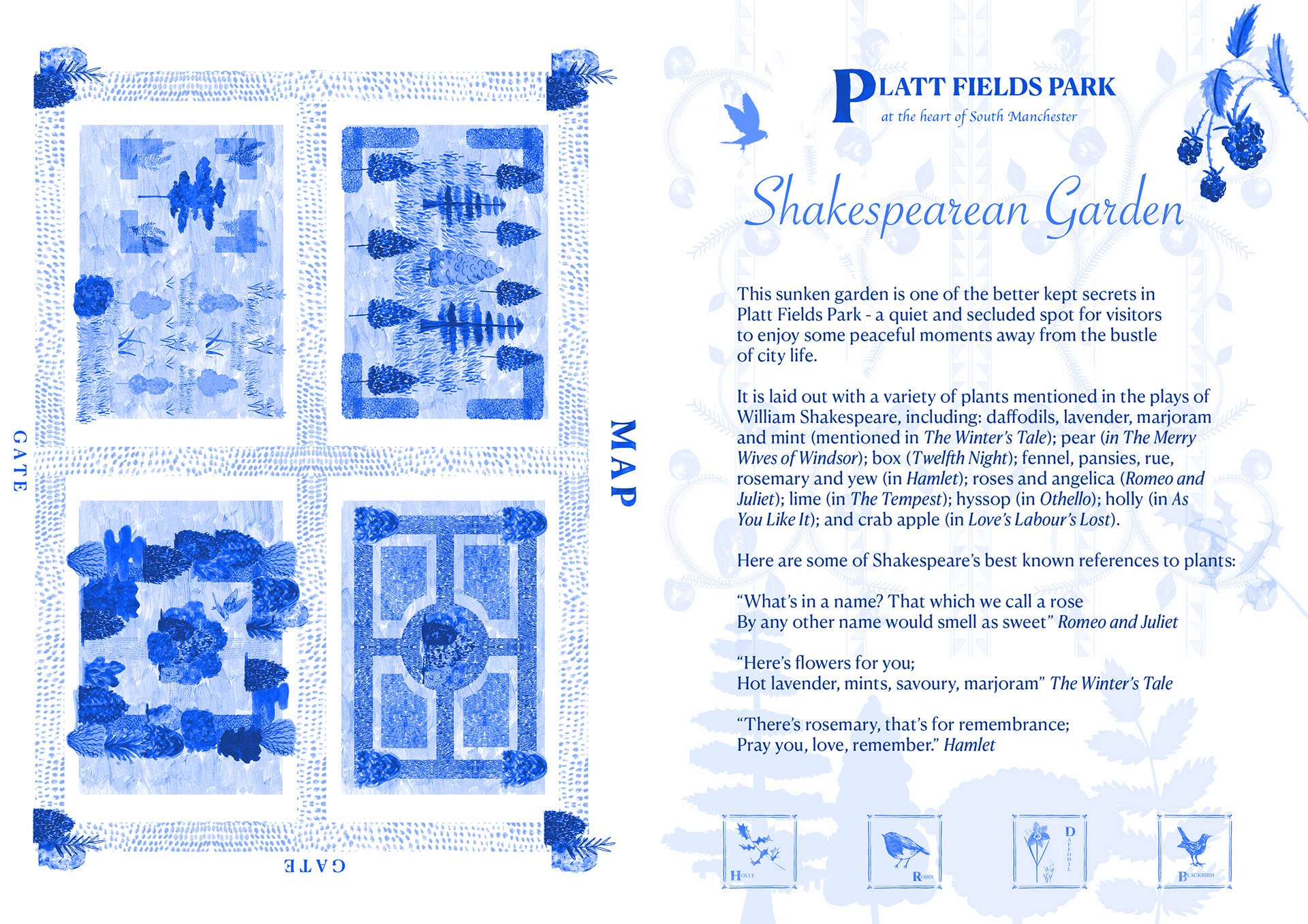
Recoloured to blue colour scheme - this could work as the back of the mini booklet. One colour to mimic a risographed outcome.
CREATING A MAP
LOOKING AT MOVING INTO PUBLIC SPACES
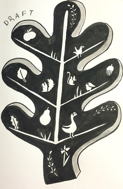
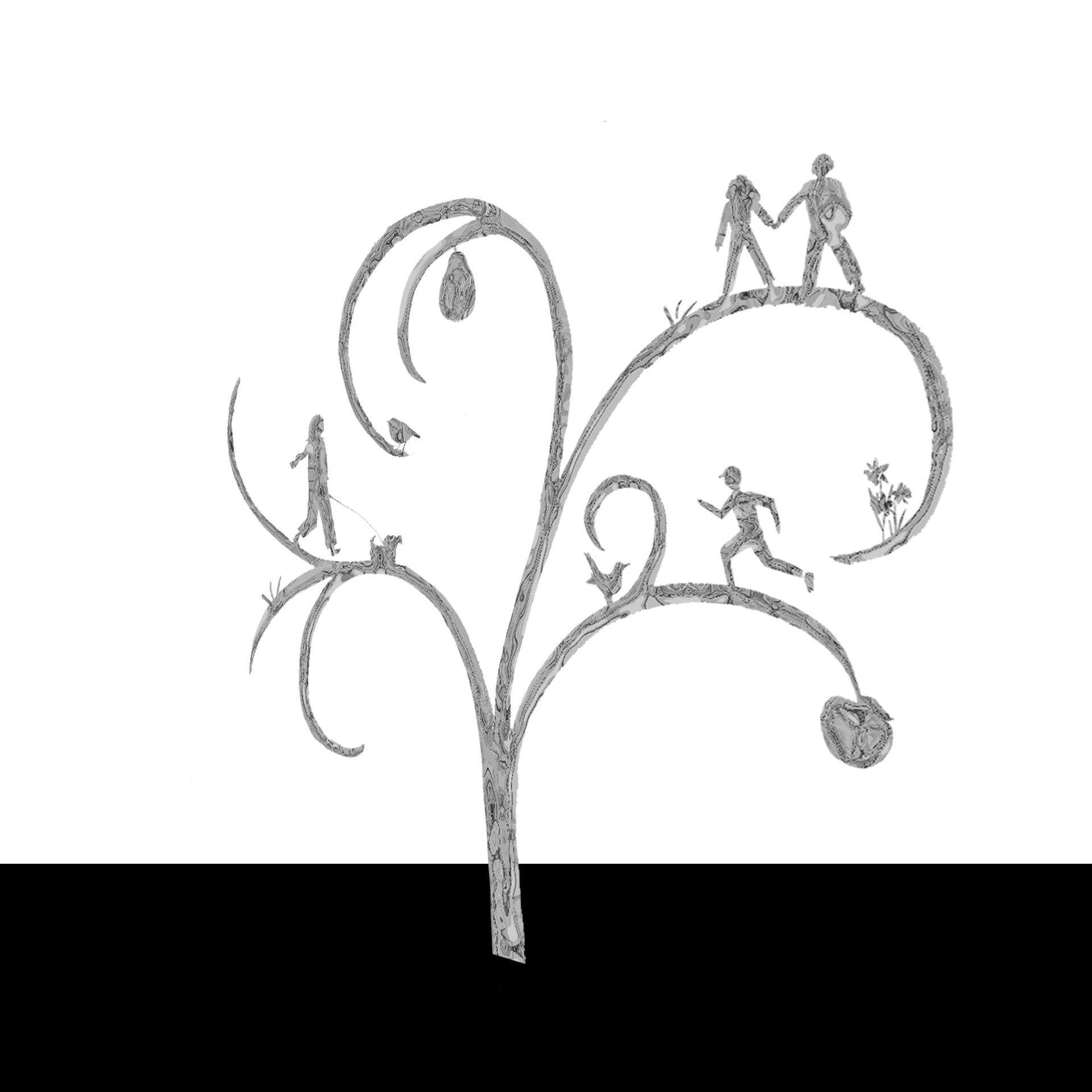
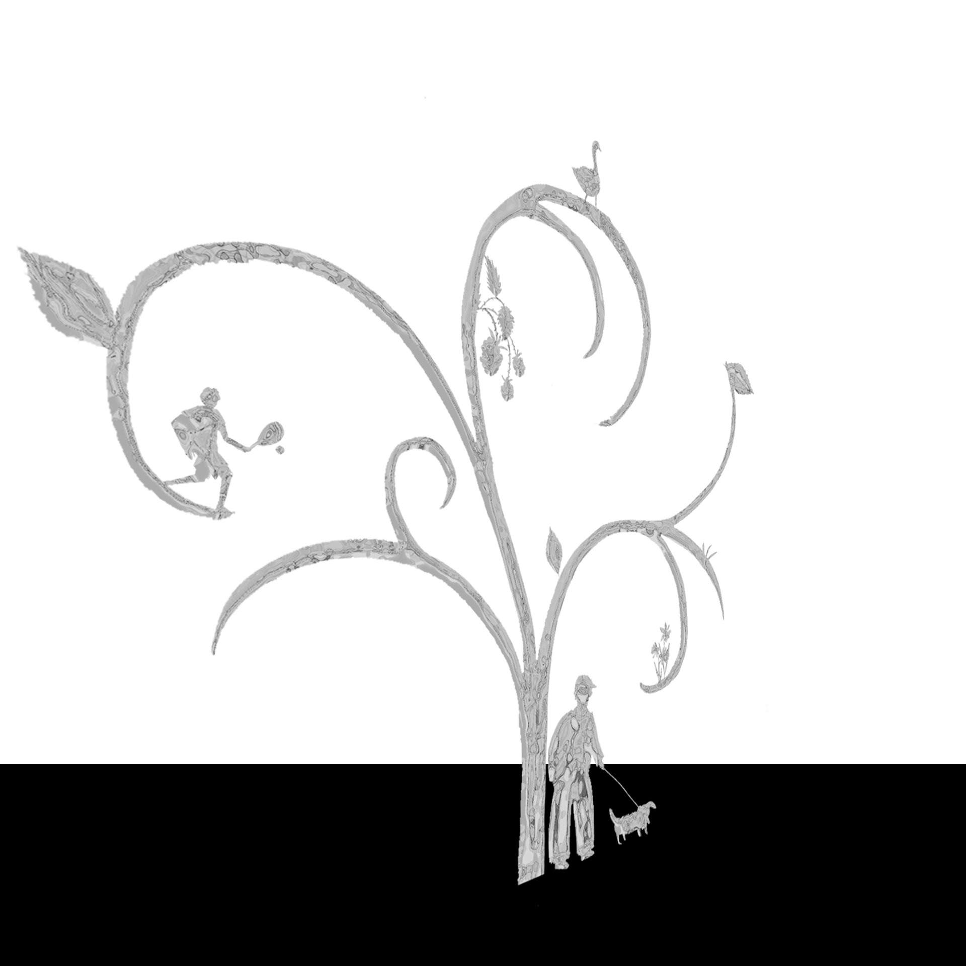
Part of looking to extend this project outward led me to look into public forms of art. I believe one of the most accessible experiences of outdoor art is sculpture, so I began looking at how my drawings might be adapted to a larger and three dimensional scale, looking at intersecting objects and looking to create interesting shadow work from the piece too. I tested my rough idea first using card, before using my scanned images to look at perspectives and how they might sit together. I then decided to try and 3D model this idea! I've never used any form of 3D modelling software before, so I opted to try in Photoshop, and after a couple of articles and videos, I managed some very rough attempts!
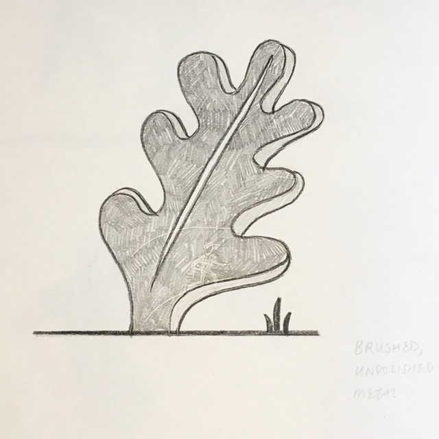
Looking into designing with cutouts in 3D materials
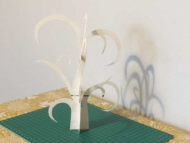
Card prototype

Card prototype
Testing
Testing
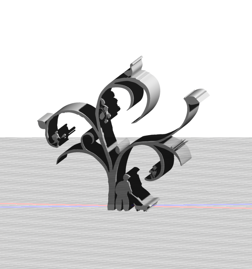
3D model
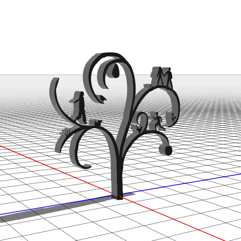
3D model
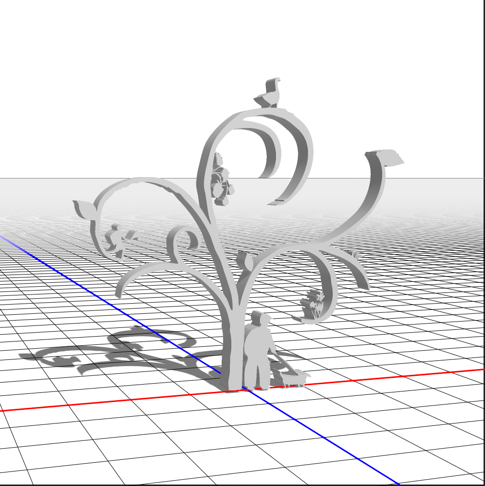
3D model
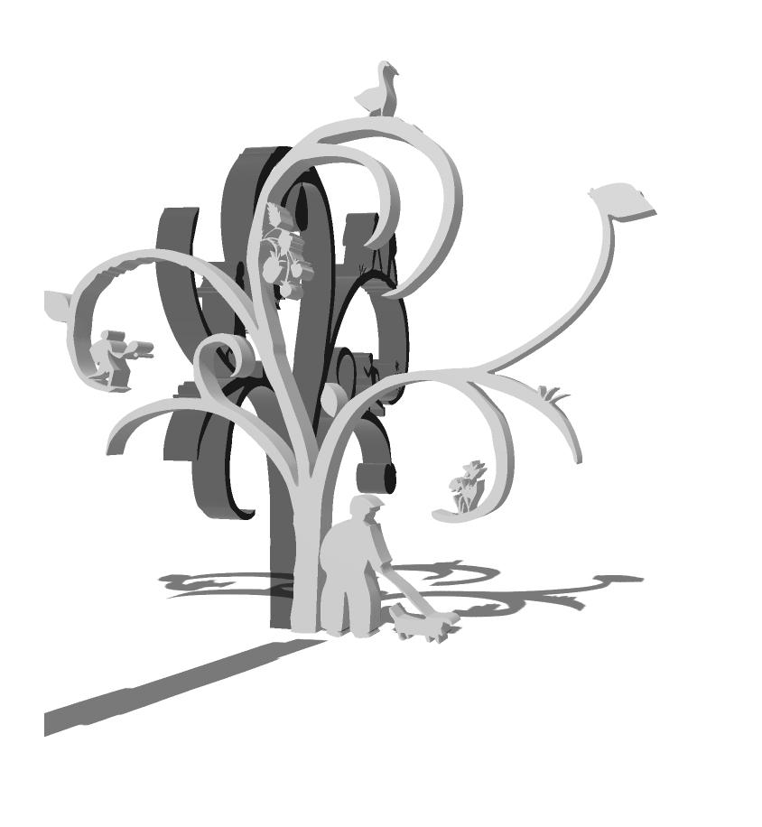
3D model
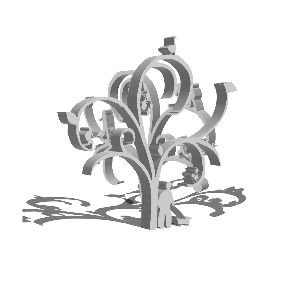
3D model
Through my research I also came across a kinetic sculpture artist, called David Watkinson, whose work I was immediately drawn to because of it’s fluidity and mesmerising quality of movement. His work is incredibly engaging and elegant, as well as relying on a deep understanding of the species he recreates and how they interact with the air around them. In this way, his work epitomises the act of creating with mindfulness and observing nature closely.
WOOD CARVINGS
Part of looking outwardly with my project to public spaces got me thinking about integrating design in a more subtle and practical way. Most parks have some form of wooden signing, outdoor furniture or seating; benches or picnic tables. I wondered about the idea of carving designs into wooden furniture which would be regularly used by park visitors.
I made a couple of lino prints to emulate a wood carved design, and digitally applied them to a wooden texture to get a visual for the idea.
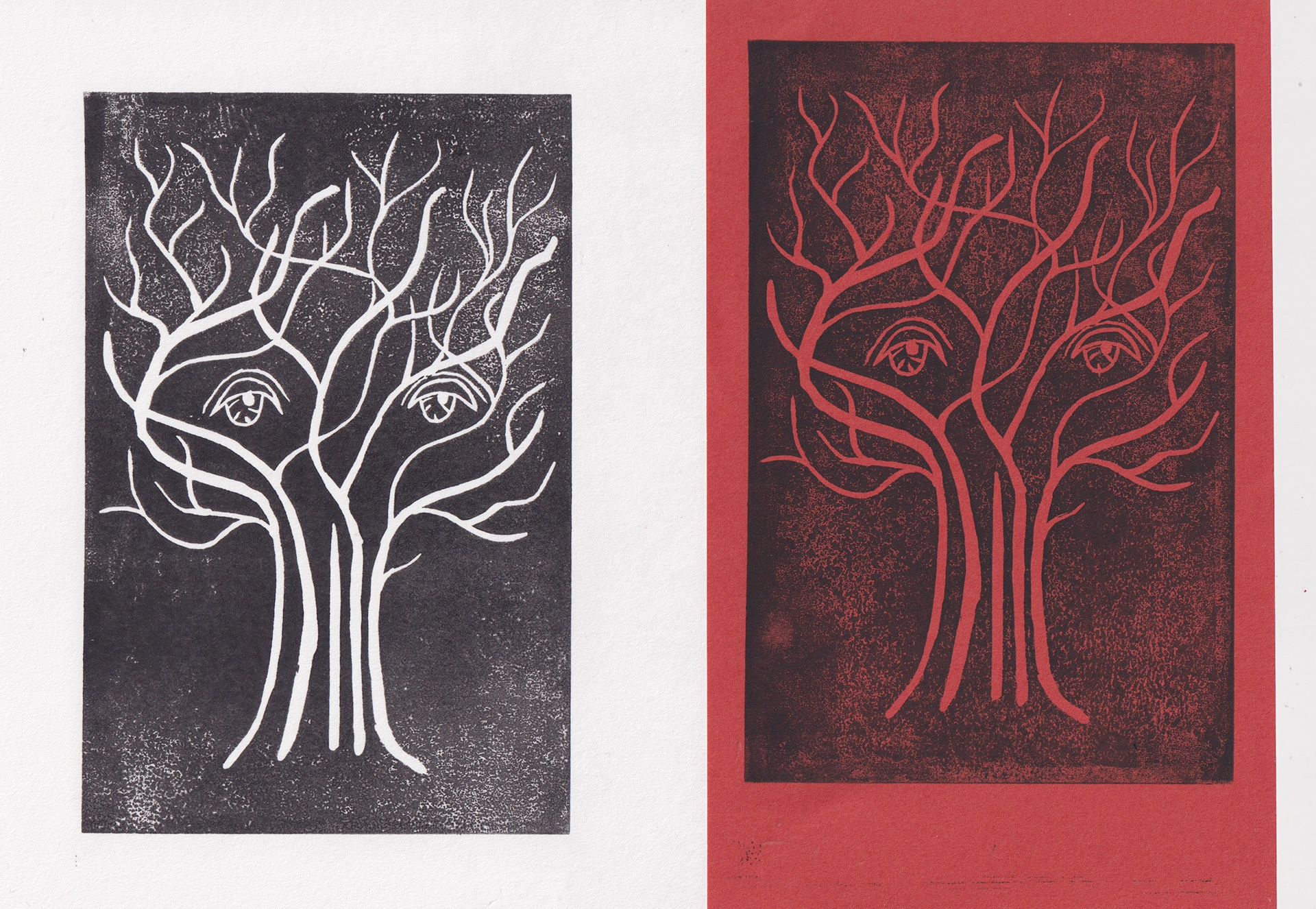
Lino print
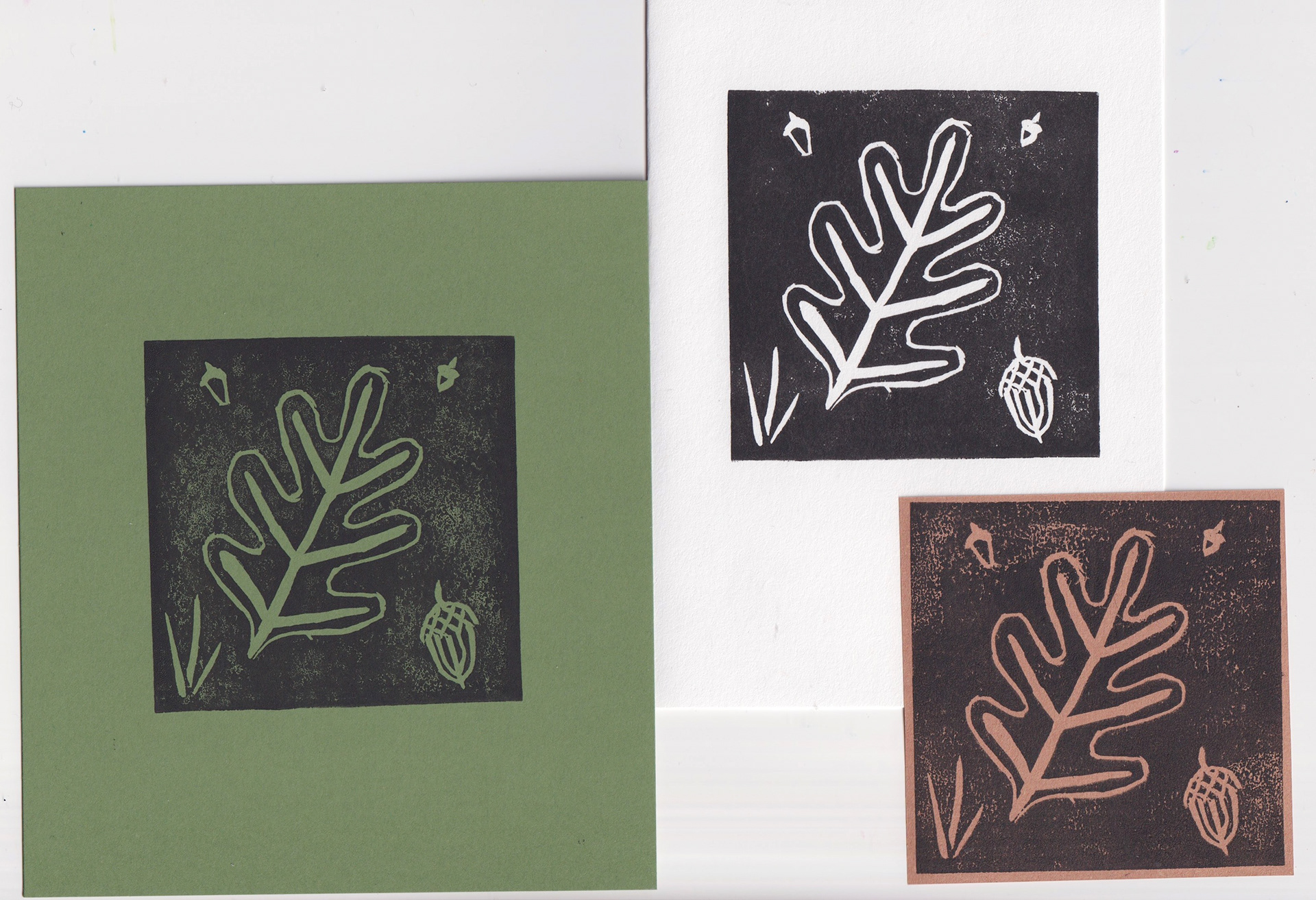
Lino print
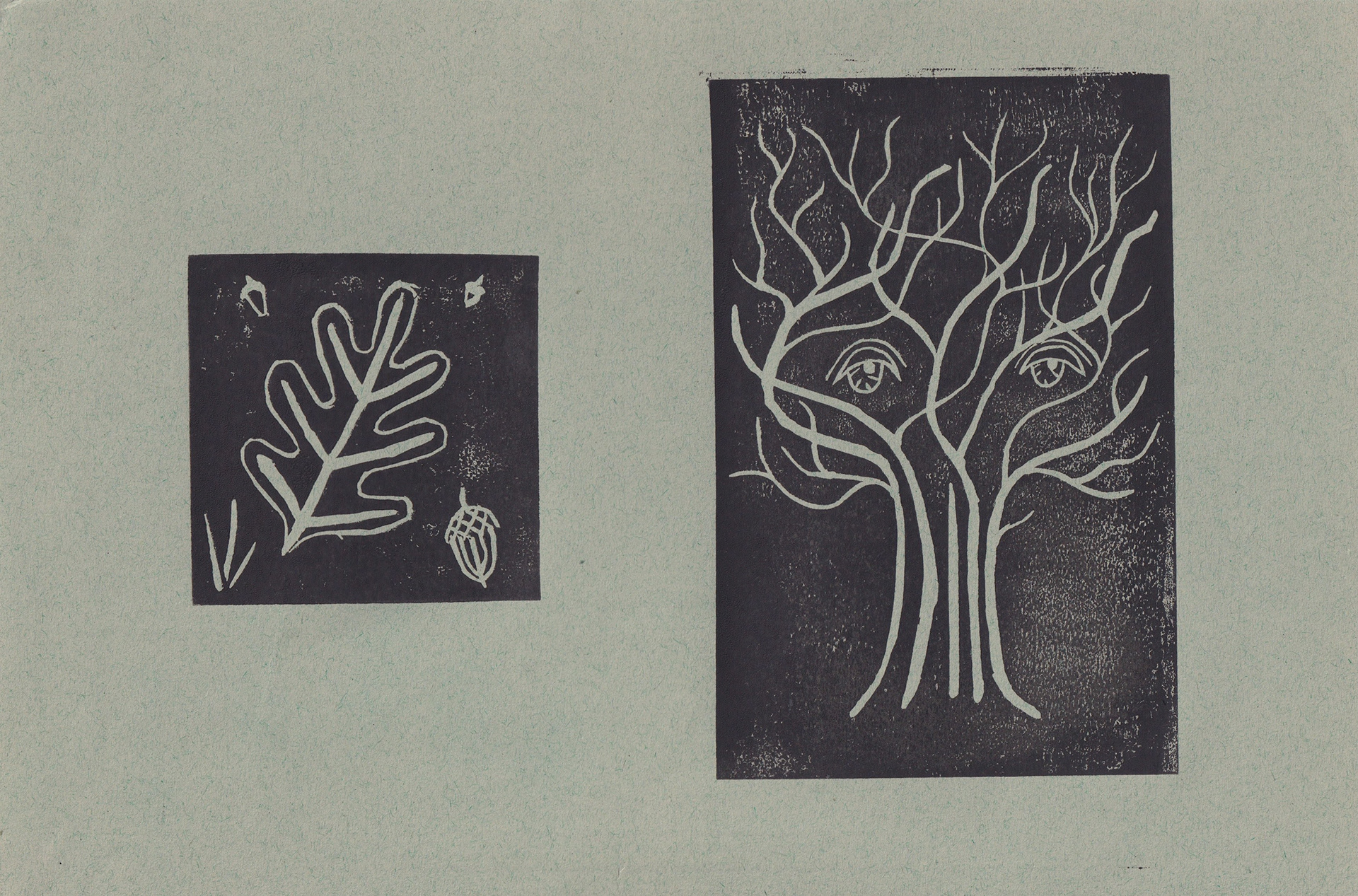
Lino print
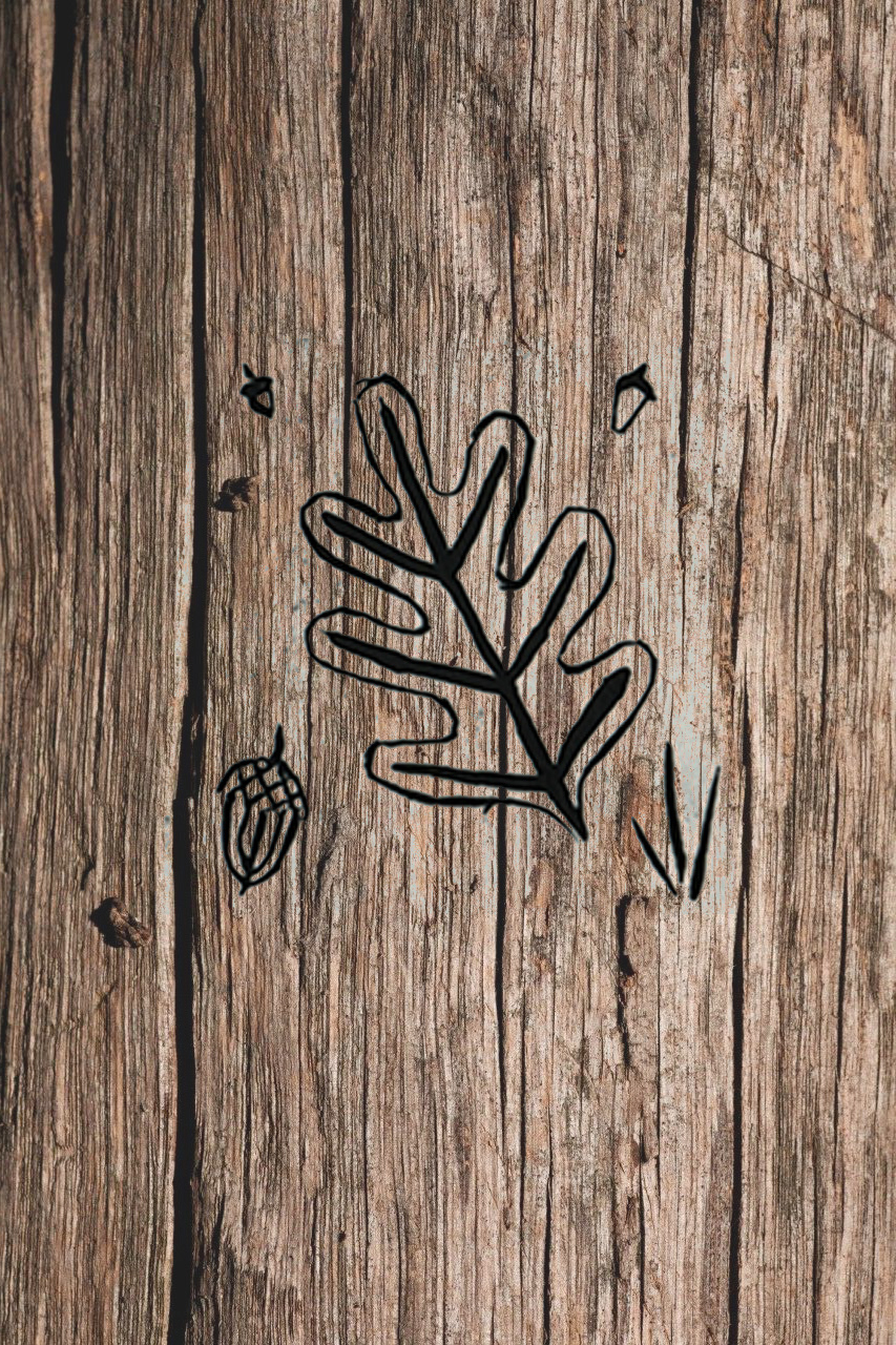
Mock up carving
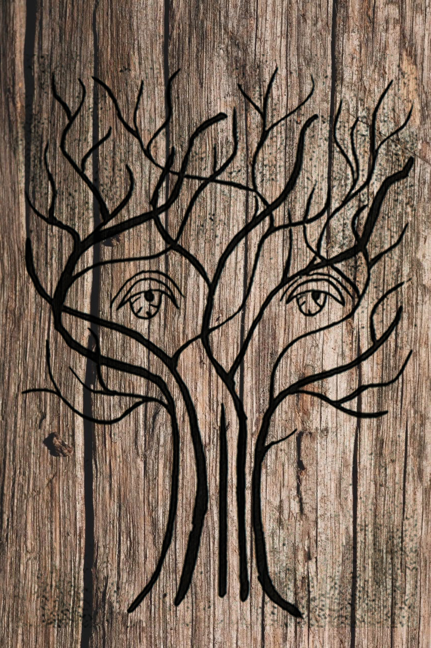
Mock up carving
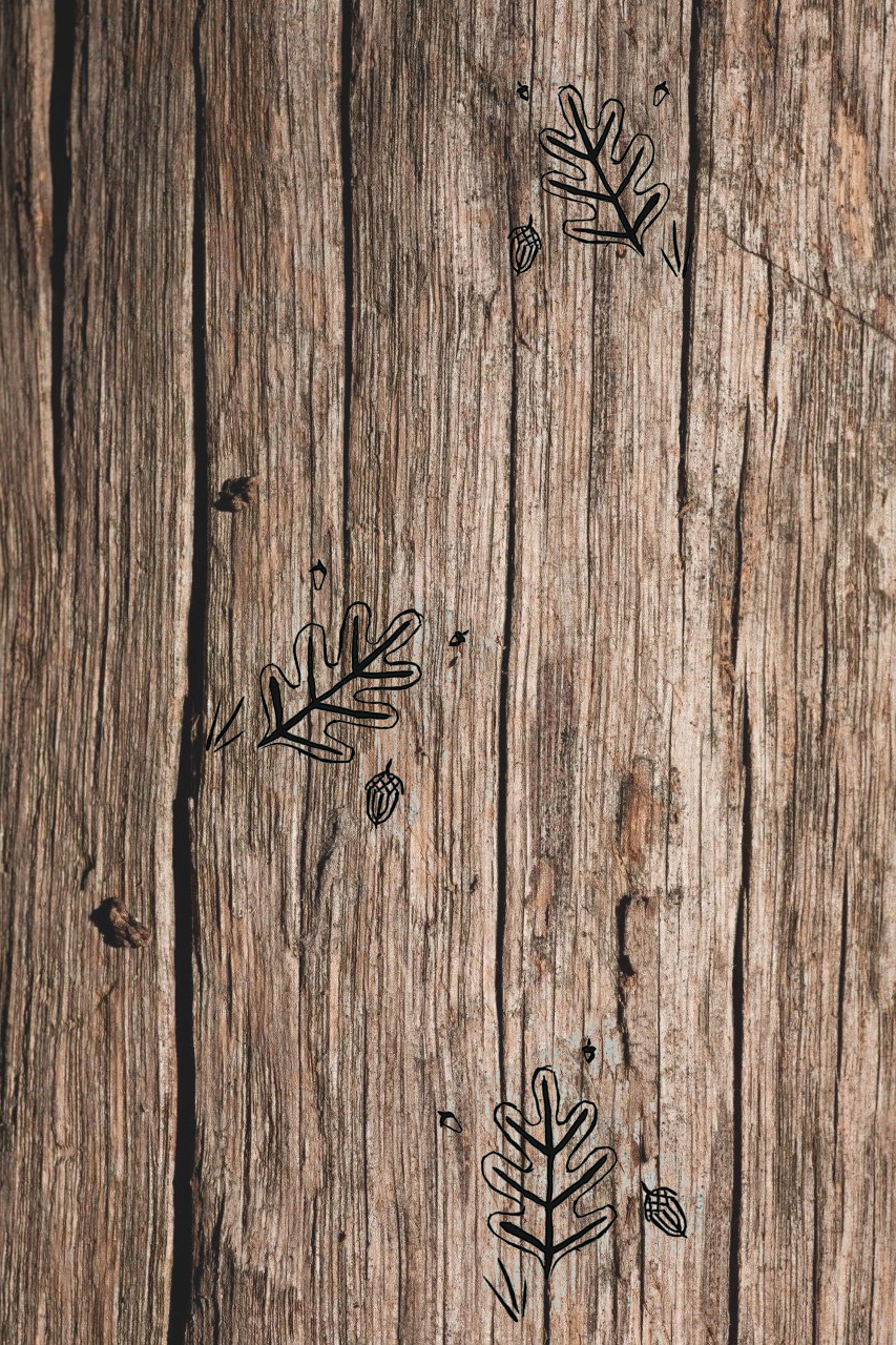
Mock up carving
RESEARCHING FUNDING
I also began to look into how I would propose and potentially obtain funding for a project like this in the future. The Arts Council was a particularly useful place to start, with lots of articles and pages online about the process of applying for grants in different settings and circumstances. For The Arts was also a good resource for understanding the basics of what a grant could do and how the process works.
APPLYING WORK TO AN EDUCATIONAL SETTING
I posted a link to a new print I had made in January based around mental wellbeing and received a message from a primary school teacher and colleague of my Mum’s asking to share it with the kids at school as they approached the end of Children’s Mental Health Week. She also asked if I could give any advice or words of encouragement about using creativity as a ‘force for good’ and I was happy to oblige!
This then led to a small discussion about running a workshop in the future, in person or sooner in pre-recorded activities and possibly a worksheet.
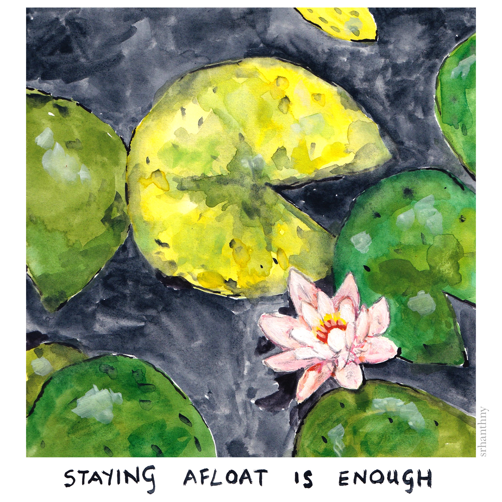
'Staying Afloat' painting (2021)
Workshop ideas and notes, for development
After noting my initial ideas, I took the P3 RISE course on developing a creative workshop which I found really helpful.
I also looked further into how drawing and the creative arts in general are being currently used in the curriculum, as well as how connection with both nature and art can positively affect children's mental health and cognitive functions.
I haven't finished this proposal yet but it's definitely something to consider expanding on in Unit X.
Additional research:
‘Do Schools Kill Creativity? Sir Ken Robinson,’ TED, YouTube (2007) https://www.youtube.com/watch?v=iG9CE55wbtY&ab_channel=TED
‘Ecotherapy: an introduction’ Mind, YouTube (2013) https://www.youtube.com/watch?v=0NJDnEGWpzU&feature=emb_title&ab_channel=Mind%2Cthementalhealthcharity
‘9 clever ways to create creativity’ Canva https://www.canva.com/learn/9-clever-ways-to-teach-creativity/
‘The Red House by Feilden Clegg Bradley Studios’ Architects Journal, YouTube, (2017) https://www.youtube.com/watch?v=sBSN7x-YRoc&ab_channel=Architects%27Journal
APPLYING MY WORK TO THE CONTEXT OF BRIDGEWATER GARDEN
PRACTITIONER RESEARCH: ANITA BOWERMAN
RHS Harlow Carr’s artist in residence was Anita Bowerman, who works primarily with acrylic. Her paintings are vibrant, with a softness to and almost diffused quality to them. She often uses twigs, moss and leaves to direct her mark making, infusing the environment with her work. Although her paintings are beautiful, they are also have a very distinct and singular style, often quite feminine in the choice of colour palettes.
Anita Bowerman
Anita Bowerman
For my own approach to the garden, I want to keep the ambience that Anita manages to create, but also move away from such a painterly approach. Harlow Carr is based in Harrogate which has a much different general demographic to the cultural landscape of Salford and Manchester. I’d like for my work to echo the surrounding area of Bridgewater Garden as well as the heritage that RHS has.
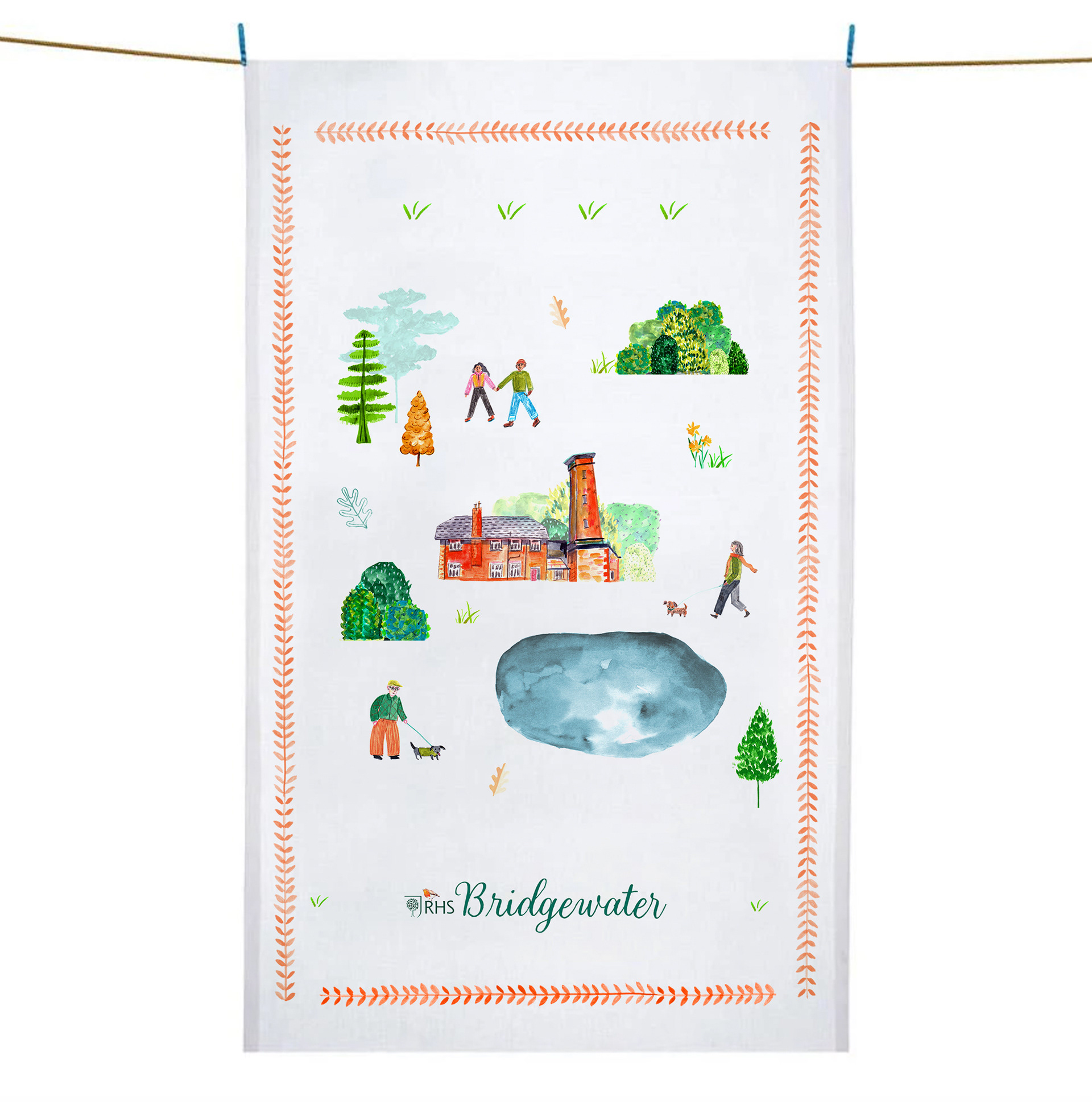
BRIDGEWATER GARDEN
From some quick digging, I found out that the RHS student annual ticket was only £10. With the new RHS Bridgewater Garden opening in Manchester in May and also the heightened interest of younger people in green spaces, I felt that if students felt they were invited to be there it might encourage a new wave of interest in the RHS from ‘the next generation,’ as well as encouraging young people to get out and enjoy nature in a different form from their local park or indoor plants.
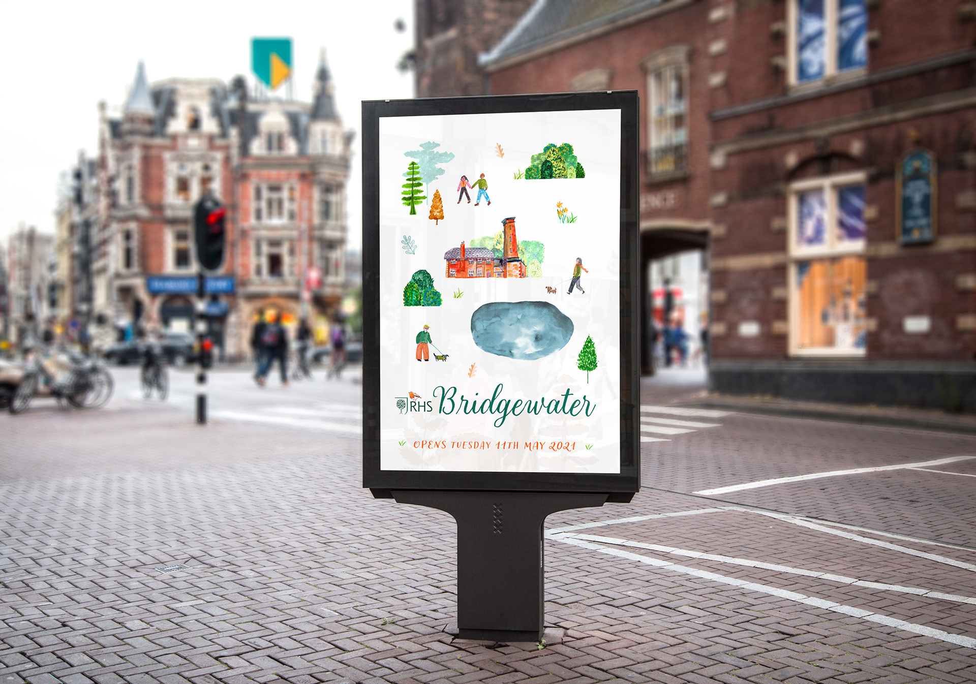
With this in mind, I decided to create some marketing materials for Bridgewater Garden that were directed at students and young adults that might not normally gravitate towards a heritage or formal garden. With the view to demonstrate how these designs could be applied to series of merchandise that could be sold in RHS gift shops, I created a mock up of a tea towel design also.
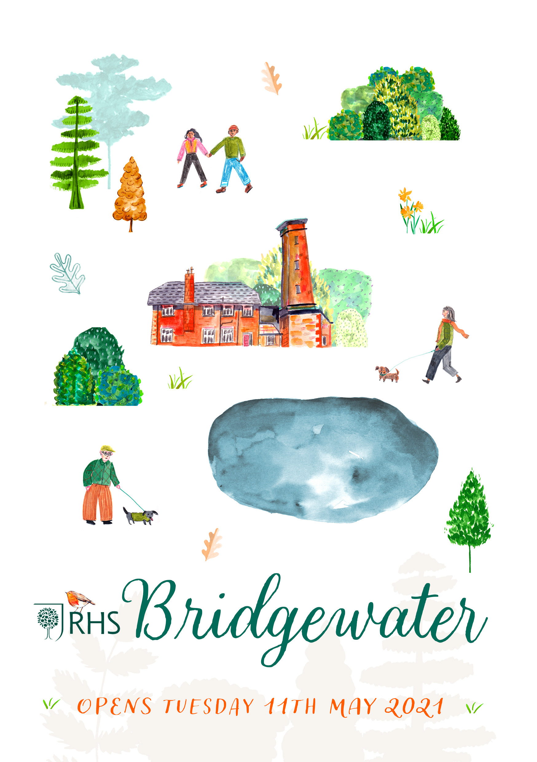
Poster
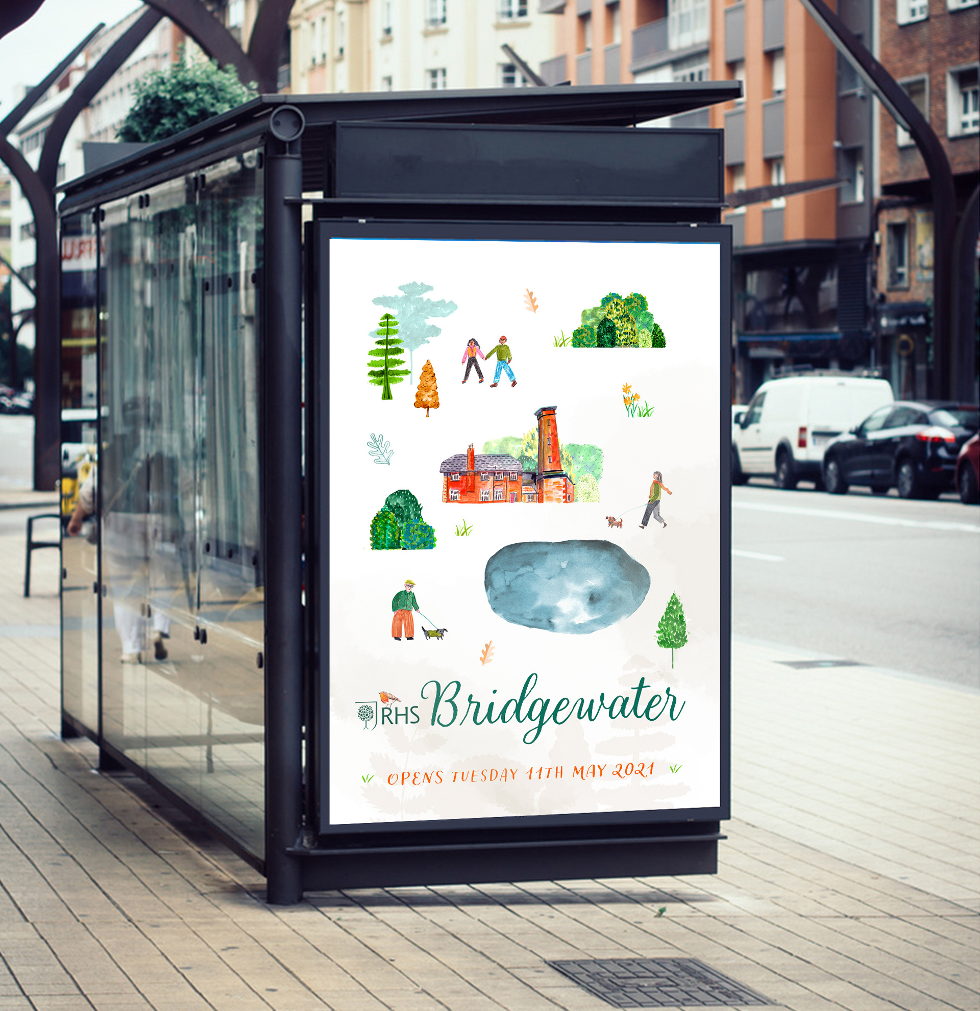
Poster in context
Poster in context